One of the things I pride myself on when I hold Presentation Magic workshops is an adherence to an evidence base for almost all the guidelines and demonstrations I offer, such that attendees are ready to put into practice what they’ve learnt at their first opportunity.
I have long argued that there is very little evidence for how many people present with slideware in particular, something which has become known in the presentation criticism trade as the Cogntive Style of Powerpoint. (See my previous entry on the Ignite format for a description).
Rules such as 10/20/30 or 7 x 7 have no evidence for them other than anecdotal, or succumb to a “we’ve always done it this way around here” conformist mentality.
As a trained family therapist, I am always curious as to how family “rules” originate and perpetuate, often in the face of evidence that they’re no longer working. In the world of presenting, 2009 will see many books and blogs published which will continue to challenge customs of presenting, and this is a good thing.
In my Presentation Magic workshop at Macworld this year, I focussed day 1 on my philosophy of presenting, complete with hopefully compelling evidence. Day 2 was more focussed on the techniques I employed to convey my messages, with a strong emphasis on how to best employ Apple’s Keynote software to achieve favourable results.
I started the workshop by looking at the inclusion of presentation-style effects in mainstream media as evidence that consumers are becoming more savvy about information transfer. Talking heads in the news and current affairs programs no longer cuts it, it seems.
I started with an edited version of the opening scenes of the recent Ron Howard film, The Da Vinci Code, where Dr. Robert Langdon (Tom Hanks) is giving a guest symposium on religious symbolism in Paris, while an old colleague is murdered in the Louvre. I edited out the murder, wanting to focus on Langdon’s demonstration of symbolic images and how they can mislead us. We don’t know what software he uses but it’s not relevant. Here’s some screenshots of one of the scenes I used, showing his hardware setup and one of the images (Poseidon and his trident):
When I later gave a one-day version of Presentation Magic to an audience of Seventh Day Adventist ministers and youth workers soon after Macworld (religious groups are very attracted to my style of presentation training with its emphasis on history, science, visuals, and story-telling), a new TV program had just started that week (actually the night before!) called Lie to Me.
The drama series, starring Tim Roth, is loosely based on the academic and professional work of psychologist Paul Ekman (UCSF) who has studied cultural variations in facial responses to emotional states such as anger, disgust, sadness, etc. The psychologist and his team in the TV show help police and FBI verify whether suspects are telling the truth or not.
In the opening sequence, even before the opening credits roll, the Roth character, Dr. Carl Lightman, is seen lecturing an audience of FBI agents and illustrating his talk with a strong series of visual elements:

Lecturing to the FBI and displaying stereotypical scorn using two familiar public characters (the one on the left is an actor)
Throughout the series, common facial expressions are demonstrated using well known public figures, showing the series has an active research department tracking down stock images.
Here’s a few more from the opening sequence of episode 1 for your entertainment:
Notice in the illustration above how I actually placed the video clip into a widescreen TV to help “contextualise” the story. Rather than just placing a video file onto a slide, I embedded it into a TV image. Most audiences find this an attractive metaphor.
In my talks, I also showed some current affairs programs and how they were illustrating their stories especially where newspapers were being quoted. What was seen were the words, and what was heard was a voice 0ver artist narrating. Here is a screenshot of a clip from the Australian media criticism show, Media Watch, I used:
In my own keynotes, I emulate these semiotics, which is especially appealling to young people who have grown up with this kind of visual. It certainly is far more appealing than bullet points.
But what’s more important is that it lends an air of authenticity and authority to the presentation. I’m not creating an all-text slide and copy and pasting words – I’m showing the real McCoy, whether it be a newspaper clipping, a magazine headline, or the header and abstract from a scholarly journal, as shown below:
Notice in the illustration above, that I use a screenshot from the actual article, which having initially been shown, I then fade and fuzz it into the background. Doing this requires some effort on my part, perhaps taking ten minutes to construct for a slide that may only stay on screen for less than a minute. But it conveys to the audience my respect for them, in that I go to the trouble of locating evidence to support my contentions, which are usually quite challenging for audiences whose own presentation style is the dreaded cognitive style of Powerpoint, ie presenter-centric, not audience-centric.
Let me come to the main point of this blog-entry, the week-long argy-bargy between CNBC and the Daily Show, personified by Jim Cramer and Jon Stewart. This matchup occurred following Stewart’s commentary the week before (March 4) when CNBC’s Rick Santelli, below, labelled Americans who had lost their homes as “losers”.
This inflamed Stewart who took Santelli and CNBC to task for not being tougher on financial CEOs and calling out their duplicity. When Santelli withdraw his invitation to be on the Daily Show, Stewart let loose the entire week, focussing in particular on former hedge fund manager, Jim Cramer and his “Mad Money” evening CNBC program.
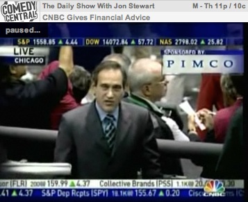
Stewart showed a series of clips wherein Cramer informs his viewers of the “safety” of certain financial institutions:
Stewart goes for the jugular, contrasting the over the top graphics and hyperbolic presentation style of Cramer and CNBC with a very Keynote-like simple and to-the-point graphic, white sans-serif font on black background for impact:
On his March 9, Daily Show, Stewart continued his evidence against the trustworthiness of CNBC and its talent:
On Thursday, March 12, Cramer accepted an invitation to be interviewed by Stewart, and ultimately turned out to be a good sport, while Stewart aggressively filleted him.
What would have interested many Apple followers was the section where Stewart showed a clip of Cramer discussing the Apple iPhone in the weeks leading up to its release in January 2007, when rumours of its existence were running hot. Essentially, Cramer discussed how easy it was to manipulate Apple stock prices (“shorting”) and getting away with it.
Stewart came to the debate armed and dangerous, despatching each of Cramer’s efforts to defend his actions with evidence from previous episodes of Cramer shows which showed him to be a disingenuous showman with debatable credentials for providing long term financial advice.
I was especially taken by Stewart’s approach, since I do the same when it comes to convincingly condemning the standard, socially normed presentation style of powerpoint (and Keynote if merely used to copy the powerpoint style). The best way to do this is not by arguing with words, but as Shakespeare has Othello tell Iago, “Show me the ocular proof”, below:
Involving audiences with visual proof, have them interact with the presentation such that they cannot help but see, feel and hear the evidence in action is compelling, memorable, and engaging – if not difficult to do, because it asks you to constantly think about your audience.
Stewart’s efforts clearly hit a nerve, and proved most convincing if the comments section in the New York Times is to be believed, which you can access here (login required). Many ask why mainstream media have left it up to the Court Jester to ask the tough questions (and some recall the lead up to the Iraq invasion when asking the same question.)
In some ways, we ought not be surprised. History has repeatedly shown that the clown, the comic, and the simpleton who knows no better (and nowadays we can include the lack of social graces displayed by those with autism spectrum disorders, e.g. Sheldon in the Big Bang Theory) can get away with questions and observations the rest of us shy away from. Witness any newspaper’s political comic section for cartoons that cut to the chase very, very quickly. I use them liberally in my talks, especially ones which make fun of Powerpoint (just Google <Powerpoint+comic>)
Next time you want to convince an audience of your authenticity and the logicality of your argument, go back and locate Stewart’s March 4 and 9 CNBC take down and remind yourself of the need to do proper research, using appropriate evidence, presented in a way for which few in your audience could disagree. And which packs an emotional punch or two.
If for nothing else, you will be remembered for doing the talk and the walk, something all too rare nowadays.


I really enjoyed this post Les. I’ve been following the Cramer Stewart debate all week (thanks to Comedy Central providing all the Daily Shows on the net) so it was a good synopsis and reminder.
On the technique of pulling out real newspaper clippings, your readers might not know that you can go to the large university and state libraries and head down to their newspaper microfiche area (it always seems to be in the basement), find the article (usually first on the web to give you a date) and then save the image of the newspaper clipping to a USB disk.
Nicely done. I think I’ll update some of my Keynote slides to highlight better the key text that I’m quoting directly from.
As for Stewart filleting Cramer, he deserves it. Have you ever read about Cramer and his henchpeople at the deepcapture.com blog? Fascinating.
Only one comment about the slides you use, the one of “contempt”, looked like a wry smile on the left and a smirk on Simon Cowell. Of course smirk and contempt are pretty close, but I’ve seen the one on the left often enough to think it’s just a wry smile.
KenC and Shawn, ta for the positive comments. The labelling of contempt was that used by the Lightman character rather than my analysis. But I thought the episode was interesting; I’m not sure if I can sustain interest through the series though – perhaps a little repetitive.
You said “Lie to me” was loosely based on work of Paul Ekman. I was thinking as much myself (not that I’m in the profession). There’s a chapter in “blink” by Malcolm Gladwell about his work with micro-expressions that I enjoyed more than the TV show, but it suggests that micro-expressions are best captured with cameras – preferably cameras with high-speed frame rates. I guess if somebody was very very expert in reading these expression like Ekman it’s possible.
Interesting post re evidence based. I would have thought that goes without saying in academia and her children, no?
Pingback: Hall of Shame: 12 of the Worst Financial Gurus