Monthly Archives: March 2014

Advice for scientists who present: In this second blog entry, I look at a better use of charts and graphs, especially the use of Keynote’s MagicMove transition (with a special reference to Steve Jobs use of graphs)

In a previous post, I began an excursion into how science presenters can be easily and unwittingly seduced into giving very poor presentations by dint of their training and facilitation of their professional association’s publication standards.

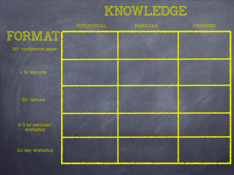
It was left with a complex diagram I often use in my workshops about IT where I try to persuade late adopter colleagues to review their relationships with technology and give thought to how best to bring themselves up to date (hint: buy an iPad).

The diagram was designed in 2008 by Nick Felton at the request of two New York Times op-ed writers, W. Michael Cox and Richard Alm, and his complex graph was then repurposed by Apple pundit, Horace Dediu, in 2012.

The link to the original NYT article is here, and the Dediu link here.

I want you to see in part how I use this diagram, employ Keynote in doing so in my workshops, and give you an idea of how I discuss it via my voiceover. It will begin a discourse on charts and graphs, one of the essential tools for scientists which can either make their presentations clear and engaging, or become utter turnoffs in their obfuscation. The video is 5 minutes long. I’ll wait…

What I wanted you to see is that it is possible to take a complex diagram rich with information, and interact with it to better engage your audience. And to combine another’s analysis of the same data but a different purpose using some of Keynote’s most useful elements – Magic Move – to make a segue between the two.

This leads to:

Unwitting mistake #6: Poor use of data-rich charts and graphs

Let me say at the outset that I have a rule of thumb that I apply to graphical portrayal of data:

Use these rich sources of presentation persuasiveness wisely. They are not things you show because science demands it, but because they serve a purpose. Because of the latter, you owe it to your audience to help them understand what you are trying to convey showing your graphs and charts.

There is a corollary to this rule of thumb, and it relates to a point I made in my previous blog entry about audiences varying between having superficial subject knowledge through to the profound. The corollary is this:

The less your audience knows your subject or is unfamiliar with the use of graphs and charts, the more you need to gently step through your graph, building up each component in a coherent story telling. The addendum to this applies the same narrative to hostile or skeptical audiences.

Let me illustrate with one of the greatest expositions of graphs as story telling in recent public memory. It starts with Steve Jobs introducing the original iPhone at Macworld in January, 2007. One where he embarks on a persuasive story of why the iPhone was created, and why it has a chance of succeeding despite various pundits and competitors saying its market was “mature” (unchangeable) and the iPhone was too expensive.

We start here with a screenshot, below, from Jobs’ iPhone keynote. If you have the entire 2007 keynote (available on iTunes or YouTube), it starts about 30 mins in. Jobs has just been discussing the properties of the current (2007) crop of “so-called” Smartphones, and wants us to know the iPhone has a place in the universe. He claims it’s because the current crop are neither that smart nor, in particular, easy to use. In other words, the current mature telco industry is saying, “You can have smart, you can have easy, but you can’t have both. We don’t know (or care) how to do that”.

For Apple, that is an industry worth challenging because the status quo has been accepted as unchangeable (A little like the science presentation scene, no?).

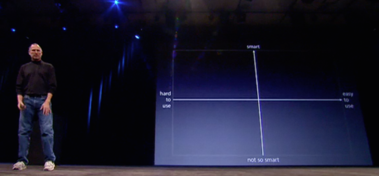
Jobs starts us on his journey of challenge – his narrative of why the iPhone is the right risk for Apple to take – with this simplest of graphs:

Voila_Capture2014-03-12_03-55-43_pmJobs “cubes” this graph in, and then says,

“If you make a Business School 101 graph of a smart axis (Y) and an easy to use (X) axis….”

That gets an audience laugh perhaps because of Jobs’ use of a really simple graph together with his “I’m-almost-embarrassed-to-say-it” expression of, “Business School 101”. What Jobs is about to do is school the telco industry using the most basic analysis of why they are wrong. Next:

Voila_Capture2014-03-12_03-59-25_pm
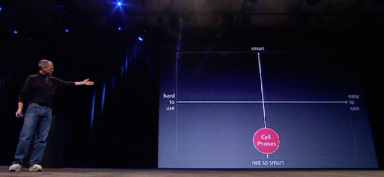
Jobs now slow builds in a circle showing the placement of the current majority of phones in use – dumb or feature phones – near the extreme of the “not so smart” Y Axis. They are zero on the X “ease of use” axis because that’s not why people buy them – it’s a given, and not a branding element. No one is claiming our phones are easier to use than our competitors, because all they do is make calls and send texts. (In fact, I always thought Nokia’s range of dumb phones possessed the most superior User Interface, compared to Ericsson or Motorola).

Jobs now wishes to make the case for where the current crop of alleged smartphones lies in his graph:

Voila_Capture2014-03-12_03-59-53_pm
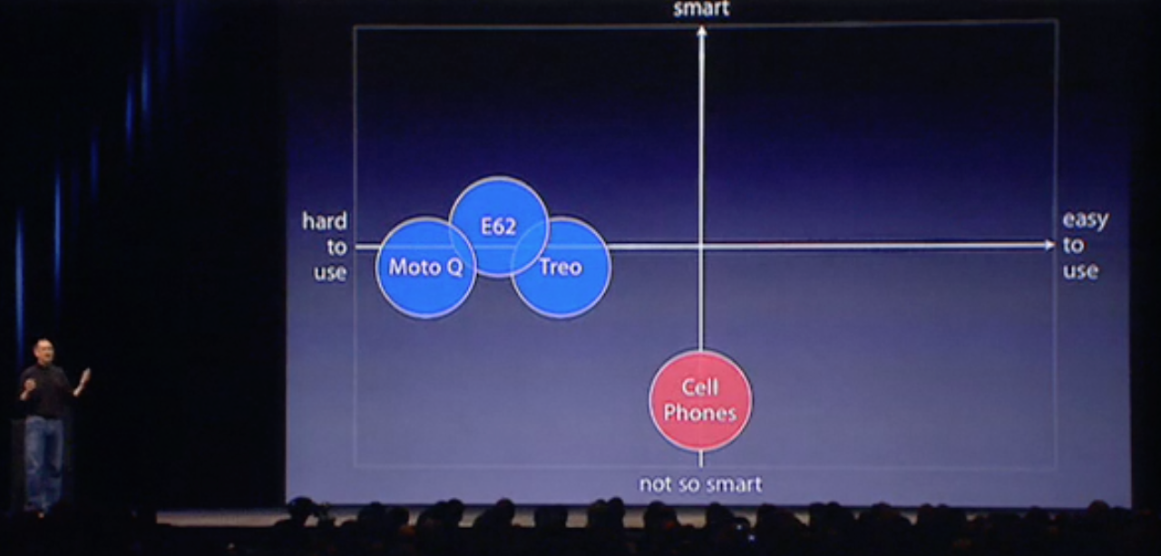
And he actually refers to them, something some of those in advertising would say is to break the Golden Rule of naming your competitors. But so confident is Jobs that Apple’s iPhone is a “leapfrog” above these (he actually uses that term, below) that he is not concerned to both name them, and later show them.

Steve Jobs: "We want to make a leapfrog product"

Steve Jobs: “We want to make a leapfrog product”

Having heaped scorn on the existing batch of dumb, feature and so-called smartphones, Jobs shows us why the iPhone has a reason for being:

Voila_Capture2014-03-12_04-00-26_pmJobs says Apple wants to make a product that is “way smarter… and easier to use” than the usual suspects, and – before we’ve even seen what it looks like – places the green iPhone icon in the top right quadrant, well away from the others, visually in a category all on its own. If the tech industry had  really studied this diagram during the keynote, rather than chuckling at Jobs’ seeming dumbing down of his Business School 101 graph – a true Jobsian misdirection – they may have detected the tsunami of innovation and change that was about to be unleashed upon them. Through hubris, inertia and groupthink, Nokia, Sony Ericsson, Motorola, Google, and especially Microsoft were caught flat-footed, and it started with such a simple, yet revealing graph.

Of course, Jobs was a master story creator and teller, and not all scientists are so gifted or empowered.

But let’s see some of the easy catches scientists can make to at least give themselves a better chance of successfully engaging and persuading their audiences.

To do this, I need to remind you of my previous blog entry, where I asserted your presentation needs to stand alone, be its own entity, and not merely a cut and paste job from your paper publication.

Here’s why:

Voila_Capture2014-03-13_04-47-49_pm
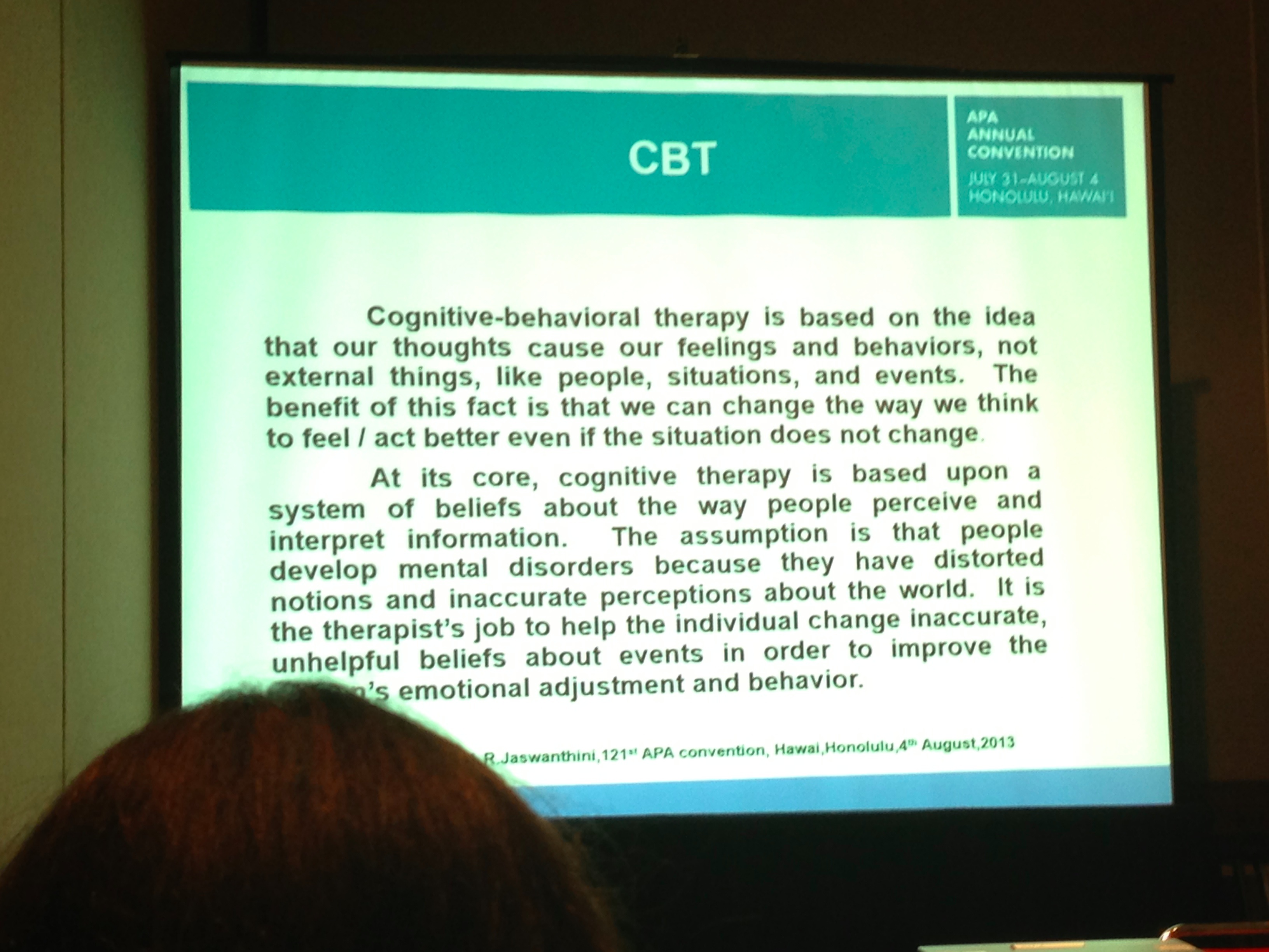
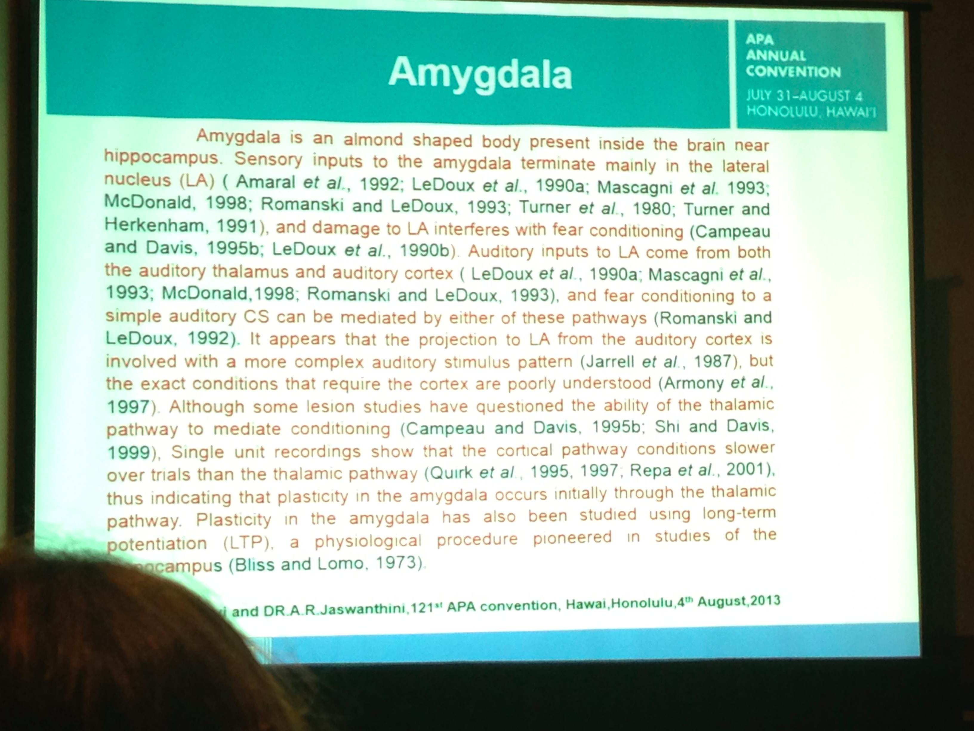
What you’re seeing here is a Powerpoint slide, not a screenshot of a journal PDF from Neurobiology. It was used in a medical presentation I located in a random search using Google.

Now there is a place for showing you have gone to the original source for your slide. I do this on a frequent basis, although I always start with the first page of the article, and sometimes even show the cover of the journal opening using Keynote’s Flop (right to left) transition to suggest a page turn of the cover.

I then use Magic Move to focus in on a selection of the page, as in the diagram above. In the Powerpoint from which this slide is taken, there is simply a change of slide.

There are some issues though with this slide, however. For one, the images are heavily pixelated. Not such a serious problem however, and those at the back of the room probably won’t notice it. But what is disconcerting no matter where you sit is the tiny print explaining the meaning of the figure. This is fine to include in a printed journal document, but in a slide in a live presentation it’s out and out junk. Clutter. Distraction. Attention splitting. Confusing, Frustrating. Message denuding. This is ironic considering the figures are comparing brain activation areas in dyslexics and normals on certain reading tasks.

How would I do this instead if it was me showing this figure? Clearly, the figure is  intended for meaning extraction by profoundly knowledgeable audiences. The use of acronyms and letters is meaningful to only such audiences and would require significant explanation for a lay audience.

What the author is trying to do is show differences between two groups on specific tasks. But in showing us all the twelve images (6 pairs) simultaneously we would have to have significant prior knowledge to know the meaning of these image variations.

For a lay audience, the idea would better be handled by taking some time to show normal responses on the tasks, then contrasting them step by step (once more using Magic Move to move from pair to pair of images) showing the changes for dyslexics across tasks. In other words, tell a story about the tasks and what they are testing for, and how it is that the images portray significant differences between the test groups.

Here’s another example from a colleague with a purpose built slide, not one taken directly from a publication:

Voila_Capture2014-03-14_12-17-37_am

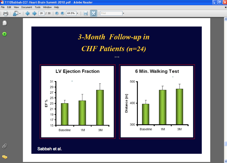
What we’re seeing are two different measures of the same subject group side by side. The presenter first talks about one measure, say the one on the left, then transfers his, and presumably our, attention to the one on the right.

But why have both appear simultaneously and split our attention when the presenter can only describe one at at time? Where would the harm be in just using one graph per slide?

Here’s another slide from the same presentation to drive the point home:

Voila_Capture2014-03-14_12-20-09_am

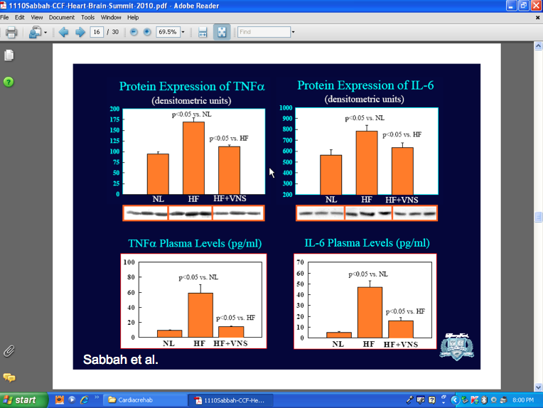
Now, just because your software allows you to show four graphs at at time doesn’t mean you have to do it this way. It’s not like you’re giving handouts and trying to conserve paper. Unless indeed that’s what you’ve done, and have now asked your audience to turn to page 16 of their handout where you will walk them through each graph step by step. In that case, I don’t have an issue with this slide. Indeed, when I speak with academics they explain to me their students demand the slides ahead of class. And workshop attendees demand handouts to take something away with them for their cost of attendance.

(Aside: I never give handouts, before, during or after my workshops. I suggest at the beginning of the class how attendees can best make use of the visuals and information I’ll be presenting, and I let them know I will follow up with an email of links to services and ideas I will make mention of, including unplanned references spontaneously arising through group discussion.)

But unless you are making direct comparisons between the graphs and you need them all on the one slide, it’s just overwhelming for a live audience. What the presenter could do is:

1. Start with all four and say, “We conducted a series of four experimental procedures the results of which are summarised on this slide. Let start with the graph top left and have a closer look at what the results mean.”

2. From there, you use the Magic Move transition to zoom to that graph and explain to your audience what’s happening.

3. You do the same shift of attention for each of the remaining three graphs.

4. You zoom out again to show all four graphs and then offer a summary of what can be gleaned having exposed subjects to four experimental conditions, and where the data either advances a hypothesis, rejects it, or constructs a new set of hypotheses not previously considered.

Here’s a quick and dirty screenshow using Keynote 6 (KN6 falls over currently when exporting to Quicktime movies unlike the mature Keynote 5):

Here’s another slide from a Powerpoint show which demonstrates one of my other pet peeves:

Voila_Capture2014-03-14_12-31-59_am

Once more, we have two graphs on the one slide. What I really dislike is the now ingrained habit of labelling the Y (vertical axis) with English (not Chinese, or Japanese) words starting from bottom to top. It’s hard to read. Now if the idea is to say, “Yes but it signifies increasing levels (e.g. 80 – 200)” why aren’t the numerals also rotated 90 degrees counter-clockwise, like the words?

The other “explanation” I hear is that in space-constricted slides where screen real estate is at a premium, it’s easier to write words in a vertical plane to conserve space. Really? Look how much white space there is on this slide.

Surely, the designer could have taken one graph at a time, significantly enlarged it, and then found space to write the Y axis description horizontally, making it much easier to read.

What I do like about the slide is the author’s header, which specifically tells his or her audience the graphs’ meaning. It cues us in to look for the important elements in the slide, which the presenter then explains to us.

I almost always either use graphs with such an explanation header, or I completely leave off any descriptions, preferring to gently build the graph item by item, Jobs-style, drawing out important differences or similarities in a cohesive narrative.

A few more guidelines:

  1. If you are going to use visual elements like photographs, try and use one per slide rather than cover your slide with numerous smaller pictures overlapping each other. There needs to be a specific reason why a slide has multiple pictures, collage-style, which otherwise simply clutters the slides and divides audience attention.
  2. Make sure when using visuals they do not pixellate when you enlarge them. I have rejected truly brilliant photos in favour of less suitable photos (or none at all), if when enlarged, they pixellate. It’s just too distracting.
  3. Make sure you remove any watermarks on photos which are not your own. It’s just plain unprofessional.(UPDATE: Following a comment below, I want to be quite specific about this point.What I should have written is, don’t just drag and drop a watermarked image into your slide. Do the right thing and purchase the image, thus killing two birds with one stone.I believe Getty images have released a huge tranche of its materials for free use in personal blogs. Worth pursuing as is paid services like iStockphoto (which now sells movies and backgrounds), and similar. And there is also Flickr and Creative Commons images to pursue with correct attribution. Also see Matt Shipman’s recent Scilogs science communication blog article here for ideas and free resources.I use a paid app from Glencode called Viewfinder to help track down images this way. These third party helpers and more will be demoed at my Macworld workshop March 26 this year.)
  4. Be wary of mixing styles of data visualisation in the one slide. Look below at the slide for an example:Voila_Capture2014-03-14_12-20-55_pm

The task with the slide above is to give consideration to how an audience will respond to this very rich slide. Where should their attention go? To the pictures or the graph? Would it not be better to show one, then the other and use your speaking to make the connection?

There is now on the web an enormous library of guides for how to portray data sets visually. With the current emphasis on “Big Data”, there are now specialists in this area who can assist to produce complex charting which are useful for paper, convention expo or website viewing, but which overwhelm a slide unless you can use Magic Move to move around the slide bringing singular attention to each component. Here’s a Big data style expo stand I located today at an IT convention in Melbourne:

Voila_Capture2014-03-14_05-05-22_pm

Also, go to the Roambi website here which makes apps for iPad and iPhones to assist with data visualisation on a large scale. Use it for inspiration.

Concluding remarks:

The challenge for scientists is that in the main they are using “small data” from their experiments, or “medium data” from meta-analytic studies then constructing the graphs themselves. This can be  either using the built-in tools Powerpoint and Keynote offer, or purpose-built apps which can construct complex charts (eg. Excel and Numbers) then import them into your slidestack.

But whatever you do, make sure you stand back from your slide metaphorically and empathise with your audience.  Ask if the slide is achieving your aim of providing persuasive information which best illustrates your ideas and findings, or is it there because science presentation dogma demands it.

In my next entry in this science-oriented series, I’ll look at the biggest challenge for scientists as well as those in the humanities: the use of text on slides. Is there a way to use text that still keeps audiences engaged and with the presenter, rather than reading and racing ahead?

The unwitting mistakes science presenters make, unknowingly facilitated by their professional Associations (Or: it’s time to move science presentations into the 21st century)

Students in the Northern Hemisphere are by now half way through the college year. Freshman college students will have been exposed to a variety of presentation styles in their lectures, some better and some worse. Here in Australia, students are commencing their academic year, given we are coming to the end of our summer.

For myself, my professional association, the Australian Psychological Society has  completed its annual conference in Cairns, in far north Queensland in October 2013, and has called for papers for its next conference the same time this year. I didn’t attend in 2013, having recently returned from the American Psychological Association’s annual convention, held in Honolulu in August.

What each psychological association has in common is their expectation that presentations at their respective conferences will reflect an evidence-base of what works in professional psychology. Attendees expect to hear about current research findings, often derived from traditional experimental methods and statistical analyses.

However, what each also has in common, sadly, is the generally poor quality of presentation skills.

The irony is that while each emphasises the empirical base of the science, few presentations bother to use an evidence base for presenting science.

Psychology is not unique in this shortcoming, and the same criticism can be aimed at many of the sciences. Fortunately, the APS has recognised the growing importance of presenting to a diversity of audiences, and so this year I will be travelling Australia conducting presentation skills workshops under the APS auspices. (It’s open to non-psychologists too). The Australian Health regulator, AHPRA, which oversees all health practitioner national registrations, complaints and continuing education requirements has also recognised presenting as an important skill set.

When it comes to conferences, travelling away from home to exotic destinations is a great way to both holiday and refresh one’s batteries, as well as gain important new insights and networks.

There’s an opportunity to watch and hear the best in their business keynote their latest ideas and discoveries, or perhaps present themselves.

The younger academics might be presenting for their first time to peers and superiors in the hope of attracting interest in their work, and perhaps a job offer if the rest of their CV matches the presentation.

In the sciences and medicine, there’ll be two hour symposia composed of twenty minute formal presentations, then question time; half day and full day “master”  workshops, as well as poster sessions where those whose papers didn’t quite make the cut can nonetheless discuss their ideas in a 30 minute informal scenario where conference goers can move around the area dipping into conversations about a student’s Masters or Ph.D research, printed on large laminated sheets in the style of a science paper: abstract, introduction, subjects, method, results, discussion, etc. Stuff you learn to do in your first year undergraduate studies your teachers hope is the start of your professional career.

Getting a spot in a symposium or workshop is a major achievement where you’re either well known, or know someone who is well-known and can sponsor your work and vouch for your ability to do the profession proud when you present.

From experience, one often witnesses presentations demonstrating original research or ideas never before presented, or one sees a recently published paper presented “live” inclusive of new research not yet ready for academic publication (it may have been submitted, but not yet accepted) but which extends the already published research.

Presenting at such a conference can be a daunting task, even for senior members of  the profession, well-versed in its ways. Preparation and rehearsal go a long way of course, but new ideas or a criticique of existing paradigms or dogma requires more than just the voice of authority or prestige. At the very top of any profession, it’s not about the money or prestige but about a true sense of advancing the profession and leaving a legacy.

I’ve attended conference presentations by such people, downloaded their presentations when I couldn’t attend, and ventured far and wide in my presentation skills interests apart from science, including how the legal profession presents both academically, at conferences, and to employees and clients.

In this blog entry, I want to guide you past the most overt presentation errors scientists make, often without awareness of these errors. Sometimes they are committed because the profession demands they be committed in order to conform to some pre-conceived notion – or dogma – about presenting that the profession has carried within it for decades.

Other times, a university or research institute or government section’s Marketing or HR department defines how a presentation will look, complete with logo or brand or “team colours”, as well as fonts, size and all. See below (click to enlarge) to see how seriously some organisations take their “look and feel”, from presentations, to business cards, to newsletters to websites, etc:

The entire pdf “visual identity guidance” document from this cancer research group can be downloaded here.

Much of the advice is well founded if a little pedantic in a corporatese kind of way… but on the next page is an interesting guide to the use of visual images in publications. What’s even more interesting is their use of unedited iStockphoto images, complete with the word “iStockphoto” left on one… something I’ll discuss as one of the deadly sins of presenting a little later (click to enlarge):

Now, I could understand leaving on the iStockphoto watermark if this booklet was advising employees where to source their images (especially if a group purchasing arrangement is in place) and with the specific advice to purchase the desired image so as to remove the watermark before placement in a presentation. What I can’t understand is the tacit approval to go outside the research facility and use images anyone could use, rather than supplying their own inhouse images unique to the establishment. The worst case scenario is presenting at the same conference as a rival who just before used the same images!

This leads me to begin my list of unwitting errors scientists make.

Unwitting Mistake #1: Not changing your presentation to suite your current audience

1. Often, conferences and conventions take place over several days, feature more than a dozen concurrent tracks to choose from, and a variety of delivery styles, from short presentations of ten to twenty minutes, longer keynotes of 45 minutes, masterclasses of two hours, as well as full day workshops. Each requires a different appreciation of the audience’s knowledge, needs and aspirations.

Take a look at this diagram I created in Keynote to help begin the analysis:

Presentation format

No one expects an extensive review of the field in a 20 minute original presentation. Such presentations usually form part of a symposium either invited by the conference scientific committee, or submitted by a group, such as a university or hospital department. Here, it’s the desire to showcase current research via four or so short papers, each related to the others, whose main theme is pulled together by a senior faculty member with sufficient gravitas and authority to discuss why the research matters.

Those symposia are usually attended by others in the same field, whose knowledge can be considered profound. There is little time for each presenter to give much backgrounding or explanation of specific terms, and audience members are expected to be up to speed with the methods and prior research briefly discussed.

Where scientists make errors, possibly due to time considerations and lack of formal presentation training experience, is taking these same presentations, which may have received much applause and recognition when originally presented, and then offering them, unchanged, to a lay audience.

These lay audiences attend for a different purpose, usually to witness the application of basic research, and possess only rudimentary awareness of the field. They’re not interested so much in experimental method but more in the current status of the field as it relates to them, e.g., Is a cure far away or in the near future? Is climate change real and is it truly man-made? Their IQs may be on par with the presenter’s but their knowledge is much more superficial.

When scientists take their same convention presentations – those they give to their peers – to such a lay audience, they can find themselves working hard to help the audience fill in their gaps of knowledge. They sense it’s not going over well, so they exceed their time limits, and appear unrehearsed. No one doubts their authority, but not all will come away impressed by the scientist’s communication skills. These may be exemplary for his or her peers, but it’s a different skill set when it comes to less informed audiences.

Such audiences may include those in the same field but without the deep foundational knowledge those immersed in a specific research area possess.

Often, speakers offering a short presentation to their peers may also be invited to offer a keynote to the entire convention, with there being few or no competing tracks. The science committee has often invited them, at some expense, because conference goers want to hear leading researchers present, even if the field is not one of primary interest, but for which they have an appreciation none the less. In my experience, science committee choice is rarely based on presentation ability.

Once more, the same “deep” presentation needs to be modified for this professional audience. Language is altered, from the profound  “we extended Smith and Jones’ landmark 2003 research by…” to the lay or less knowledgable presentation’s “let me spend a few moments explaining how we setup the experiments”.

It’s my belief the best presenters science has to offer – for both the highly specific through to the lay audience – carefully prepare their data and literally mould it to suit the situation. But it’s not just the data they consider; it’s how their data and its meaning will be conveyed in the most informative and dare I say persuasive manner possible. After all, why present if not to persuade? Well, the answer can all too often be: to add another presentation attendance and paper to my CV.

Such is the demand on scientists to justify their livelihoods that sometimes we in the audience pay the price for poorly conceived delivery methods from presenters who clearly don’t care if we learn anything or not.

There is one more audience parameter that needs to be mentioned in this climate of polarised debates when it comes to certain topics which challenges the neutrality of science research. That is audience bias. As much as scientists may wish to offer a value neutral exposition of their research, its application may have strong emotional and monetary considerations for their audience. So, I can add a third dimension to our table which may influence how a presentation is to be constructed and delivered – ONSIDE, NEUTRAL and HOSTILE:

Voila_Capture807Now it’s not my idea to intimidate science presenters. It’s more about starting a conversation about the various parameters that can take an average but easily forgotten presentation to something stellar, career changing and memorable.

Unwitting Mistake #2: Not knowing or forgetting a presentation is not the regurgitation of a published paper, but is a medium of knowledge transfer unto itself

Them’s highfalutin words, I know, but this is one of most common and easily remediated mistakes those who undertake science communication instruction need to modify very early in their training.

Below are some photos of slides I took during a symposium at the APA convention in Honololu, 2013. These pictures are from a single 20 minute presentation:

abstractAPA

CBTAPA

AmygdalaAPA

IMG_2027 CtndAPAprocedureAPAConcAPA

What you are witnessing in this series of slide photos I took with my iPhone is not a presentation, but a paper intended for publication in a paper journal (or online as a PDF) placed onto Powerpoint slides: a cut and paste job from the original Word file, most likely.

How can this be in 2013? In the last few years, I’ve been railing against the dumbing down of presentations through the unwitting overuse of bullet points and half-sentences.

In this case, what we have is no effort at thinking about the presentation and its intended live audience. Perhaps it came about because the presenter was in an enormous hurry and had no time to prepare. Highly unlikely since the APA gives you months of acknowledgement that your presentation has been accepted.

Or more likely, it’s the way the presenter has always presented; has seen others in her university present, and worse still, seen others at international conferences present.

But I’m afraid I have worse news: The presenter actually read the slides to us, word for word. And as I looked around the seminar room, I noted one more very disturbing thing: no one in the audience I witnessed seemed to mind. It’s as if they all accepted this as par for the course.

This kind of presentation is not a one off – I’ve seen it too many times to think it’s out of the ordinary.

Now if you’ve come here to this blog entry after referral from a friend and wondering why I am making such as fuss about this, my message is this.

When you read an article in a publication, you have time to pursue the references, to decipher the tables, charts and graphs at your leisure, to look up the references over your morning coffee, and to read at your own pace, perhaps starting with the abstract, heading to the Discussion section, and then closely examining the Results section in more minute detail. Each scientist has their own style of reading journal articles.

In a live presentation, you don’t have this luxury. It is the presenter’s role to tell her story, and use her slides as her augmenting or support crew to illustrate convincingly the veracity and worth of her story.

In plain terms,

It is insulting to the audience to be read to

It utterly disconnects the audience from your presentation, and renders you an impassive narrator while the audience races ahead and reads for themselves the content of the slides.

Scientists are fortunate compared to business presenters because we have our story arcs laid out for us by historical convention, especially if we are reporting original experimental outcomes.

The APA publishes on its website a tutorial for those starting out where it clearly educates how scholarly publications should be constructed:

APAStyle

The story arc in its publications are expected to conform to this structure. At its live presentations at conferences, no such demands are made, but clearly there is an expectation that original research conforms to this story arc too.

But is it really the best way for live audiences to be kept engaged during a keynote or brief paper? Can one hope to achieve the same appreciation of one’s original research in a presentation as can occur in a paper publication?

It seems to me we must start to think about the delivery of scientific story arcs to a live audience in profoundly different ways, and even more so when our audience does not have deep subject knowledge and comes from a hostile base. Your scientific colleagues might approve, but the audience will not be shifted one iota. This is also why the mainstream media is so hungry for scientists who understand how media works, who its audience is, its deadlines, and its use of narrative.

Unwitting mistake #3: Unhelpful room layouts

Take a look at the picture below which I took at another seminar at APA Honolulu, August, 2013:

PresentationTennis

What do you notice immediately?

The presenter is in the corner, behind his miked podium, Stage right. Centre stage is the presentation discussant alone on a table for seven, and Stage left is the Powerpointed slide, in usual “filled with text” fashion.

The audience, occupying the middle of the room, is forced to play “Presentation Ping Pong” going back and forth between presenter and his slide.

I dread when I walk into such arenas as an audience member, and despise it as a presenter. This is why I scope out the room the day before if it’s at all possible. And why I never, as hard as it is, never stand behind a podium. It has all the appearance of authority at the commencement of your presentation, as you’re introduced and make your way behind the podium, only to lose it once you reach it and do one or more of several things:

  1. Tap the microphone several times, and ask “CAN YOU HEAR ME”? The several hundred dollar mike and the audio operator with headphones on will not appreciate it.
  2. You bring up your presentation by showing us the entire slide show contents of 200 text filled slides, with the occasional cheesy clipart.
  3. You immediately start to read your slides from the laptop, vanity monitor or the projected image as if you had no audience present.

Once more, it’s up to those in charge of scientific presentations and conventions to do what they can – even at the fundamental structural level of designing the room – to assist presenters in what is for many one of the more difficult but nowadays mandatory parts of their professional lives.

Unwitting mistake #4: Failure to understand the power of stories

I spend a lot of time discussing storytelling when I speak with scientist presenters. How do I do this?

In my Presentation Magic workshops, I often show brief clips of favourite movies; those clips which stop you in your tracks to watch over and over again. Such as when you visit a friend and the movie is on in the background… and you say, “Hey, have you seen this movie…?” And when your friend says, “Nup!” you say, “Quick, sit down… there’s this great scene coming up.”

Just like a favourite piece of music you can listen to over and over again because it has emotional hooks for you, there are some movie scenes that feel the same. I usually show a few of mine during my workshops, asking the audience if they can guess what movie they’re from, then asking them to form small groups and share with others their own favourite movie sequences, and why.

The choices discussed often form a kind of movie Rorschach test, telling us something about the viewer via his or her choice. Almost always, there is a personal meaning the viewer extracts from the scene, such as the comeuppance of a nasty character, a “hit it out” of the ball park by an unexpected baseball hero, a rescue by a very ordinary passerby, or a scene where you know how it ends but want to see the reactions of those who don’t know what will happen next… a favourite story arc of master story teller, Alfred Hitchcock.

Indeed, this sequence in my workshops is the commencement of an important discussion in presentation skills training, one that has now caught on fast:  the place of story telling in helping make complex ideas more readily understandable.

Some would say there are only a limited number of story “styles” traceable back to ancient times with their fables, biblical and metaphorical accounts, and so on.

The rise of psychoanalysis in the twentieth century with Freud and later Jung exploring the role of universal conflicts, dreams and fantasies, collective beliefs and archetypes is still a potent force in the twenty first century.

The power of storytelling is to convey complex and perhaps difficult messages to unbelieving or sceptical audiences, for which there is a body of neuroscience knowledge that likely underpins the uniquely human quality of both telling and witnessing others’ stories, to perhaps better understand and change our own.

So, back to the mistake of confusing live presentations with published papers, and why a presentation should not be a repurposed or reformatted paper: It’s because each tells a story in a different way.

Take a look at this diagram below which I’ve been using recently in workshops for psychologists on IT. I found it on Horace Dedieu’s blog and it refers to a New York Times’ article he cites, published several years ago (click to enlarge):

The graph was developed by famed data visualiser and self-chronicler, Nicholas Felton, who was a recent visitor to Australia for his own presentations to designers.

Essentially, Felton’s NYT graph shows the rate at which various technologies we now take for granted were taken up in the last hundred years. The dependent variable is percentage of US households, and we can see along the independent (X or Time axis) how newer technologies, when they penetrate customer resistance, penetrate much more quickly than the older ones, like the telephone, electricity, and refrigeration, all of which are near 100% penetration currently.

In my IT presentations, I often discuss what happens when a product reaches 50% home penetration, how there are often dips after the products reaches a certain acceptance (sometimes called The Valley of Disappointment), and what happens at 80% (it’s more about marketers trying for brand loyalty rather than convince potential customers to purchase for the first time).

But the graph, while offering the newspaper reader plentiful data to immerse oneself – tracking uptake for various products over 100 years – is time consuming, given its data density.

I would not ordinarily, even for a switched-on audience, show such as graph, or more pointedly, create one of my own for a stand and deliver audience. It’s much too dense and would take too much time for even hard core data visualisers to work out what’s going on.

It’s worse when you’re standing up speaking with this in the background because its complexity (and I think it is a terrifically informative graphic) will easily distract your audience from you and what you’re are saying as the audience tries to work out what’s going on. Those who are easily confused by such graphs will just turn off completely and go play Angry Birds or Candy Crush.

But there are ways and means for using this in a live presentation and still stay in control of your presentation. Left as it is with the speaker likely using a laser pointer to try and track a product’s time course, an audience will quickly turn off and disengage.

In my follow up blog entry, I’ll spend a little time and effort discussing the importance of using graphs and charts, and how there are better and worse ways to achieve your goals of being an influential, entertaining and persuasive presenter.

Unwitting Mistake #5: Applying the principles of Garr Reynolds, Nancy Duarte and me without forethought

What the heck am I saying, you might be asking?

It’s this: In some domains, you are better off staying with the status quo that elevating yourself above your peers and betters, lest you be seen as a smart-ass. For certain audiences, especially those with deep profound knowledge of the subject, perhaps greater than the presenter’s (think PhD examination committee), shifting away from traditional means of presenting and employing the new guidelines espoused by some of us (who are thoroughly over how most academics present), may set your audience against you.

They may perceive you to be obscuring statistically insignificant findings or poorly thought through outcomes with glitz and glamour (you know, when presenters go crazy with builds, animations, transitions when the presentation does not call for it). In other words, the deeper the knowledge level of the audience, and the more hostile or disbelieving they are, the better it is to leave aside flashy presentations, and get to the meat and potatoes swiftly – no nouvelle cuisine. 

This doesn’t means returning to the standard default Powerpoint of 6 x 6 slides filled with text. It means being cautious with the visual elements of your presentation, using charts and graphs judiciously, and adhering to the advice offered by your supervisors if you are a graduate student.

Later, as your career develops, you can introduce more 21st Century components, or you can take the risk as I do each time of challenging dogmatic “principles” of presenting, as long as you’re prepared to wear the consequences.

More to follow in another blog entry soon, and I will be discussing more of these ideas at Macworld in a few weeks time in San Francisco.