We’re currently in the throes of Apple changing the look and feel of its operating systems.
iOS 8 has just been released, revealing the influence of Apple Senior VP Jony Ive in bringing a flatter look. Yosemite is around the corner and it too will show a quite different feel from the desktop operating systems of the past few years.
When Apple makes these large scale changes, it introduces design memes which are often copied. Witness the original Bondi Blue iMac of 1998, and how it changed not just Apple’s design standards, but that of many other technologies, bringing multicoloured translucency to many non-IT products, for better or worse.
In iOS8, Apple has introduced Healthkit, a series of services combining both apps and hardware which resides on your iOS devices.
Below is a representation of some of its services:
Here, on the left you can see the Dashboard, with Calories burnt in orange above a Sleep measure, in blue, below. On the right, you can see a variety of health services and measures incorporated into Healthkit.
I now fully expect that these visual representations of data points will become a design meme many will choose to follow, with their crisp sharp images and icons.
(UPDATE: The folks at UI design outfit, Mercury, have offered a graphic of iOS8 elements here. Below is the healthkit range – click to enlarge).
Here’s a screenshot I took of my own iPhone 6 screen showing steps taken these past few days:
I want you to note Apple’s use of dual advanced gradients. One is the entire orange soft edge rectangular shape containing all the relevant data, chart and information, going vertically from an orange to an almost blood red.
But I want you to also note the line chart showing how many steps I took the last few days, from September 26-October 1. Note in particular the area under the series of white lined data points, which too has a gradient from light orange to a darker hue.
I wanted to know if this design meme could be replicated in Keynote unassisted by third party drawing tools. This is one way I hone my Keynote skills, by setting myself challenges to reproduce what may have been constructed in professional design software.
The task then was to create an advanced gradient embedded on an advanced gradient.
In the video below, I walk you through one set of solutions, so that those with rudimentary Keynote skills can learn to apply some of the software’s deeper elements, such as grouping, drawing, outlining, gradients, colour matching, opacity and layering.
Bear in mind, the means I show may not be the only way to do this, and if you have more economical means (i.e., less mouse clicking), let me know in the comments.
In January 2003, when Steve Jobs introduced Apple’s presentation software, Keynote, at Macworld, he emphasised its “cinematic” qualities. By this he meant its adroitness using high quality images, text and transitions between slides. His presentation at Macworld elicited many “Ooohs” and “Ahhhs” when he demonstrated cube and dissolve transition, something the dominant platform of its day – Microsoft’s Powerpoint – could not perform with such slickness.
Jobs then elicited many cheers when he announced the $99 Keynote would be given free to all the Macworld attendees, and indeed, just like Powerpoint had become the first part of the Microsoft Office puzzle to form, Keynote became the first part of iWork.
The history is a little more political in a sense, however. 2003 was the year the five year agreement between Apple and Microsoft was to end. The story is now well known but often misinterpreted that on his return in 1997, Jobs declared the desktop wars were over, Microsoft had won, and Apple didn’t need Microsoft to lose for it to win also. As a sign of good faith, and as part of a legal arrangement due to its use of Quicktime technologies, Microsoft invested $150 million of non-voting stock (often said to have saved Apple from the brink of bankruptcy by those who insist Microsoft “saved” Apple), and Apple gave Internet Explorer pride of place as its browser of choice. Microsoft also agreed to continue developing Office for the Mac for five years.
Some would say this was a very important vote of confidence in Apple, as well as perhaps preventing accusations of monopoly operations on the part of Microsoft. The full story can be read in any number of places, but perhaps start here.
Almost twelve years later, the world of technology is a very different place. But one aspect hasn’t changed much at all, despite the evolving use of technologies and their increasing power, and that’s presenting complex information to a variety of audiences, something that forms the basis for this blog site.
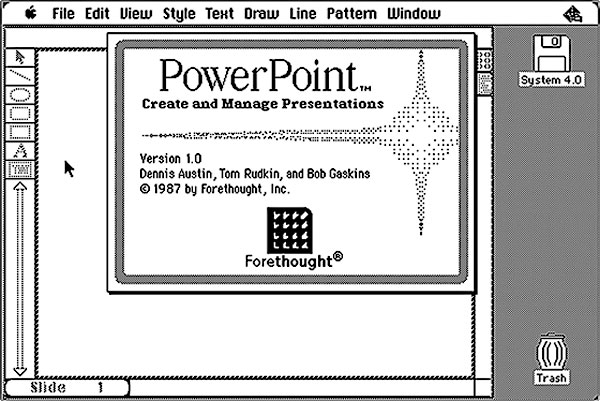
It still feels to me as I travel locally and internationally that many presenters still present as if they’re using overhead projectors, for which the predecessor to Powerpoint – Forethought – was developed, so that the Macintosh Plus and Apple’s Laserwriter could produce overhead transparencies.
These presentation remain text and chart heavy, and of course if all you show is text, there is no need to give consideration to how you transit from one slide to the next.
But of course film makers, from the time in the early 20 century when film could be edited and glued back together, understood the role of transitions in helping tell a story, especially when that story was fictional. Do remember that in its early days, films usually depicted real life events, often biblical or historical in nature, and eventually evolved to create motion pictures featuring new stories.
Transitions between scenes became a tremendously important audience cue, telling them if they were to be transported back or forward in time, or to another location, or into a thought sequence of one of the characters, and so on.
They formed imaginary bridges between scenes, allowing – along with the editing process – for filmmakers to shoot out of sequence. A language of transitions was created, and it was this vocabulary that Jobs referred to in 2003, distinguishing Keynote’s cinematic qualities from that of the more pedestrian Powerpoint.
It should come as no surprise that Keynote was developed for Jobs’ own style of presenting, having its origins – at least from a design point of view – as a NeXT application, Concurrence. This occurred at a time when Jobs was making his second fortune, taking ownership of Pixar, and steeping himself heavily in the machinations of the film industry. (Do locate that link to Concurrence for an exceptional first hand insight into the origins of Jobs’ presenting skills).
Both Powerpoint and Keynote distinguish themselves by their various themes, builds and transitions. There is a vast third party market for themes, and one only needs to attend a few science conferences to see how regularly certain Powerpoint themes appear, almost as if to say “This is the default for Science Presenting”.
Apple itself for its own elaborate keynotes rarely strays from the Gradient theme, and many Keynote users stay with this for their own presentations. Transitions between slides however do not see a third party plug-in system, unlike that for Apple’s professional moviemaking siblings, like Final Cut and Motion, the latter allowing you to create your own transitions for Final Cut.
These are professionally oriented programs. Keynote can be used for school projects as well as multimillion dollar deals and also appears on your iPhone, iPad and laptops of lower processing power. I’ve always wondered, and occasionally written, if Apple will introduce a plugin system for its builds and transitions, expecting or at least half hoping that with each update or upgrade of Keynote, this feature would be added.
Alas, even at version 6, Keynote’s transitions remain immutable; indeed, some got left out in going from version 5 to 6 to allow greater parity amongst all versions of Keynote, including online. Another aspect of version 5 that was overlooked, but thankfully now included in the latest version of Keynote, is movie transparency. That’s important for the next part of this blog entry.
The other features I had expected would make their appearance by now would be some kind of Apple timeline in Keynote for making more precise builds and transitions, and that of grouping and naming items. Group several items into multiple groups on the one slide, and they’re all named Group, not even Group 1, Group 2, etc. Combine that with less than stellar manipulation of layers on a Keynote slide and you have a lot of frustration at your finger tips. Not enough to send me over to Powerpoint, but the Microsoft product has certainly done a lot of catching up in recent upgrades, although it remains less than cinematic in its output.
So, is there a way to introduce new transitions into Keynote, ones that better help you tell your story and help you stand out from the crowd who are going to town using cube transitions and other overused elements?
Well, yes, in the shape of Telestream’s Screenflow software, one of several “helper” applications I use when creating my presentations. That in combination with another third party maker of transitions, Flowtility.
Screenflow may have started out as a screen capture tool – a feature that’s now even built into the current Quicktime application – but it is now way more than that. It is still a great tool for developing training tools, showing how users how to become familiar with the operations and functions of applications. It comes with a timeline, sophisticated means to add media then manipulate them, text rendering, and so on. And it also comes with built-in transitions, just like Keynote and some too have been borrowed from the motion picture business.
There are times when I want really precise build timing on a Keynote slide but sometimes, it’s just too laborious to use trial-and-error, as it stands now. So what I do is have all the elements and their builds on a slide in “as-close to final but not perfect” fashion then export that slide – on its own – as the highest quality Quicktime export I can. That file is then imported into Screenflow when I can make adjustments to fractions of a second, and even add new elements if the mood strikes me.
When I’m satisfied, the Screenflow file is exported, once more as a high quality Quicktime file, into Keynote where it will be observed by a none-the-wiser audience, and perhaps intrigue any Keynote users as to how the effect was done.
As a corollary, many Powerpoint heavy users know I don’t use their favourite presentation tool because some of the effects can’t be achieved in Powerpoint.
Unfortunately, as with Motion and Final Cut, you can’t “lift” Screenflow transitions and dump them into Keynote in some ersatz plug in system. But you can use them, and some of the third party transitions now available for Screenflow, in Keynote with a little sleight of hand. These third party transitions, from Flowtility, are really quite interesting, but as usual, one must be cautious rather than kitschy.
Flowtility allows you to download transitions as transparent movie files which can then be imported into a variety of apps such as iMovie, and of course Keynote. Here is a selection of its movie files added to a Keynote file.
In this case, the transitions occur on the slide, not between them. Your task is to remove the items your transiting from at some midpoint of the movie’s playing when the entire slide is obscured, use the Disappear build out feature, then immediately use the build in Appear feature for the new element you wish your audience to see. See my instructional video below to see how to do this:
In the case above, you don’t need to use Screenflow at all – just the transparent movies imported into your Keynote slides. If the movies play too fast or slow, find a copy of Quicktime Pro 7 which allows you to change the playback speed, up or down. This will allow a greater or lesser pause time when the slide contents are obscured.
In the next video, I have instead used another Flowtility pack imported into Screenflow. I have used an imaginary book as the element on the slide to be introduced or whisked away, but for the video below, the sequence looks as follows, from this Screenflow screenshot:
You can see the image we are working with, to its right are various media I can choose from, and below is the timeline with a thin red bar showing at what time point the transition – a camera shot – will occur.
The one image is “stretched” for a certain time – a few minutes in this case – then a cut is made every few seconds. Each cut, like an edited strip of film, is shifted to overlay the previous cut, and Screenflow automatically creates a transition area, the default of which is a dissolve transition, although this can be reset to the user’s preference.
One then selects each transition from a gallery, including the defaults, plus the addition of new purchased items. A small snapshot of each transition is embedded so you can see a static preview. In this way, you can “fake” a transition from one slide to another, by having a transition occur as a movie on the one slide. Here are some of Flowtility’s Pro transitions:
Your task is to know the content of the slide at the beginning pre-transition and what it will look like at the end. Your audience will be none the wiser.
There is one aspect you need to know.
Often, Keynote’s own transitions manipulate what’s on the screen and distorts or animates it as it moves to the next slide. Magic Move is a great example, and still underused by many. Others like Droplet manipulate the image before the audience’s eyes.
Screenflow’s transitions can do some of these too, but they are essentially parallels to Keynote and offer nothing new. The effects not seen in Keynote which interest us here function as you will have seen from the sample video above by obscuring the objects on the slide then revealing them.
That is, for a moment, the slide’s content is not seen, and this is where – like a magician’s sleight of hand – you replace one image or set of objects with a new set, which in fact is your new slide. This all occurs on the one slide, because what the audience is witnessing is a movie exported from Screenflow.
The next Keynote slide can be the end result reconstructed as a whole – or even a screenshot transited to – with an “Appear” transition in Keynote so the audience is none the wiser. This can be done with a click manually, or automatically once the Screenflow movie has stopped playing. Just remember which style of transition you’ve used.
The new slide could conceivably contain all the elements of the previous slide, such as text, images, backgrounds, etc., but represented statically. They then can be built out or moved individually, depending on your story.
So, that’s one way to add some new transitions to a familiar friend in Keynote. More advanced users may wish to play with Apple’s Motion software, but for many this will be going past the point of necessity.
On the other hand, I think all presenters who use Keynote would do well to download a copy of Screenflow and explore its virtues. In a forthcoming blog article, I’ll discuss how I use its ChromaKey or Green Screen effect to create more engaging webinars in concert with Keynote.