Category Archives: science communication

Using Keynote 8 to present about my clinical experiences using Virtual Reality at Cedars-Sinai – how I managed unexpected glitches and “tech support”

In late March, 2018, I was in Los Angeles presenting at the inaugural Virtual Medicine conference at Cedars-Sinai. Here’s the website and screenshot:

virtual medicine C-S

I had been invited over by faculty head Dr. Brennan Spiegel to present, TED-style, on my 17 years working clinically with Virtual Reality.

The timing of the conference was excellent and the day it finished Steven Spielberg’s new film, Real Player One, which features VR, was set to open. Indeed, my hotel, the Sofitel, featuring a huge poster on its wall.

IMG_6285

Some 300 people attended in person while another 1000 viewed the live stream via 360 degree Samsung technology, so it could be viewed in a head mounted display. The stage was equipped with a large vanity screen which mirrored the very large projection screen behind and above the presenters. Below, you can see a picture of the setup which I took during a break, below. The control booth for the presentations can be seen at the very top of the picture, centre.

IMG_8086


For my presentation, I was given 25 minutes very early in the two day conference, and prior had been asked to hand in my slidestack to be uploaded to a central server.

I never do that, given I present using Apple’s Keynote on a MacBook Pro and it contains a number of unusual fonts.

So I and a number of other speakers made arrangements with the technical support staff to use our MacBooks on stage, but not stand behind a podium. This required some form of remote control so we could wander the stage.

The videos of all the speakers will be uploaded soon, I’m told, but in the meantime, there are some lessons to be learnt which I want to pass on.

When tech support becomes a hindrance

While most other speakers used a clicker device to advance slides (and unfortunately also use the built-in laser light to highlight live slide elements), I elected to use my iPad to both control the slides, and as a mirror for my MacBook which was placed in presenter mode, meaning it displayed on the left the current slide the audience could see, and on the right was the next build. You can see an image, below:

Screen Shot 2018-04-05 at 5.37.03 pm (2).png

The next build can refer to the same slide but the next action which takes place, or it could mean the next slide. Some presentation mavens speak about the maximum number of slides a presentation should contain. This is really 1980s uninformed thinking. I could have one slide but with 200 builds which could take twenty minutes to present, or 200 individual slides with no builds, just transitions between slides. Be wary of anyone who offers you unbending rules about presentations.

If you’re unfamiliar with presenter mode (most presenters I meet, whether using Keynote or Powerpoint don’t use presenter mode), you can see this mode in action, illustrated above, using the latest Keynote 8. On the left is the image the audience sees, and on the right is the next build the audience will see when the slideshow is advanced. It also shows the number of builds on the same slide still to come. In the image, above, the right “preview” screen it states Builds Remaining: 3. You can also see two other handy images: the current time on the left, and the elapsed time on the right. It commences when you hit Keynote’s Play button.

In previous versions of Keynote, builds remaining was represented by blue dots not numbers, displayed under the current screen (as shown in this screen shot of Keynote 5, below). Why don’t more people use presenter mode? Presenting at conferences using the venue equipment almost always prohibits its use.

Screen Shot 2018-04-05 at 5.42.47 pm.png

Note, too, the use of Post it Notes graphics placed on the two slides. This was a great feature of Keynote up to version 5. It allowed you to remind yourself of the content of the screen when it was black. It’s like the presenter’s notes Keynote still maintains at the bottom of the screen, which I NEVER use. It takes up too much screen real estate, and it encourages you to read the slides. My guidance is that anything written in the presenter’s notes area (hidden from the audience) should really be on the slide itself. The Post It style note – which also is invisible to the audience – used to help me remember there was a movie or object under the black screen. I wanted to control when the audience would see the movie begin, often with a slow fade in, rather than its initial image. When Keynote on the desktop aimed for parity with iOS versions starting in Keynote 6, these Post It Notes were dropped in favour of yellow Comments notes to encourage collaboration with other Keynote users. They would not appear during the live presentation so couldn’t function as slide reminders.

The Post It notes feature was also useful if objects are to enter the screen from the sides and I want a cue to remind me of the blank slide’s content. In the screen movie below, I wanted to illustrate an experiment where objects movie across the screen, entering stage left and right, where the subject’s task is to say which one is in front and which one is behind (a test of depth perception). The objects need to move in off screen, but Keynote 8 can’t show in presenter mode they are “waiting in the wings” to make their entry. This is where the Post it Note feature could still be handy. To overcome this in Keynote 8, one could put the reminder in the presenter’s notes, but that area is then taken up for the entire show, not just the slide in question. You would have to be at the MacBook to hit the correct keyboard sequence (SHIFT+COMMAND+P) to switch off presenter notes.

But here is the problem with how Keynote operates: on both the current and next build  screen, nothing can be seen. Keynote will not show the animation, but just as importantly it can’t show what’s not on the slide nor what will happen next – you look at two blank slides, see below. The screen movie of presenter mode shows the current time, the elapsed time, the builds remaining (counting down from 3, 2, 1) and the red and green progress bar at. the screen top edge – when in red, an animation is taking place, when in green, Keynote is ready for the next manual build.

My own vanity app setup to annotate and control slides during a presentation

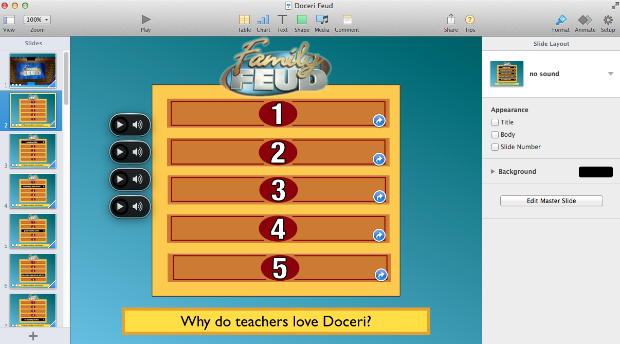
I have written previously about the software I use to facilitate my own vanity setup on the iPad, called Doceri from SP controls. It uses an app on the MacBook (or Windows setup), and a complementary app on the iPad. With the two devices sharing the same wifi LAN  (I bring my own router but not connected to the internet in the US – at home it does) I can also annotate the slides live, something the latest update to Keynote on the iPad allows for also, if you use the iPad as your presentation hardware.

I should add that I had created the slideshow using Keynote 7, but decided to live dangerously and update to the just released Keynote 8 the day before my presentation. I made a copy of Keynote 7 just in case something broke in 8.

When things don’t go according to plan

I want to point out a couple of issues which raised my level of arousal during my presentation which only I knew about. It may offer you the opportunity to learn from my experience.

My presentation was scheduled to begin very soon after the conference introductory remarks. Previously, when I arrived at the venue I’d gone to the control booth at the back of the auditorium and met with the tech group who checked my sound system, and  wired me up via a back of the head wireless microphone. Because I teach dance, I’m very used to wearing a similar microphone behind the ear.

While I was waiting for my turn to go on stage, I did two things: I quickly ran through all the slides to make sure they were in correct order and no build was hiding behind another, something that can occur when you’re working on slides with multiple builds which cover other builds, where you can forget to build it out, to reveal another image or text.

The second thing I did was fire up the portable wifi router, and open the Doceri apps on the Mac and iPad. This was a small problem as the router expected to see the internet, and had to be told not to keep searching for a connection. At home this happens automatically, but in the US it seeks a 4G tower. A moment of doubt, but it soon did its job.

Once I was ready to go, I headed to the first row, waiting for the signal to head to the podium where the MacBook would be connected via my HMDI adaptor to the A/V system. Once hooked up, I placed it in presenter mode. A different group of tech assistants was there, and as the conference host was finishing his remarks with perhaps 20 seconds for me to take centre stage, I noticed one of the tech crew opening a browser window on my MacBook and accessing YouTube. In doing so, he had dropped me out of my Optus router needed for Doceri, and employed the venue wifi. Asked why this was happening, I was told it was a final sound check, performed by playing a YouTube movie.

I was stunned.

I always keep a blank first slide with a sound file on it for just such purposes, which then transitions to my opening title slide, as shown below – yes, I used a movie background as a way to say, “this isn’t going to be your usual medical Powerpoint.”

slide.gif

I pointed out to the tech people what had happened and quickly reset the wifi to my own wifi router with a few seconds to spare, and the Doceri connection was re-instated. But as I moved to the stage for my introduction, I looked down at my iPad which ought to have been in presenter mode, and it was now in mirror mode. Usually two small screen icons with the numbers 1 and 2 appear above the display, allowing you to begin presenter mode (screen 1, coloured blue, below) or switch to mirror mode (Screen 2, in grey, below) if you want to annotate the slide – annotations won’t work in presenter mode, as shown below.

IMG_2207.PNG

But when I looked closely the choice of modes was not available – I was stuck in mirror mode. A quick glance at the MacBook over on stage right showed it to be in mirror mode, likely a result of the tech support person dropping out of Keynote to open a YouTube browser window.

I was stranded now centre stage, with no hope of taking time to leave the stage and fiddle with the Mac via its screen preferences. I had no way of knowing if the very large audience screen would show the guts of my Keynote (my worst presenter nightmare) or just an empty desktop – a preferred option. But the thought also occurred to me that by trying to setup presenter mode, the audience could possible see what I alone should see, the complete set of slides to come, which for me is a presentation faux pas.

So I had to be content with operating in mirror mode, with the iPad acting solely as a slide advancer. It could work in annotation mode too, but I had prepared my talk so this great feature would not be necessary. Things that would need to be highlighted were already pre-prepared with animations. I had rehearsed and rehearsed and so my not having presenter mode was unfortunate, but not a deal breaker.

What was much more serious is what went missing in mirror mode – my countdown timer which tells me how much time has elapsed (or if you prefer how much time remains), plus the actual Keynote clock time. The iPad does display real time but it’s tiny. I was somewhat panicked when I saw neither Screen 1 or 2 icons were present.

Image-1.jpg

This was very alarming as I need to see the timer. Because I don’t rehearse my exact words like most do for TED-talks, when I rehearse I “play” with the slide narration, testing out various ways to tell my story, knowing the feedback from the audience will guide me. This helps keep the talk spontaneous and lively, not over-rehearsed and “flat”. Some slides I can spend more time with judging by the audience reactions, some can be glossed over swiftly. But I need the timer to keep me on course and finish early if can. If things are going well, I might be able to go to black (use the B key) and add some more to the speech as long as it’s on message – I always rehearse these extras for just such occasions.

Les cedars18

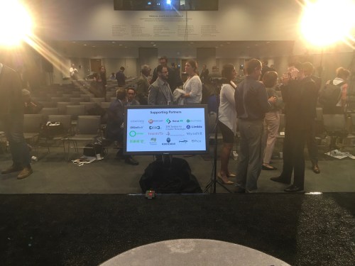
Presenting at Cedar-Sinai Virtual reality in Medicine conference – here, holding my iPad Pro to control and annotate slides. There’s a Samsung 360 degree camera live-streaming, bottom left.

Only after I gave my talk did I learn that just in front of the large vanity monitor were three small lights – green, yellow and red which would flash eventually. These are cue lights to inform presenters of their timing situation. Essentially, I was flying in the dark. When I began my presentation we were already behind schedule and I really wanted to help bring it back, even at the cost of jumping over a slide, but alas I had no idea of the time, and I refuse to look at my wristwatch while presenting.

As if not having presenter mode wasn’t enough…

Once I settled down into a presentation rhythm and felt I had the audience onside, the next glitch occurred. I had quite a few movie clips to show, which I had downloaded from YouTube and converted to .mov format via specialist software. These had all worked on the MacBook in Keynote rehearsal mode, and also while playing on my external LG monitor and Epson projector via HDMI at home. Earlier this year, however, at a conference in Melbourne, two of my movies came up on the screen and refused to play. My initial thought at the time was that I had somehow corrupted the build in-build out timings, but when I got home they played fine on my system.

Lo and Behold the same thing happened to three movies that had worked fine in rehearsal. I tried twice to get them working, and when it was clear they would not, I proceeded to use my storytelling to inform the audience the idea behind the movies. When these situations happen, you just have to keep going, and appear professional – there is no room for thoughts like “I’ve flown 8000 miles to be here – this shouldn’t happen”.

As it turns out,  I received two unexpected compliments during a break after my presentation. One was that I had “read the audience well”, and the other was: “What software did you use?”

I am still working on the movies-not-playing problem, trying to see what properties they have when compared to the movies that did play. This can be achieved using Quicktime’s Movie Inspector window  (COMMAND-I).

Extra features in Keynote 8

It’s always good to know Keynote is receiving updates, although I’m not sure the changes to 7 justified calling the update version 8, rather than a dot release to 7.4. Perhaps it’s to acknowledge the big change in iWork for iOS where the Apple Pencil can be used on inexpensive iPads to annotate slides. New infographics in mobile and desktop iWork apps to build donut charts, integration with Box for sharing content, and a new image gallery feature are the major additions, although I do miss the “Smart Builds” feature left behind in Keynote 5. See an example below, which I like so much I saved as a movie and now use it every so often. It’s actually two minutes in length, but to hopefully not trigger YouTube’s copyright algorithm, I’ve shortened it. Its purpose is to highlight the historical importance of the heart, when I do presentations about the brain. The importance of the heart remains firm in our folklore, so I combined movie posters with snippets of well known songs where the lyrics feature “heart”.

For a fuller description of the Keynote 8 features, see KeynotePro’s website Keynote pro and Keynote 8.


Feedback is so important to presenters shifting the paradigm – overcoming Powerpointlessness

This entry is going to sound a little self-aggrandising -perhaps even full of braggadocio  – but the exchange between myself and an attendee following a recent academic presentation I gave may be useful if you attend similar workshops.

A few weeks ago, I was the final speaker in a long day on a rather dry but important subject for psychologists – risk management. I was requested to speak about how IT could mitigate  risk for psychologist practitioners. I’ve offered all day workshops for this population around Australia, showing how IT can be incorporated into their workflow.

So, I attended with a presentation I believe understood its audience’s fears and concerns, which would only have been heightened through the day with lectures by lawyers, “old heads” and representations from regulatory boards.

I saw my task, being the last speaker for the day, as being both “light” and enlightening, and indeed very early in my presentation, acknowledged that I was presenting in one of the two times to be avoided: last (the other being straight after lunch).

I asked the audience to relax, forget about taking notes, while I told them a story. Yes, I literally said I was going to tell them a story. Which I proceeded to do about an airline’s incident which saw a 747 land with its nose gear retracted at Sydney Airport in 1994. I then wove a story within a story about how I was already involved as a psychologist with the same airline, and how I came to be involved in the aftermath of the incident in question.

Quite a few in the audience of perhaps 150 looked confused as to where I was going and its relevance to the day’s topic, but it soon came home to them, which is a frequent modus operandi I have when presenting. It’s a fine line, but hanging people out in confusion then bringing them back in with an “aha – I get it” moment is a trope I use for increasing audience engagement, much like a magician tries to hold an audience in suspense while setting up the trick.

This was the first time I’d presented this topic in this short format (about 45″) and so without an opportunity to trial it, I was eager to receive some feedback. A few days later, I received an email whose author has given me permission to reproduce (without ID). I was a little surprised by its content and focus:

Hi Les,
I attended your presentation last weekend at the PPWP meeting.
Thanks for presenting such an engaging and thought provoking presentation – especially, as you acknowledged, in the graveyard shift!
While I was very interested in the content of your presentation I have to admit to being more focussed on process, and taking copious notes about presentation style and the use of a/v.
I speak regularly in both Psychology and Yoga settings (I am a Psych and also a Yoga Teacher), and I’m presenting a keynote presentation this March at the Yoga Australia national conference (the peak body for Yoga Teachers in Australia).
I’ve been gradually training myself away from a heavy reliance on text based presentations, and I’m really hoping to challenge myself with this presentation.
So – to get to the point – I’m really keen to attend one of your ‘Presentation Magic’ courses if you still run them?  And I also wondered if you offer individual consultation where you could look over my planned presentation and provide feedback?
Thanks Les, cheerio,
To provide some context, not just was my presentation the last for the day, but the previous ones had followed the usual psychology Powerpoint style which the letter above alludes to. It wasn’t just that being the final speaker is a tough task, but expectations after a day of text-based powerpoint is usually so low that my task was actually made a little easier in terms of gaining attention and engagement. Just by daring to be different.
I opened a dialogue with my correspondent:
Thanks for your feedback,

Had you seen me present before?

If you hadn’t, I can imagine that what you witnessed (“saw” is too narrow) may have changed or confirmed the direction you want to take your own presentations.

Certainly (and I only got there after lunch), you would have witnessed standard psychology presentation materials and skills during the day.

I’d be really curious – as in, I would like to write a blog article – about your “copious notes”: what was occurring to you as you were note-taking, as I’m guessing that’s not what you had come prepared to do, but correct me if I’m wrong.
It’s not everyday you get to have such feedback. Often we present in an unfamiliar location to an audience we may never see again. Given this, I was curious to hear the feedback, which shortly arrived in the form of points the correspondent had taken while I presented:

Les’s presentation approach:

  • ·             Handheld device to control powerpoint
  • ·             ‘Holder’ under iPad mini to handle easily
  • ·             Les had his own notes on the mini?
  • ·             Storytelling – to make a point. Use visual prompts to help tell the story
  •               Engage the audience – don’t treat them like they have no idea what              you’re talking about, ie. Don’t tell them the obvious!
  • ·             Weave different things throughout – ie, while Les was talking abut the plane crash he mentioned his own work in fear of flying
  • ·             Slides are purely, very few words
  • ·             Keep to a few key messages – eg. Les’s 3, 2, 1
  • ·             Offer something people can email you for (eg, Les’s social medial policy). This encourages follow up and interaction with your audience later
  • ·             Tell people what you are and aren’t going to cover – keep expectations manageable
  • ·             When referencing websites use screenshot images of the website – visual interest
  • ·             Books – show image of the cover of the book
  • ·             Give the audience time to think for themselves – pose questions for their deliberation

I found this very interesting – what a psychologist about to do her own important keynote in a few weeks – finds worth attending to in another’s presentation. It’s important feedback. Let me share the next piece of correspondence (my response) which will hopefully provide further clarification:

I am curious when you noticed your attention shifted from content to process – do you recall? After all, you were most likely lulled into a sense of Powerpointlessness by some of the previous speakers – or did you recall you’d seen me before and so your expectations shifted? Just asking so as to provide for more depth and nuance to my blog article!

Let me go through your observations one by one:

Les’s presentation approach:

  • ·             Handheld device to control powerpoint

Yes, I use my iPad nowadays, rather than stand at the podium and click the keyboard. It requires the MacbookAir and the iPad to be on the same wifi network. I use my Optus mobile wifi router to provide that. It also accesses the web in case I need to do that to answer a question. But I also keep a small handheld Kensington clicker USB installed in case Optus falls over. (backup!) Oh, and I don’t use Powerpoint!

  • ·             ‘Holder’ under iPad mini to handle easily

This was a device (“BakBone”) gifted to me a few years ago when I was a Keynote speaker at Macworld in San Francisco, part of the shwag for presenters. It was developed by a surgeon to help hold his iPad in surgery! Link: <http://www.holdyourtablet.com/pages/about-the-bakbone-tablet-holder>

  • ·             Les had his own notes on the mini?

No, no notes under the slides. Anything that is important enough to need a note (an amount, a number of significance, a ratio), should be on the slide itself. I tell stories (see below) and so the slides (I can see the next one coming on the iPad) cue me in. But you must know your story. The exact words are not so important, so you don’t need to learn lines like an actor. BUT, it does require rehearsal which includes advancing your slides to match your words. We can discuss this more. If I made it look easy, it’s because I practise so much.

  • ·             Storytelling – to make a point. Use visual prompts to help tell the story

As above.

  • ·             Engage the audience – don’t treat them like they have no idea what you’re talking about, ie. Don’t tell them the obvious!

I call it “respect your audience”. They may not have the deep understanding of the subject, but they will appreciate being treated as equals. Lowers the barrier to engagement.

  • ·             Weave different things throughout – ie, while Les was talking abut the plane crash he mentioned his own work in fear of flying

Unspoken presentation rule. Even engaging presos need a change of pace and media every few minutes.

  • ·             Slides are purely, very few words

Yep. Slides are your support crew. Martin/Lewis; Abbott/Costello; Rowan/Martin… etc. You work as a team.

  • ·             Keep to a few key messages – eg. Les’s 3, 2, 1

in a brief presentation like mine, no more than 2 main messages for the audience – and tell them, “this is one of your take-home  messages you can start working on immediately”.

  • ·             Offer something people can email you for (eg, Les’s social medial policy). This encourages follow up and interaction with your audience later

Sneaky, aren’t I? Social psychology is plastered with experimental findings like this.

  • ·             Tell people what you are and aren’t going to cover – keep expectations manageable

Not sure I actually did this, apart from the low expectations which gets a quick laugh, but underneath that sets the tone,  also the quality of the presentation. Many in the audience who ARE presenters and think they know Powerpoint, will ask themselves, “How did he DO that?” Curiosity – up!

  • ·             When referencing websites use screenshot images of the website – visual interest

Absolutely, And the same for books and journal articles and emails… And then focus in on the salient bits and it’s OK to read someone else’s quote, just not your own!

  • ·             Books – show image of the cover of the book

ditto!

  • ·             Give the audience time to think for themselves – pose questions for their deliberation

Yes, all about engagement, and lots of small “aha” moments. Misdirect, then bring the audience home, so they sigh with satisfaction: “Yep, I get that… cool!”

Hope this helps

I want to share with you the final correspondence of relevance:

Thanks Les for your detailed points (above) – incredibly helpful and very generous of you.

My attention was on process before you spoke as I know presentation skills are your forte, and I’m working on this myself.  Yes, I had already been ‘lulled into a sense of Powerpointlessness’… please use that in your blog – gold!
I really loved that for a while there I was thinking – “where is he going with this story?  I’m not sure it’s relevant”… then a-ha!
The message I want to convey in this blog entry is that many in academia and the regulated health professions are ready for change in how complex ideas and information is offered up in formal settings designed to improve their professional development. The standard way of powerpoint-based learning is no longer working for many and no longer can be considered evidence based teaching, yet we still persist with it as evidence of the persistence of social norms and tradition in the sciences.
Thankfully, there will be a growing number of practitioner who both recognise quality training, and who are willing to say enough is enough to their peers and professional societies.

Essential new tools for bringing presentations, using Keynote or Powerpoint, to a whole other level

Last week, I spend time on Australia’s Gold Coast in Southern Queensland attending my professional society’s Annual Conference. This year, it celebrated 50 years and I was fortunate to be asked to be a member of the Organising Committee. I also gave a pre-conference half-day workshop on Presentation Skills, as well as being a panellist for a Social Media symposium, and chairing two symposia on technologies and animal-assistive therapy.

The Presentation Skills workshop gave me the opportunity to do the “walk and the talk” to about 25 attendees, the maximum the room could accommodate comfortably.

Interestingly, the room was in a very modern Convention facility, decked out with the latest technology whistles and bells. This included screens next to each room which could be updated with information about sessions. I had informed the AV people I would be using my own MacbookAir, and I would bring up my own adaptors.

Usually, I visit a new venue the day before to check out its layout and AV facilities so I am ready to go when the first attendee walks in. On this occasion, I landed the night before, so my first chance to see the room was an hour before the scheduled commencement.

The setup for other presenters was the usual configuration now commonly found in conventions to minimise problems: you go to a “blue room” where the AV people have some networked PCs and you offer them your Powerpoint on a memory stick. They upload it to their server, and add in your name to the first slide of the symposium which lists all the presenters with names hyperlinked. That way, the session chair just clicks on the next speaker’s name, and their Powerpoint opens.

The system on the Gold Coast unusually allowed for presenter mode, such that the standard PC on the lectern could  display both the current slide and the next one, something I find incredibly useful but few others seem to use.

In this system there was no way to accomodate a Mac running Apple’s Keynote.  Which is why I let AV people know ahead of time of my particular needs. However, in my workshop room, there was a wireless USB device which allowed the Mac to be seen by the projector, but only in mirror mode, disallowing presenter mode. This wasn’t satisfactory as I am set to work in presenter mode, and I wanted to show it as part of the discussion on how to improve presenting styles.

So it was back to plan A, which was to connect the Macbook Air via an adaptor to the projection system. This proved difficult as the system wanted an HDMI adaptor, and I had brought only the usual VGA adaptor. My Bad. It now becomes standard practice when visiting a new venue to bring both, as well as an AppleTV if I want to display attendees’ laptop displays (if they have a Mac) or their iPad’s or iPhone’s. Using HDMI also means audio can be passed through as well, rather than a separate cable (which sometimes is tied down and will not stretch to the Macbook. You put your Mac where the AV team says to put it!)

On this occasion, I didn’t hook in my AppleTV, so if I was going to display attendees’ screens, another solution would be needed. For a laptop, that would mean the wireless USB dongle mentioned above; for an iOS device, they would link wirelessly to my MacbookAir using my own wifi router and software from Squirrels called Reflector. The latest version is compatible with Android and Windows devices.

If an AppleTV was connected, it would use Airplay to mirror all Apple devices. I am finding this kind of setup in lecture rooms and modern convention centres to be on the increase. The only struggle can be making sure all devices connecting wirelessly are on the same subnet mask and you know any passwords for Airplay. This is why I bring my own router, but you can also bring and connect an Airport Express which will help connect 50 devices on the same subnet, as long as it can be put in bridging mode or connected to the available network over Ethernet. If it sounds like the “just give us your plain and simple Powerpoint file” is simpler and less trouble, you’d be correct.

In days of yore, of course, this was all unnecessary, as you rocked up to your presentation with your carousel of 35mm slides, and there was no sharing of others’ work. Your transition to the next slide was audibly heard with a definitive “chunck-chunck” sound, when the slides were advanced. So in those days, transitions were audible, not visual. Occasionally, a slide would be upside down or back to front, or even get caught in the gate and melt!

I started my workshop with a couple of slides using movies and effects simply not possible with either 35mm slides, overhead transparencies, or indeed likely never seen by this audience: this is my shaking book slide which I have written about previously. Here it is again:

This is my way of sending a direct message in the first few moments of the workshop that we are doing something different today.

But I also have two other means of demonstrating this “different way” of presenting which commences even before the first slide is shown.

In an effort to impress the group we will be doing a “presentation as conversation”, I refuse to stand behind a lectern and instead stand to the left of the screen if this is possible, with the MacBook Air over on the right side near the mixing panel and connections. Thus, if the audience looks to the front of the room, they see me on the left, the screen in the middle, and ancillary equipment to the right. The task is to remain in charge of the presentation even though the screen dominates the room, and the audience expects the screen to be the main medium by which they will learn. They will soon learn however that physical layout is only a small part of their learning experience.

The second clue that something different is happening comes when the audience notices I am holding my iPad in my left hand, and I might have a small Kensington clicker in my right. It’s the iPad which will control the flow of slides with the clicker as backup. (The second backup is walking up to the MacBook and hitting one of the keys which advances the slides manually).

There was a time when I travelled to present and would place the iPad in a stand in front of me to operate as a vanity or “confidence” monitor. Most modern keynote arenas will have these on display on the floor and if you’ve watched Apple’s own keynotes or those from TED talks, you’re also likely to have seen them in action, such as here:

Steve Jobs delivering a keynote and his confidence monitors below stage in presenter mode

Steve Jobs delivering a keynote and his confidence monitors below stage in presenter mode

Voila_Capture2015-10-07_12-16-58_PM

Above is Facebook COO, Sheryl Sandberg, in a TED talk and her confidence monitors.

These are great if you’re unlikely to move around very much. In the case of Steve Jobs and the huge stages he once worked, several pairs of monitors were strategically placed along the foot of the stage so no matter if he was extreme stage left or right he could see the monitors. His slide stacks often contained hundreds of slides and builds, too many to memorise so confidence monitors ion presenter display are needed to keep the story on track.

In a small workshop room where space is premium and where the stand with an attached iPad could obscure the screen for some at the back, another option is needed.

And this is where my three favourite presentation augmenters come into the picture, apart from the MacbookAir and Keynote itself.

They are:

  1. An iPadAir
  2. Doceri software, installed on both iPad and Macbook
  3. Bakbone magnetic holder, attached to the iPad.

There was a time when I wanted both hands free when I presented, with my right hand surreptitiously holding the Kensington clicker so that slides or builds would advance as if by magic in concordance with what I was saying. After the first few times, I think audiences stopped trying to work out how it happened and just accepted and perhaps expected the style throughout the rest of the presentation.

This is now one of the important evidence-based rules of presenting such that audio (what I’m saying) and video (what the audience is seeing) are in sync. The two most important sensory channels (auditory and visual) work together, rather than splitting; splitting or mixing up the channels confuses an audience at a “less than conscious level” and if you keep doing it in your presentation, they will attempt to restore the balance by doing their own activities and ignoring you. That is, they will reach for their iPhone or speak with their colleague next to them.

Having “split channels” is one of the ways many presenters unwittingly disengage their audience; it is easily “cured” and will lead to improved engagement and message delivery and recall. It is an essential skill presenters need to learn, and then impose upon their slide conception and building. By example, once I have a basic draft of my slide or set of slides, I will rehearse what I will say and practice my timing of slide builds. If it seems awkward or much too fiddly, I will try to automate the builds so they flow together rather than me having to remember when to click to advance. With really complicated slides with lots of automatic builds at precise intervals, I may even export that slide as a movie and then bring the movie back onto a slide, and let it roll. But that requires a great deal of rehearsal to hit your “marks” accurately. The “shaking book” example I began with started out as a complex slide, but it now a single movie replacing perhaps 25 builds.

Recording a complex set of single slide builds also helps with those times when the presenter clicker decides to stop working, or some background operation on the Mac decides to kick in (e.g. Spotlight, or when you’ve forgotten to shut down Mail and it’s automatically connecting to the Mail server). This is when you might double click because the first click didn’t advance – except it did, but was delayed and now that beautiful point you were making has been skipped because you double clicked!

If you export the slide builds as a movie in HD, your audience will not see any loss of picture quality, and it adds a safety net to your presentation. Mind you, it can also bulk up a slide stack, so don’t go overboard either!

So nowadays I hold the iPad in my left hand rather than have it attached to an immobile stand. It’s almost like returning to the bad old days of having 3×5 cards on which you have written your main points. These were yesterday’s presenter screens, cueing you in to the next element of your story, rather than reading the notes on the slides (egregious presenter error of the highest order, except if you are expressing a quotation from a nominated source).

Initially, I was worried that I may be harshly judged if the audience saw me refer to the iPad in my hand. Previously, my use of a vanity monitor would be done as surreptitiously as using the clicker, so as not to allow the audience to see me clueing myself in. You’ll often see the Apple V-P’s glancing down at their vanity monitors during their keynotes in quite obvious fashion, certainly much more so than Steve Jobs ever did. It’s neither good nor bad, just what it is.

But now, carrying the iPad with me, roving about the room, it’s very obvious what I’m doing but I no longer concern myself that the audience is “in” on my presentation tricks. Indeed, many come up to me afterwards and ask about the arrangement I use, principally because they would like to emulate its obvious effectiveness.

This is because the software I use on my iPad allows me to mirror the Macbook’s display in presenter mode, or, mirror what the data projector is displaying to the audience. The former is important for me as I may have roamed the room and now can’t see the Macbook to cue myself into the next slide or build. The iPad mirrors the Macbook’s Keynote (or Powerpoint) in presenter mode, and lets me see current and next slide using some wonderful software called Doceri.

I’ve blogged about the Doceri software before, and it’s recently received a small update to make it compatible with iOS9. It’s from SP Controls in South San Francisco, and I continue to be a beta tester and feed back ideas for product improvement. The software has very much found a home in teaching environments such as schools and colleges, and less so in presentation arenas, not surprising given how uncomfortable with change many presenters can be.

But the other reason audiences accommodate this rather strange or unfamiliar approach to presenting comes via Doceri’s ability for me to annotate the current slide on show. When in mirror mode (the iPad is displaying what the audience is seeing), I can draw, underline, bring up other pictures to colour in, take a picture of the audience, and leap about other slides which I have stored in Doceri but not prepared for the current presentation. Should it be necessary, I can keep the current presentation going, and overlay a previous set of slide pictures should an unanticipated question or comment occur. I think we’ve all had those moments when there is that one really great slide which could illustrate a point an audience member has just raised, but it’s not in the current stack. And Doceri will also record what I’m doing for uploading to YouTube if that’s my desire.

A more primitive form of this is possible if you use your iPhone as your “clicker” such that it can also go into presenter display mode, and supply you with a laser pointer-like image you can move around the display screen by dragging on your iPhone screen. And some minimal annotation tools too, all hand drawn. Doceri lets you draw precise squares, circles and objects with its palette of tools. There is one caveat however: if you’re in single screen drawing mode, the slides won’t advance. You have to unlock and leave that mode, even when mirroring. Doceri has the option of placing a thin coloured rectangle around the slide to cue you in that it is still in drawing mode, something most viewers will not see because they’re not expecting to see it – a form of inattentional blindness.

I’ve seen presenters use their iPhone as a clicker/vanity screen but the small size of the screen, even in Plus versions, has never had much appeal. It feels ungainly to hold and manipulate.

Which is your cue to ask about holding a 9.7 inch iPad and its ungainliness. And this is where the Bakbone comes into play. Let’s show you the video so you get to see what it is:

Rather than having the Bakbone attached in the middle of the iPad’s back panel over the  logo, I have it set to one side so I can more easily reach the Home button.

Its use means I don’t have to put too much thought or energy into holding onto the iPad – it just sits on my finger. I have to tell you that after workshops nowadays, I get two questions asked more often than others: One is what software I used (especially in workshops where I am not referring to Keynote or Powerpoint), and the second is about the Bakbone, especially from teachers who are employing iPads in their classroom for whom the Bakbone is clearly going to solve some problems.

I was given a Bakbone a few years ago as part of the shwag for presenting at Macworld, and it has become an indispensable part of my presenting, freeing me up from the static use of the iPad as vanity monitor, and allowing me to be much more interactive with the slides I’ve created, facilitated by Doceri’s vast compliment of presenting tools. It is now distributed in Australia via this link

One of the Bakbone inventors, physician Paul Webber

One of the Bakbone inventors, physician Paul Webber

In the next month or so when the iPad Pro with its pencil ships, it will be interesting to see if Doceri updates to take advantage of all that extra real estate and if the Bakbone will be compatible given the iPad Pro’s extra size. I’m guessing the Bakbone crew are constructing mockups given we know dimensions and weight, to see if there are handling issues. With current tablets, the use of factory styli are said to be compromised so it will be of great interest to see if the iPad Pencil will work.

I want to conclude this entry with a fresh point I made in my workshop to psychologists last week. I took them through a visual history of presenting so as to inform them that the problem of getting information from one person into another is a very ancient human challenge. From lectures, through to drawing in the sand and on slate, through to overhead cells and now slideware, it’s a challenge to know what the evidence says is most effective and which is being held onto for reasons of social norms and tradition.

To which I offered: “If you could have done your presentation using overheads like we did in the 1960s and 1970s and even into the 1980s (the reason in fact that Powerpoint came into existence – to help the MacPlus construct cell transparencies using new LaserWriters), then did you do your audience any favours? Did you produce for your audience a modern means of learning compared to something whose origins began in WWII for military training?”

And there was one last thing I offered in this pre-conference workshop:

“You’re gonna hate me, because for the next three days of this conference, going to various symposia and keynotes from eminent scientists, you won’t be able to unsee all the presentation errors I’ve just shown you. You’ll giggle, or gasp while your colleagues are trying to concentrate on the message; but you’ll feel split because once seen, the errors can’t be unseen. Just think of it as my workshop going on for another few days!”

Apple gives us some great transitions in its Keynote presentation software – but is there a way to add more? Yes, there is!

In January 2003, when Steve Jobs introduced Apple’s presentation software, Keynote, at Macworld, he emphasised its “cinematic” qualities. By this he meant its adroitness using high quality images, text and transitions between slides. His presentation at Macworld elicited many “Ooohs” and “Ahhhs” when he demonstrated cube and dissolve transition, something the dominant platform of its day – Microsoft’s Powerpoint – could not perform with such slickness.

Jobs then elicited many cheers when he announced the $99 Keynote would be given free to all the Macworld attendees, and indeed, just like Powerpoint had become the first part of the Microsoft Office puzzle to form, Keynote became the first part of iWork.

The history is a little more political in a sense, however. 2003 was the year the five year agreement between Apple and Microsoft was to end. The story is now well known but often misinterpreted that on his return in 1997, Jobs declared the desktop wars were over, Microsoft had won, and Apple didn’t need Microsoft to lose for it to win also. As a sign of good faith, and as part of a legal arrangement due to its use of Quicktime technologies, Microsoft invested $150 million of non-voting stock (often said to have saved Apple from the brink of bankruptcy by those who insist Microsoft “saved” Apple), and Apple gave Internet Explorer pride of place as its browser of choice. Microsoft also agreed to continue developing Office for the Mac for five years.

Some would say this was a very important vote of confidence in Apple, as well as perhaps preventing accusations of monopoly operations on the part of Microsoft. The full story can be read in any number of places, but perhaps start here.

Almost twelve years later, the world of technology is a very different place. But one aspect hasn’t changed much at all, despite the evolving use of technologies and their increasing power, and that’s presenting complex information to a variety of audiences, something that forms the basis for this blog site.

It still feels to me as I travel locally and internationally that many presenters still present as if they’re using overhead projectors, for which the predecessor to Powerpoint – Forethought – was developed, so that the Macintosh Plus and Apple’s Laserwriter could produce overhead transparencies.

powerpoint-25years-06

These presentation remain text and chart heavy, and of course if all you show is text, there is no need to give consideration to how you transit from one slide to the next.

But of course film makers, from the time in the early 20 century when film could be edited and glued back together, understood the role of transitions in helping tell a story, especially when that story was fictional. Do remember that in its early days, films usually depicted real life events, often biblical or historical in nature, and eventually evolved to create motion pictures featuring new stories.

Transitions between scenes became a tremendously important audience cue, telling them if they were to be transported back or forward in time, or to another location, or into a thought sequence of one of the characters, and so on.

They formed imaginary bridges between scenes, allowing – along with the editing process – for filmmakers to shoot out of sequence. A language of transitions was created, and it was this vocabulary that Jobs referred to in 2003, distinguishing Keynote’s cinematic qualities from that of the more pedestrian Powerpoint.

It should come as no surprise that Keynote was developed for Jobs’ own style of presenting, having its origins – at least from a design point of view –  as a NeXT application, Concurrence. This occurred at a time when Jobs was making his second fortune, taking ownership of Pixar, and steeping himself heavily in the machinations of the film industry. (Do locate that link to Concurrence for an exceptional first hand insight into the origins of Jobs’ presenting skills).

Both Powerpoint and Keynote distinguish themselves by their various themes, builds and transitions. There is a vast third party market for themes, and one only needs to attend a few science conferences to see how regularly certain Powerpoint themes appear, almost as if to say “This is the default for Science Presenting”.

Apple itself for its own elaborate keynotes rarely strays from the Gradient theme, and many Keynote users stay with this for their own presentations. Transitions between slides however do not see a third party plug-in system, unlike that for Apple’s professional moviemaking siblings, like Final Cut and Motion, the latter allowing you to create your own transitions for Final Cut.

These are professionally oriented programs. Keynote can be used for school projects as well as multimillion dollar deals and also appears on your iPhone, iPad and laptops of lower processing power. I’ve always wondered, and occasionally written, if Apple will introduce a plugin system for its builds and transitions, expecting or at least half hoping that with each update or upgrade of Keynote, this feature would be added.

Alas, even at version 6, Keynote’s transitions remain immutable; indeed, some got left out in going from version 5 to 6 to allow greater parity amongst all versions of Keynote, including online. Another aspect of version 5 that was overlooked, but thankfully now included in the latest version of Keynote, is movie transparency. That’s important for the next part of this blog entry.

The other features I had expected would make their appearance by now would be some kind of Apple timeline in Keynote for making more precise builds and transitions, and that of grouping and naming items. Group several items into multiple groups on the one slide, and they’re all named Group, not even Group 1, Group 2, etc. Combine that with less than stellar manipulation of layers on a Keynote slide and you have a lot of frustration at your finger tips. Not enough to send me over to Powerpoint, but the Microsoft product has certainly done a lot of catching up in recent upgrades, although it remains less than cinematic in its output.

So, is there a way to introduce new transitions into Keynote, ones that better help you tell your story and help you stand out from the crowd who are going to town using cube transitions and other overused elements?

Well, yes, in the shape of Telestream’s Screenflow software, one of several “helper” applications I use when creating my presentations. That in combination with another third party maker of transitions, Flowtility.

Screenflow may have started out as a screen capture tool – a feature that’s now even built into the current Quicktime application – but it is now way more than that. It is still a great tool for developing training tools, showing how users how to become familiar with the operations and functions of applications. It comes with a timeline, sophisticated means to add media then manipulate them, text rendering, and so on. And it also comes with built-in transitions, just like Keynote and some too have been borrowed from the motion picture business.

There are times when I want really precise build timing on a Keynote slide but sometimes, it’s just too laborious to use trial-and-error, as it stands now. So what I do is have all the elements and their builds on a slide in “as-close to final but not perfect” fashion then export that slide – on its own – as the highest quality Quicktime export I can. That file is then imported into Screenflow when I can make adjustments to fractions of a second, and even add new elements if the mood strikes me.

When I’m satisfied, the Screenflow file is exported, once more as a high quality Quicktime file, into Keynote where it will be observed by a none-the-wiser audience, and perhaps intrigue any Keynote users as to how the effect was done.

As a corollary, many Powerpoint heavy users know I don’t use their favourite presentation tool because some of the effects can’t be achieved in Powerpoint.

Unfortunately, as with Motion and Final Cut, you can’t “lift” Screenflow transitions and dump them into Keynote in some ersatz plug in system. But you can use them, and some of the third party transitions now available for Screenflow, in Keynote with a little sleight of hand. These third party transitions, from Flowtility, are really quite interesting, but as usual, one must be cautious rather than kitschy.

Flowtility allows you to download transitions as transparent movie files which can then be imported into a variety of apps such as iMovie, and of course Keynote. Here is a selection of its movie files added to a Keynote file.

In this case, the transitions occur on the slide, not between them. Your task is to remove the items your transiting from at some midpoint of the movie’s playing when the entire slide is obscured, use the Disappear build out feature, then immediately use the build in Appear feature for the new element you wish your audience to see. See my instructional video below to see how to do this:

In the case above, you don’t need to use Screenflow at all – just the transparent movies imported into your Keynote slides. If the movies play too fast or slow,  find a copy of Quicktime Pro 7 which allows you to change the playback speed, up or down. This will allow a greater or lesser pause time when the slide contents are obscured.

In the next video, I have instead used another Flowtility pack imported into Screenflow. I have used an imaginary book as the element on the slide to be introduced or whisked away, but for the video below, the sequence looks as follows, from this Screenflow screenshot:

Screenshot 2014-10-01 15.32.18

You can see the image we are working with, to its right are various media I can choose from, and below is the timeline with a thin red bar showing at what time point the transition – a camera shot – will occur.

The one image is “stretched” for a certain time – a few minutes in this case – then a cut is made every few seconds. Each cut, like an edited strip of film, is shifted to overlay the previous cut, and Screenflow automatically creates a transition area, the default of which is a dissolve transition, although this can be reset to the user’s preference.

One then selects each transition from a gallery, including the defaults, plus the addition of new purchased items. A small snapshot of each transition is embedded so you can see a static preview. In this way, you can “fake” a transition from one slide to another, by having a transition occur as a movie on the one slide. Here are some of Flowtility’s Pro transitions:

Your task is to know the content of the slide at the beginning pre-transition and what it will look like at the end. Your audience will be none the wiser.

There is one aspect you need to know.

Often, Keynote’s own transitions manipulate what’s on the screen and distorts or animates it as it moves to the next slide. Magic Move is a great example, and still underused by many. Others like Droplet manipulate the image before the audience’s eyes.

Screenflow’s transitions can do some of these too, but they are essentially parallels to Keynote and offer nothing new. The effects not seen in Keynote which interest us here function as you will have seen from the sample video above by obscuring the objects on the slide then revealing them.

That is, for a moment, the slide’s content is not seen, and this is where – like a magician’s sleight of hand – you replace one image or set of objects with a new set, which in fact is your new slide. This all occurs on the one slide, because what the audience is witnessing is a movie exported from Screenflow.

The next Keynote slide can be the end result reconstructed as a whole – or even a screenshot transited to – with an “Appear” transition in Keynote so the audience is none the wiser. This can be done with a click manually, or automatically once the Screenflow movie has stopped playing. Just remember which style of transition you’ve used.

The new slide could conceivably contain all the elements of the previous slide, such as text, images, backgrounds, etc., but represented statically. They then can be built out or moved individually, depending on your story.

So, that’s one way to add some new transitions to a familiar friend in Keynote. More advanced users may wish to play with Apple’s Motion software, but for many this will be going past the point of necessity.

On the other hand, I think all presenters who use Keynote would do well to download a copy of Screenflow and explore its virtues. In a forthcoming blog article, I’ll discuss how I use its ChromaKey or Green Screen effect to create more engaging webinars in concert with Keynote.

The moment I lost my cool presenting on Keynote at Macworld this year (and why)

Many who attend my Presentation Magic workshops are often in for a surprise. Some come along hoping to learn more about the mechanics of Keynote or Powerpoint; some to overcome their performance anxiety, and others because they’ve been before and want to know what new goodies I may have to share in an updated workshop.

In truth, I cover a lot of these bases, except the one about the mechanics of Powerpoint, but then again there is no shortage of coaches for getting better at working through all that Powerpoint has to offer.

But as I frequently mention, all that sage Powerpoint advice hasn’t improved the “presentationsphere”, especially in the worlds of science, medicine, engineering and the law.

No, what attendees get is a day of reasoning about why it’s important to change the way we present, to understand to whom we’re presenting, how to best take our complex messages and make them accessible and memorable, and then see first hand how I think through all of the above, with examples I have constructed, or in the case of others’ presentations, deconstructed.

This year, I returned to Macworld/iWorld after a year’s absence to show how my presentations have been affected by the introduction of Keynote 6 on the desktop.

I drew about 50 to the all day workshop, and SRO to the 45 minute quick look I gave a few days later.

It was at the Quick Look session that I momentarily lost my cool. In truth, I tried to pack too much into a brief session, including how to use Keynote with Green Screen or Chroma Key effects, much like you see weather presenters on the TV news.

I wanted to show how understanding where the presentation landscape was moving – to a much more interactive and less linear style – would drive the future use of Keynote, and change how its users thought about presentations in general.

So I was feeling somewhat under the pump, as the saying goes, juggling a variety of Keynote stacks, so I could move swiftly between ideas.

Things did not start well when I played a game of Keynote-based Family Feud, selecting two member so of the audience to guess the top answers to the question,

What are the best new features in Keynote6?

The intention was to use the Keynote 6-based hyperlinked stack of slides to highlight some of its improvements. This is based on an old stack going back to Keynote 3 or so, when hyperlinking was introduced to Keynote. It’s a way to have fun, and show the power of such a feature to “move around” a slide deck with a live audience and bring more engagement to the presentation.

To do it, I use my iPad to mirror the projector data display, and by pressing on its screen, can either produce a “buzz – you’re wrong” sound, or a “bing – you’re correct” sound, with which a numbered panel “cubes” around to reveal the correct answer and how many votes it got.

Unfortunately, the two competitors I chose were not sufficiently familiar with the possible answers, that I had to return them to the audience and turn it into an audience-wide activity. We got to all fiver answers in the end, and I was able to show some of the features. But it was also clear to me that for many in the audience, the switch to Keynote 6 from Keynote 5 was not the Little Shop of Horrors it had been for power users hungry for an update after almost five years.

Indeed, I would hazard a guess that for many, Keynote 6 and its equivalent on the iOS, was their first experience at Apple’s efforts on the presentation front.

This led me to the next part of my brief talk, and that was the justification for why it’s important to understand and use the best tools available to get across complex messages. As in previous workshops, I showed a variety of scenarios where presentations were being employed in unexpected scenarios, such as cruise ship lectures, sermons and of course MOOCS, the online training courses which have traditional universities quaking.

But I also wanted to say that in the world of science, those who endorse the scientific method, with their publications appearing in scholarly journals written in an academic style – devoid of self-reference and emotion – are coming up against opposing camps who do not have to hold to the same level of peer review,  scientific endeavour, and who are well-funded.

I had in mind a video to show, one which I have used on various occasions, featuring the television performer, Jenny McCarthy, below, speaking on ABC television about dietary treatments for autism. I wanted to hold her up as a poster child for whom television wishes more of, because she brings “easy on the eye and ear” charm, even though her message(s) are often contradicted by the published data in scholarly journals. In the ABC TV news item, only very brief mention is made of a journal editorial in Pediatrics, the bulk of the time going to McCarthy’s personal experiences, which are contradicted by Pediatrics.

Voila_Capture2014-05-05_11-27-18_pm

Now, almost everything I say in my workshops has been rehearsed and matched to the slides I show. When I go off-script, I usually render the screen black (the B key on your keyboard or a button on your remote) and have a discussion with the audience.

But in preparing to discuss why presenters need to upskill, and with my arousal levels already high with wanting to get through all material I had prepared (which needed a very tight adherence to allotted times), when it came to my introducing the science vs. anecdotal evidence argument (one characterised by Jenny McCarthy’s interview), I blurted out a phrase which I had thought about in preparations, but had decided was too emotional to actually mention.

What I said was,

“There are Barbarians at the Gate”.

 This a two-part reference to firstly, a book and movie of the same name, the story of the leveraged buyout of the R.J. Nabsico company. It stars my favourite Barbariansatthegate-bookactor, James Garner, in a central role as his character orchestrates the aggressive buyout from Nabisco’s shareholders.

The whole movie is available to watch (it being a Made for TV HBO special) on YouTube here:

Barbarians at the Gate

My use of this film title really is idiosyncratic. My thinking was to use the word “Barbarian” in the way many ancient societies had used it to denote those who did not belong to the mainstream society, whose values were uneducated and callous, and who had a disregard to seeking a society’s higher values and ethics.

The term itself has an incredibly rich history as a reading of Wikipedia will show.

…”at the Gate” is a reference to an imminent takeover. It’s my personal reference to the many threats to the pursuit of evidence as orthodox science best offers, compared to anecdotal evidence, folk lore, and that derived from politics, religious belief and the seeking of power.

It was my emotional recognition that contemporary science is losing the battle for the public mindset in such important endeavours as climate change, vaccination, evolution, and evidence-based health care, such as some US states’ refusal to fluoridate their water supplies.  Some would include gun control efforts in health care too.

One of the ways it’s losing that battle is the across-the-board poor presentation skills scientists display as they present to themselves, and seem to have very little idea of how to present complex ideas to the general public.

It’s a lament I continue to mention in my own promotional materials for conference workshops were I say that presenters are expected to describe their research conforming to an evidence-base but usually present to their audiences with a distinctly non-evidence based means, the so-called Death by Powerpoint.

It’s a really serious challenge for scientists who hold themselves to a higher level of evidence, who couch their findings not in certainties but in probabilities, and whose language is replete with unemphatic suggestion. Non-scientists in contrast ignore such niceties and speak publicly far more often in certainties, hyperbole, and misleading statistics. They capitalise on the general public’s poor understanding of science, and its methods.

Others have previously joined the chorus, such as Richard Somerville, a scientist at UCSD, and science communicator, Susan Joy Hassel. Writing in Physics Today, October 2011 (PDF), they declare

It is urgent that climate scientists improve the ways they convey their findings to a poorly informed and often indifferent public. 

They set out a number of hypothesis for this declaration as well as ways the indifference of the public can be overcome, especially how science uses language, as seen in this diagram below:

Voila_Capture2014-05-05_08-40-02_pm

[ASIDE: Thus, I’m certainly not alone in recognising this gap between how science publicly presents itself, and how scientists think when they’re off the record. It’s why attending conferences is so important for professional development because it’s at lunch, or over coffee, or in a low-key networking event that leading scientists will speak more about their hypotheses and opinions – educated ones – and where one can learn so much. As a private practitioner in psychology, I try and abide by the evidence my betters in research provide, but it’s usually  years behind what I’m discovering from my patients.

So while I allow the research-based evidence to guide my practice, thirty years of working with thousands of patients is not to be sneezed at, especially given the research can’t be descriptive of all the permutations and combinations of patient presentations (symptom description) I’ve seen over the years. As one of my supervisors once remarked, therapists learn the most from their patients, then the supervision of their work with patients, then from workshops and other professional development, and least from the first degrees. Professional knowledge “turns over” so fast one might have to start learning facts again as soon as one’s degree course is completed!  END OF ASIDE]

There are very few scientists who know now to work the media, understand its games, and respond accurately yet firmly to journalist questions. It’s as if they’re always fearful their Head of Department is watching or the Fellows committee of their professional society is tut-tutting over some effort to explain complex phenomena in lay terms.

So we have few science media stars, or conversely, the few that exist are trotted out like the Usual Suspects such that in time their important message is lost through sheer familiarity.

What this means is that science and its practitioners must deepen the reservoir of talent who can reach out to the public with understandable and actionable message delivery. They must enrich themselves with stories the public can understand, rather than the story telling implicit in writing research-based publication: Introduction, Subjects, Method, Results, Discussion, References.

They must help the public understand in meaningful, visually elegant ways statistical concepts, probability theory, uncertainty, and confidence limits. So rather than being persuaded that 95% is a high level of confidence in one’s hypotheses, only to have an opponent say “but you’re not 100% sure, are you?”, scientists should offer up an understandable metaphor to throw back at their conservative interviewers:

“If you knew an area you wished to cross was 95% covered with land mines, leaving a random 5% free, would you take the risk of crossing; or, if you wished to swim across a river but knew that of the 100 people who tried before you only 5 got across with the rest being taken by crocodiles would you take the risk? Well, that’s how certain we are of…”

Concluding remarks:

All this means the modern skill set of scientists, at a time when conservative governments such as we have here in Australia are diluting the role of science in society, must encompass more than lab-based endeavours. It means starting with giving better presentations to themselves and the community, and seeing presentation skills as an implicit component of being a professional scientist.

Those in the sciences who dismiss these endeavours as not core to scientific endeavours might sooner or later find themselves without funds to carry out applied research, much less basic research.

To invoke another movie, All the President’s Men, scientists would do well to heed the words of Deep Throat to Bob Woodward: “Follow the money” to see how science is currently confronting barbarians who wish nothing more than to dismiss science’s values, methods and endeavours as an intrusion into their “entitlements” to carry on, business as usual.

Advice for scientists who present: In this second blog entry, I look at a better use of charts and graphs, especially the use of Keynote’s MagicMove transition (with a special reference to Steve Jobs use of graphs)

In a previous post, I began an excursion into how science presenters can be easily and unwittingly seduced into giving very poor presentations by dint of their training and facilitation of their professional association’s publication standards.

It was left with a complex diagram I often use in my workshops about IT where I try to persuade late adopter colleagues to review their relationships with technology and give thought to how best to bring themselves up to date (hint: buy an iPad).

The diagram was designed in 2008 by Nick Felton at the request of two New York Times op-ed writers, W. Michael Cox and Richard Alm, and his complex graph was then repurposed by Apple pundit, Horace Dediu, in 2012.

The link to the original NYT article is here, and the Dediu link here.

I want you to see in part how I use this diagram, employ Keynote in doing so in my workshops, and give you an idea of how I discuss it via my voiceover. It will begin a discourse on charts and graphs, one of the essential tools for scientists which can either make their presentations clear and engaging, or become utter turnoffs in their obfuscation. The video is 5 minutes long. I’ll wait…

What I wanted you to see is that it is possible to take a complex diagram rich with information, and interact with it to better engage your audience. And to combine another’s analysis of the same data but a different purpose using some of Keynote’s most useful elements – Magic Move – to make a segue between the two.

This leads to:

Unwitting mistake #6: Poor use of data-rich charts and graphs

Let me say at the outset that I have a rule of thumb that I apply to graphical portrayal of data:

Use these rich sources of presentation persuasiveness wisely. They are not things you show because science demands it, but because they serve a purpose. Because of the latter, you owe it to your audience to help them understand what you are trying to convey showing your graphs and charts.

There is a corollary to this rule of thumb, and it relates to a point I made in my previous blog entry about audiences varying between having superficial subject knowledge through to the profound. The corollary is this:

The less your audience knows your subject or is unfamiliar with the use of graphs and charts, the more you need to gently step through your graph, building up each component in a coherent story telling. The addendum to this applies the same narrative to hostile or skeptical audiences.

Let me illustrate with one of the greatest expositions of graphs as story telling in recent public memory. It starts with Steve Jobs introducing the original iPhone at Macworld in January, 2007. One where he embarks on a persuasive story of why the iPhone was created, and why it has a chance of succeeding despite various pundits and competitors saying its market was “mature” (unchangeable) and the iPhone was too expensive.

We start here with a screenshot, below, from Jobs’ iPhone keynote. If you have the entire 2007 keynote (available on iTunes or YouTube), it starts about 30 mins in. Jobs has just been discussing the properties of the current (2007) crop of “so-called” Smartphones, and wants us to know the iPhone has a place in the universe. He claims it’s because the current crop are neither that smart nor, in particular, easy to use. In other words, the current mature telco industry is saying, “You can have smart, you can have easy, but you can’t have both. We don’t know (or care) how to do that”.

For Apple, that is an industry worth challenging because the status quo has been accepted as unchangeable (A little like the science presentation scene, no?).

Jobs starts us on his journey of challenge – his narrative of why the iPhone is the right risk for Apple to take – with this simplest of graphs:

Voila_Capture2014-03-12_03-55-43_pmJobs “cubes” this graph in, and then says,

“If you make a Business School 101 graph of a smart axis (Y) and an easy to use (X) axis….”

That gets an audience laugh perhaps because of Jobs’ use of a really simple graph together with his “I’m-almost-embarrassed-to-say-it” expression of, “Business School 101”. What Jobs is about to do is school the telco industry using the most basic analysis of why they are wrong. Next:

Voila_Capture2014-03-12_03-59-25_pmJobs now slow builds in a circle showing the placement of the current majority of phones in use – dumb or feature phones – near the extreme of the “not so smart” Y Axis. They are zero on the X “ease of use” axis because that’s not why people buy them – it’s a given, and not a branding element. No one is claiming our phones are easier to use than our competitors, because all they do is make calls and send texts. (In fact, I always thought Nokia’s range of dumb phones possessed the most superior User Interface, compared to Ericsson or Motorola).

Jobs now wishes to make the case for where the current crop of alleged smartphones lies in his graph:

Voila_Capture2014-03-12_03-59-53_pmAnd he actually refers to them, something some of those in advertising would say is to break the Golden Rule of naming your competitors. But so confident is Jobs that Apple’s iPhone is a “leapfrog” above these (he actually uses that term, below) that he is not concerned to both name them, and later show them.

Steve Jobs: "We want to make a leapfrog product"

Steve Jobs: “We want to make a leapfrog product”

Having heaped scorn on the existing batch of dumb, feature and so-called smartphones, Jobs shows us why the iPhone has a reason for being:

Voila_Capture2014-03-12_04-00-26_pmJobs says Apple wants to make a product that is “way smarter… and easier to use” than the usual suspects, and – before we’ve even seen what it looks like – places the green iPhone icon in the top right quadrant, well away from the others, visually in a category all on its own. If the tech industry had  really studied this diagram during the keynote, rather than chuckling at Jobs’ seeming dumbing down of his Business School 101 graph – a true Jobsian misdirection – they may have detected the tsunami of innovation and change that was about to be unleashed upon them. Through hubris, inertia and groupthink, Nokia, Sony Ericsson, Motorola, Google, and especially Microsoft were caught flat-footed, and it started with such a simple, yet revealing graph.

Of course, Jobs was a master story creator and teller, and not all scientists are so gifted or empowered.

But let’s see some of the easy catches scientists can make to at least give themselves a better chance of successfully engaging and persuading their audiences.

To do this, I need to remind you of my previous blog entry, where I asserted your presentation needs to stand alone, be its own entity, and not merely a cut and paste job from your paper publication.

Here’s why:

Voila_Capture2014-03-13_04-47-49_pmWhat you’re seeing here is a Powerpoint slide, not a screenshot of a journal PDF from Neurobiology. It was used in a medical presentation I located in a random search using Google.

Now there is a place for showing you have gone to the original source for your slide. I do this on a frequent basis, although I always start with the first page of the article, and sometimes even show the cover of the journal opening using Keynote’s Flop (right to left) transition to suggest a page turn of the cover.

I then use Magic Move to focus in on a selection of the page, as in the diagram above. In the Powerpoint from which this slide is taken, there is simply a change of slide.

There are some issues though with this slide, however. For one, the images are heavily pixelated. Not such a serious problem however, and those at the back of the room probably won’t notice it. But what is disconcerting no matter where you sit is the tiny print explaining the meaning of the figure. This is fine to include in a printed journal document, but in a slide in a live presentation it’s out and out junk. Clutter. Distraction. Attention splitting. Confusing, Frustrating. Message denuding. This is ironic considering the figures are comparing brain activation areas in dyslexics and normals on certain reading tasks.

How would I do this instead if it was me showing this figure? Clearly, the figure is  intended for meaning extraction by profoundly knowledgeable audiences. The use of acronyms and letters is meaningful to only such audiences and would require significant explanation for a lay audience.

What the author is trying to do is show differences between two groups on specific tasks. But in showing us all the twelve images (6 pairs) simultaneously we would have to have significant prior knowledge to know the meaning of these image variations.

For a lay audience, the idea would better be handled by taking some time to show normal responses on the tasks, then contrasting them step by step (once more using Magic Move to move from pair to pair of images) showing the changes for dyslexics across tasks. In other words, tell a story about the tasks and what they are testing for, and how it is that the images portray significant differences between the test groups.

Here’s another example from a colleague with a purpose built slide, not one taken directly from a publication:

Voila_Capture2014-03-14_12-17-37_am

What we’re seeing are two different measures of the same subject group side by side. The presenter first talks about one measure, say the one on the left, then transfers his, and presumably our, attention to the one on the right.

But why have both appear simultaneously and split our attention when the presenter can only describe one at at time? Where would the harm be in just using one graph per slide?

Here’s another slide from the same presentation to drive the point home:

Voila_Capture2014-03-14_12-20-09_am

Now, just because your software allows you to show four graphs at at time doesn’t mean you have to do it this way. It’s not like you’re giving handouts and trying to conserve paper. Unless indeed that’s what you’ve done, and have now asked your audience to turn to page 16 of their handout where you will walk them through each graph step by step. In that case, I don’t have an issue with this slide. Indeed, when I speak with academics they explain to me their students demand the slides ahead of class. And workshop attendees demand handouts to take something away with them for their cost of attendance.

(Aside: I never give handouts, before, during or after my workshops. I suggest at the beginning of the class how attendees can best make use of the visuals and information I’ll be presenting, and I let them know I will follow up with an email of links to services and ideas I will make mention of, including unplanned references spontaneously arising through group discussion.)

But unless you are making direct comparisons between the graphs and you need them all on the one slide, it’s just overwhelming for a live audience. What the presenter could do is:

1. Start with all four and say, “We conducted a series of four experimental procedures the results of which are summarised on this slide. Let start with the graph top left and have a closer look at what the results mean.”

2. From there, you use the Magic Move transition to zoom to that graph and explain to your audience what’s happening.

3. You do the same shift of attention for each of the remaining three graphs.

4. You zoom out again to show all four graphs and then offer a summary of what can be gleaned having exposed subjects to four experimental conditions, and where the data either advances a hypothesis, rejects it, or constructs a new set of hypotheses not previously considered.

Here’s a quick and dirty screenshow using Keynote 6 (KN6 falls over currently when exporting to Quicktime movies unlike the mature Keynote 5):

Here’s another slide from a Powerpoint show which demonstrates one of my other pet peeves:

Voila_Capture2014-03-14_12-31-59_am

Once more, we have two graphs on the one slide. What I really dislike is the now ingrained habit of labelling the Y (vertical axis) with English (not Chinese, or Japanese) words starting from bottom to top. It’s hard to read. Now if the idea is to say, “Yes but it signifies increasing levels (e.g. 80 – 200)” why aren’t the numerals also rotated 90 degrees counter-clockwise, like the words?

The other “explanation” I hear is that in space-constricted slides where screen real estate is at a premium, it’s easier to write words in a vertical plane to conserve space. Really? Look how much white space there is on this slide.

Surely, the designer could have taken one graph at a time, significantly enlarged it, and then found space to write the Y axis description horizontally, making it much easier to read.

What I do like about the slide is the author’s header, which specifically tells his or her audience the graphs’ meaning. It cues us in to look for the important elements in the slide, which the presenter then explains to us.

I almost always either use graphs with such an explanation header, or I completely leave off any descriptions, preferring to gently build the graph item by item, Jobs-style, drawing out important differences or similarities in a cohesive narrative.

A few more guidelines:

  1. If you are going to use visual elements like photographs, try and use one per slide rather than cover your slide with numerous smaller pictures overlapping each other. There needs to be a specific reason why a slide has multiple pictures, collage-style, which otherwise simply clutters the slides and divides audience attention.
  2. Make sure when using visuals they do not pixellate when you enlarge them. I have rejected truly brilliant photos in favour of less suitable photos (or none at all), if when enlarged, they pixellate. It’s just too distracting.
  3. Make sure you remove any watermarks on photos which are not your own. It’s just plain unprofessional.(UPDATE: Following a comment below, I want to be quite specific about this point.What I should have written is, don’t just drag and drop a watermarked image into your slide. Do the right thing and purchase the image, thus killing two birds with one stone.I believe Getty images have released a huge tranche of its materials for free use in personal blogs. Worth pursuing as is paid services like iStockphoto (which now sells movies and backgrounds), and similar. And there is also Flickr and Creative Commons images to pursue with correct attribution. Also see Matt Shipman’s recent Scilogs science communication blog article here for ideas and free resources.I use a paid app from Glencode called Viewfinder to help track down images this way. These third party helpers and more will be demoed at my Macworld workshop March 26 this year.)
  4. Be wary of mixing styles of data visualisation in the one slide. Look below at the slide for an example:Voila_Capture2014-03-14_12-20-55_pm

The task with the slide above is to give consideration to how an audience will respond to this very rich slide. Where should their attention go? To the pictures or the graph? Would it not be better to show one, then the other and use your speaking to make the connection?

There is now on the web an enormous library of guides for how to portray data sets visually. With the current emphasis on “Big Data”, there are now specialists in this area who can assist to produce complex charting which are useful for paper, convention expo or website viewing, but which overwhelm a slide unless you can use Magic Move to move around the slide bringing singular attention to each component. Here’s a Big data style expo stand I located today at an IT convention in Melbourne:

Voila_Capture2014-03-14_05-05-22_pm

Also, go to the Roambi website here which makes apps for iPad and iPhones to assist with data visualisation on a large scale. Use it for inspiration.

Concluding remarks:

The challenge for scientists is that in the main they are using “small data” from their experiments, or “medium data” from meta-analytic studies then constructing the graphs themselves. This can be  either using the built-in tools Powerpoint and Keynote offer, or purpose-built apps which can construct complex charts (eg. Excel and Numbers) then import them into your slidestack.

But whatever you do, make sure you stand back from your slide metaphorically and empathise with your audience.  Ask if the slide is achieving your aim of providing persuasive information which best illustrates your ideas and findings, or is it there because science presentation dogma demands it.

In my next entry in this science-oriented series, I’ll look at the biggest challenge for scientists as well as those in the humanities: the use of text on slides. Is there a way to use text that still keeps audiences engaged and with the presenter, rather than reading and racing ahead?

The unwitting mistakes science presenters make, unknowingly facilitated by their professional Associations (Or: it’s time to move science presentations into the 21st century)

Students in the Northern Hemisphere are by now half way through the college year. Freshman college students will have been exposed to a variety of presentation styles in their lectures, some better and some worse. Here in Australia, students are commencing their academic year, given we are coming to the end of our summer.

For myself, my professional association, the Australian Psychological Society has  completed its annual conference in Cairns, in far north Queensland in October 2013, and has called for papers for its next conference the same time this year. I didn’t attend in 2013, having recently returned from the American Psychological Association’s annual convention, held in Honolulu in August.

What each psychological association has in common is their expectation that presentations at their respective conferences will reflect an evidence-base of what works in professional psychology. Attendees expect to hear about current research findings, often derived from traditional experimental methods and statistical analyses.

However, what each also has in common, sadly, is the generally poor quality of presentation skills.

The irony is that while each emphasises the empirical base of the science, few presentations bother to use an evidence base for presenting science.

Psychology is not unique in this shortcoming, and the same criticism can be aimed at many of the sciences. Fortunately, the APS has recognised the growing importance of presenting to a diversity of audiences, and so this year I will be travelling Australia conducting presentation skills workshops under the APS auspices. (It’s open to non-psychologists too). The Australian Health regulator, AHPRA, which oversees all health practitioner national registrations, complaints and continuing education requirements has also recognised presenting as an important skill set.

When it comes to conferences, travelling away from home to exotic destinations is a great way to both holiday and refresh one’s batteries, as well as gain important new insights and networks.

There’s an opportunity to watch and hear the best in their business keynote their latest ideas and discoveries, or perhaps present themselves.

The younger academics might be presenting for their first time to peers and superiors in the hope of attracting interest in their work, and perhaps a job offer if the rest of their CV matches the presentation.

In the sciences and medicine, there’ll be two hour symposia composed of twenty minute formal presentations, then question time; half day and full day “master”  workshops, as well as poster sessions where those whose papers didn’t quite make the cut can nonetheless discuss their ideas in a 30 minute informal scenario where conference goers can move around the area dipping into conversations about a student’s Masters or Ph.D research, printed on large laminated sheets in the style of a science paper: abstract, introduction, subjects, method, results, discussion, etc. Stuff you learn to do in your first year undergraduate studies your teachers hope is the start of your professional career.

Getting a spot in a symposium or workshop is a major achievement where you’re either well known, or know someone who is well-known and can sponsor your work and vouch for your ability to do the profession proud when you present.

From experience, one often witnesses presentations demonstrating original research or ideas never before presented, or one sees a recently published paper presented “live” inclusive of new research not yet ready for academic publication (it may have been submitted, but not yet accepted) but which extends the already published research.

Presenting at such a conference can be a daunting task, even for senior members of  the profession, well-versed in its ways. Preparation and rehearsal go a long way of course, but new ideas or a criticique of existing paradigms or dogma requires more than just the voice of authority or prestige. At the very top of any profession, it’s not about the money or prestige but about a true sense of advancing the profession and leaving a legacy.

I’ve attended conference presentations by such people, downloaded their presentations when I couldn’t attend, and ventured far and wide in my presentation skills interests apart from science, including how the legal profession presents both academically, at conferences, and to employees and clients.

In this blog entry, I want to guide you past the most overt presentation errors scientists make, often without awareness of these errors. Sometimes they are committed because the profession demands they be committed in order to conform to some pre-conceived notion – or dogma – about presenting that the profession has carried within it for decades.

Other times, a university or research institute or government section’s Marketing or HR department defines how a presentation will look, complete with logo or brand or “team colours”, as well as fonts, size and all. See below (click to enlarge) to see how seriously some organisations take their “look and feel”, from presentations, to business cards, to newsletters to websites, etc:

The entire pdf “visual identity guidance” document from this cancer research group can be downloaded here.

Much of the advice is well founded if a little pedantic in a corporatese kind of way… but on the next page is an interesting guide to the use of visual images in publications. What’s even more interesting is their use of unedited iStockphoto images, complete with the word “iStockphoto” left on one… something I’ll discuss as one of the deadly sins of presenting a little later (click to enlarge):

Now, I could understand leaving on the iStockphoto watermark if this booklet was advising employees where to source their images (especially if a group purchasing arrangement is in place) and with the specific advice to purchase the desired image so as to remove the watermark before placement in a presentation. What I can’t understand is the tacit approval to go outside the research facility and use images anyone could use, rather than supplying their own inhouse images unique to the establishment. The worst case scenario is presenting at the same conference as a rival who just before used the same images!

This leads me to begin my list of unwitting errors scientists make.

Unwitting Mistake #1: Not changing your presentation to suite your current audience

1. Often, conferences and conventions take place over several days, feature more than a dozen concurrent tracks to choose from, and a variety of delivery styles, from short presentations of ten to twenty minutes, longer keynotes of 45 minutes, masterclasses of two hours, as well as full day workshops. Each requires a different appreciation of the audience’s knowledge, needs and aspirations.

Take a look at this diagram I created in Keynote to help begin the analysis:

Presentation format

No one expects an extensive review of the field in a 20 minute original presentation. Such presentations usually form part of a symposium either invited by the conference scientific committee, or submitted by a group, such as a university or hospital department. Here, it’s the desire to showcase current research via four or so short papers, each related to the others, whose main theme is pulled together by a senior faculty member with sufficient gravitas and authority to discuss why the research matters.

Those symposia are usually attended by others in the same field, whose knowledge can be considered profound. There is little time for each presenter to give much backgrounding or explanation of specific terms, and audience members are expected to be up to speed with the methods and prior research briefly discussed.

Where scientists make errors, possibly due to time considerations and lack of formal presentation training experience, is taking these same presentations, which may have received much applause and recognition when originally presented, and then offering them, unchanged, to a lay audience.

These lay audiences attend for a different purpose, usually to witness the application of basic research, and possess only rudimentary awareness of the field. They’re not interested so much in experimental method but more in the current status of the field as it relates to them, e.g., Is a cure far away or in the near future? Is climate change real and is it truly man-made? Their IQs may be on par with the presenter’s but their knowledge is much more superficial.

When scientists take their same convention presentations – those they give to their peers – to such a lay audience, they can find themselves working hard to help the audience fill in their gaps of knowledge. They sense it’s not going over well, so they exceed their time limits, and appear unrehearsed. No one doubts their authority, but not all will come away impressed by the scientist’s communication skills. These may be exemplary for his or her peers, but it’s a different skill set when it comes to less informed audiences.

Such audiences may include those in the same field but without the deep foundational knowledge those immersed in a specific research area possess.

Often, speakers offering a short presentation to their peers may also be invited to offer a keynote to the entire convention, with there being few or no competing tracks. The science committee has often invited them, at some expense, because conference goers want to hear leading researchers present, even if the field is not one of primary interest, but for which they have an appreciation none the less. In my experience, science committee choice is rarely based on presentation ability.

Once more, the same “deep” presentation needs to be modified for this professional audience. Language is altered, from the profound  “we extended Smith and Jones’ landmark 2003 research by…” to the lay or less knowledgable presentation’s “let me spend a few moments explaining how we setup the experiments”.

It’s my belief the best presenters science has to offer – for both the highly specific through to the lay audience – carefully prepare their data and literally mould it to suit the situation. But it’s not just the data they consider; it’s how their data and its meaning will be conveyed in the most informative and dare I say persuasive manner possible. After all, why present if not to persuade? Well, the answer can all too often be: to add another presentation attendance and paper to my CV.

Such is the demand on scientists to justify their livelihoods that sometimes we in the audience pay the price for poorly conceived delivery methods from presenters who clearly don’t care if we learn anything or not.

There is one more audience parameter that needs to be mentioned in this climate of polarised debates when it comes to certain topics which challenges the neutrality of science research. That is audience bias. As much as scientists may wish to offer a value neutral exposition of their research, its application may have strong emotional and monetary considerations for their audience. So, I can add a third dimension to our table which may influence how a presentation is to be constructed and delivered – ONSIDE, NEUTRAL and HOSTILE:

Voila_Capture807Now it’s not my idea to intimidate science presenters. It’s more about starting a conversation about the various parameters that can take an average but easily forgotten presentation to something stellar, career changing and memorable.

Unwitting Mistake #2: Not knowing or forgetting a presentation is not the regurgitation of a published paper, but is a medium of knowledge transfer unto itself

Them’s highfalutin words, I know, but this is one of most common and easily remediated mistakes those who undertake science communication instruction need to modify very early in their training.

Below are some photos of slides I took during a symposium at the APA convention in Honololu, 2013. These pictures are from a single 20 minute presentation:

abstractAPA

CBTAPA

AmygdalaAPA

IMG_2027 CtndAPAprocedureAPAConcAPA

What you are witnessing in this series of slide photos I took with my iPhone is not a presentation, but a paper intended for publication in a paper journal (or online as a PDF) placed onto Powerpoint slides: a cut and paste job from the original Word file, most likely.

How can this be in 2013? In the last few years, I’ve been railing against the dumbing down of presentations through the unwitting overuse of bullet points and half-sentences.

In this case, what we have is no effort at thinking about the presentation and its intended live audience. Perhaps it came about because the presenter was in an enormous hurry and had no time to prepare. Highly unlikely since the APA gives you months of acknowledgement that your presentation has been accepted.

Or more likely, it’s the way the presenter has always presented; has seen others in her university present, and worse still, seen others at international conferences present.

But I’m afraid I have worse news: The presenter actually read the slides to us, word for word. And as I looked around the seminar room, I noted one more very disturbing thing: no one in the audience I witnessed seemed to mind. It’s as if they all accepted this as par for the course.

This kind of presentation is not a one off – I’ve seen it too many times to think it’s out of the ordinary.

Now if you’ve come here to this blog entry after referral from a friend and wondering why I am making such as fuss about this, my message is this.

When you read an article in a publication, you have time to pursue the references, to decipher the tables, charts and graphs at your leisure, to look up the references over your morning coffee, and to read at your own pace, perhaps starting with the abstract, heading to the Discussion section, and then closely examining the Results section in more minute detail. Each scientist has their own style of reading journal articles.

In a live presentation, you don’t have this luxury. It is the presenter’s role to tell her story, and use her slides as her augmenting or support crew to illustrate convincingly the veracity and worth of her story.

In plain terms,

It is insulting to the audience to be read to

It utterly disconnects the audience from your presentation, and renders you an impassive narrator while the audience races ahead and reads for themselves the content of the slides.

Scientists are fortunate compared to business presenters because we have our story arcs laid out for us by historical convention, especially if we are reporting original experimental outcomes.

The APA publishes on its website a tutorial for those starting out where it clearly educates how scholarly publications should be constructed:

APAStyle

The story arc in its publications are expected to conform to this structure. At its live presentations at conferences, no such demands are made, but clearly there is an expectation that original research conforms to this story arc too.

But is it really the best way for live audiences to be kept engaged during a keynote or brief paper? Can one hope to achieve the same appreciation of one’s original research in a presentation as can occur in a paper publication?

It seems to me we must start to think about the delivery of scientific story arcs to a live audience in profoundly different ways, and even more so when our audience does not have deep subject knowledge and comes from a hostile base. Your scientific colleagues might approve, but the audience will not be shifted one iota. This is also why the mainstream media is so hungry for scientists who understand how media works, who its audience is, its deadlines, and its use of narrative.

Unwitting mistake #3: Unhelpful room layouts

Take a look at the picture below which I took at another seminar at APA Honolulu, August, 2013:

PresentationTennis

What do you notice immediately?

The presenter is in the corner, behind his miked podium, Stage right. Centre stage is the presentation discussant alone on a table for seven, and Stage left is the Powerpointed slide, in usual “filled with text” fashion.

The audience, occupying the middle of the room, is forced to play “Presentation Ping Pong” going back and forth between presenter and his slide.

I dread when I walk into such arenas as an audience member, and despise it as a presenter. This is why I scope out the room the day before if it’s at all possible. And why I never, as hard as it is, never stand behind a podium. It has all the appearance of authority at the commencement of your presentation, as you’re introduced and make your way behind the podium, only to lose it once you reach it and do one or more of several things:

  1. Tap the microphone several times, and ask “CAN YOU HEAR ME”? The several hundred dollar mike and the audio operator with headphones on will not appreciate it.
  2. You bring up your presentation by showing us the entire slide show contents of 200 text filled slides, with the occasional cheesy clipart.
  3. You immediately start to read your slides from the laptop, vanity monitor or the projected image as if you had no audience present.

Once more, it’s up to those in charge of scientific presentations and conventions to do what they can – even at the fundamental structural level of designing the room – to assist presenters in what is for many one of the more difficult but nowadays mandatory parts of their professional lives.

Unwitting mistake #4: Failure to understand the power of stories

I spend a lot of time discussing storytelling when I speak with scientist presenters. How do I do this?

In my Presentation Magic workshops, I often show brief clips of favourite movies; those clips which stop you in your tracks to watch over and over again. Such as when you visit a friend and the movie is on in the background… and you say, “Hey, have you seen this movie…?” And when your friend says, “Nup!” you say, “Quick, sit down… there’s this great scene coming up.”

Just like a favourite piece of music you can listen to over and over again because it has emotional hooks for you, there are some movie scenes that feel the same. I usually show a few of mine during my workshops, asking the audience if they can guess what movie they’re from, then asking them to form small groups and share with others their own favourite movie sequences, and why.

The choices discussed often form a kind of movie Rorschach test, telling us something about the viewer via his or her choice. Almost always, there is a personal meaning the viewer extracts from the scene, such as the comeuppance of a nasty character, a “hit it out” of the ball park by an unexpected baseball hero, a rescue by a very ordinary passerby, or a scene where you know how it ends but want to see the reactions of those who don’t know what will happen next… a favourite story arc of master story teller, Alfred Hitchcock.

Indeed, this sequence in my workshops is the commencement of an important discussion in presentation skills training, one that has now caught on fast:  the place of story telling in helping make complex ideas more readily understandable.

Some would say there are only a limited number of story “styles” traceable back to ancient times with their fables, biblical and metaphorical accounts, and so on.

The rise of psychoanalysis in the twentieth century with Freud and later Jung exploring the role of universal conflicts, dreams and fantasies, collective beliefs and archetypes is still a potent force in the twenty first century.

The power of storytelling is to convey complex and perhaps difficult messages to unbelieving or sceptical audiences, for which there is a body of neuroscience knowledge that likely underpins the uniquely human quality of both telling and witnessing others’ stories, to perhaps better understand and change our own.

So, back to the mistake of confusing live presentations with published papers, and why a presentation should not be a repurposed or reformatted paper: It’s because each tells a story in a different way.

Take a look at this diagram below which I’ve been using recently in workshops for psychologists on IT. I found it on Horace Dedieu’s blog and it refers to a New York Times’ article he cites, published several years ago (click to enlarge):

The graph was developed by famed data visualiser and self-chronicler, Nicholas Felton, who was a recent visitor to Australia for his own presentations to designers.

Essentially, Felton’s NYT graph shows the rate at which various technologies we now take for granted were taken up in the last hundred years. The dependent variable is percentage of US households, and we can see along the independent (X or Time axis) how newer technologies, when they penetrate customer resistance, penetrate much more quickly than the older ones, like the telephone, electricity, and refrigeration, all of which are near 100% penetration currently.

In my IT presentations, I often discuss what happens when a product reaches 50% home penetration, how there are often dips after the products reaches a certain acceptance (sometimes called The Valley of Disappointment), and what happens at 80% (it’s more about marketers trying for brand loyalty rather than convince potential customers to purchase for the first time).

But the graph, while offering the newspaper reader plentiful data to immerse oneself – tracking uptake for various products over 100 years – is time consuming, given its data density.

I would not ordinarily, even for a switched-on audience, show such as graph, or more pointedly, create one of my own for a stand and deliver audience. It’s much too dense and would take too much time for even hard core data visualisers to work out what’s going on.

It’s worse when you’re standing up speaking with this in the background because its complexity (and I think it is a terrifically informative graphic) will easily distract your audience from you and what you’re are saying as the audience tries to work out what’s going on. Those who are easily confused by such graphs will just turn off completely and go play Angry Birds or Candy Crush.

But there are ways and means for using this in a live presentation and still stay in control of your presentation. Left as it is with the speaker likely using a laser pointer to try and track a product’s time course, an audience will quickly turn off and disengage.

In my follow up blog entry, I’ll spend a little time and effort discussing the importance of using graphs and charts, and how there are better and worse ways to achieve your goals of being an influential, entertaining and persuasive presenter.

Unwitting Mistake #5: Applying the principles of Garr Reynolds, Nancy Duarte and me without forethought

What the heck am I saying, you might be asking?

It’s this: In some domains, you are better off staying with the status quo that elevating yourself above your peers and betters, lest you be seen as a smart-ass. For certain audiences, especially those with deep profound knowledge of the subject, perhaps greater than the presenter’s (think PhD examination committee), shifting away from traditional means of presenting and employing the new guidelines espoused by some of us (who are thoroughly over how most academics present), may set your audience against you.

They may perceive you to be obscuring statistically insignificant findings or poorly thought through outcomes with glitz and glamour (you know, when presenters go crazy with builds, animations, transitions when the presentation does not call for it). In other words, the deeper the knowledge level of the audience, and the more hostile or disbelieving they are, the better it is to leave aside flashy presentations, and get to the meat and potatoes swiftly – no nouvelle cuisine. 

This doesn’t means returning to the standard default Powerpoint of 6 x 6 slides filled with text. It means being cautious with the visual elements of your presentation, using charts and graphs judiciously, and adhering to the advice offered by your supervisors if you are a graduate student.

Later, as your career develops, you can introduce more 21st Century components, or you can take the risk as I do each time of challenging dogmatic “principles” of presenting, as long as you’re prepared to wear the consequences.

More to follow in another blog entry soon, and I will be discussing more of these ideas at Macworld in a few weeks time in San Francisco.

Keynote 6 retains hyperlinks, but they’re buried treasure – further thoughts on Apple’s management of iWork (and a quote from Klaatu).

In my previous blog entry, my first about Keynote 6, I wrote that one of my liked features – hyperlinking slides, files, websites and emails – had gone MIA: Missing in Action.

But today I had cause to look at Keynote for iOS 7 and it has retained hyperlinks, here: Voila_Capture812

So, in Keynote on the iPad, you go the Spanner (Tools), select “Presentation Tools”, then select the first item in the drop down menu: Interactive Links.

The familiar hyperlink menu items will show themselves, in much the same layout as occurred in Keynote 5 for the Mac, along with their shortcut or alias blue arrows and associated functionality.

By now, the thought will have occurred to you: “If this feature exists within Keynote for iOS, and there is parity between iOS, Cloud, and Mac OS, where is it in Keynote 6?”

Well, here’s a screenshot of it in Keynote 6:

Voila_Capture3

As you may have noticed, there is no Inspector or obvious button, menu bar or “thingy” of any sort to guide you to this Keynote element. For reasons best known to themselves, the Keynote engineers and UI designers decided not to replicate the iOS layout, only the functionality it seems.

So, how do you create Hyperlinks as per Keynote 5?

1. Highlight (select) an object on your slide.

Voila_Capture813

As you can see, it’s the blue square, now with white “handles” on each side and corners to resize it.

2. Place your pointer over the object, still selected, and hold down the Control key, and click your mouse or trackpad to bring up a menu list. In this case, below, the “Add Link” option is highlighted.

Voila_Capture814If you click on this menu time, something familiar from Keynote 5 will make itself known to you:

Voila_Capture815An important question some of you may be asking, about now: How does Keynote 6 handle hyperlinked slides in Keynote 5 files? Do they get lost and messed up?

To answer that question, I imported a Keynote 5 “Family Feud” file I had created as a gift to the guys at Doceri, the iPad-based software I use to monitor and annotate my Keynote presentations. It’s very complex, containing 35 slides so all possibilities could be covered for a typical 5-item contest. (It’s based on a Keynote 3 deck I used from here, which you will need to convert to Keynote 5, before converting to Keynote 6!). Here’s what it looks like, complete with sound files – one for correct, one for – buzzzz – incorrect, and two others for the intro and outro music themes:

Voila_Capture818

Notice how each of the five answer boxes has the familiar hyperlink blue arrow. This is a very complex test for hyperlinks, and here are all the answers revealed when the game ends:

Voila_Capture817

I am pleased to say all the hyperlinks and related sounds remained intact, and useable. By the way, I use Doceri on my iPad when I play this game in my workshops on various subjects. Touching the bluish area outside the answer panel will produce the “wrong answer” buzz, while touching any of the black answer panels, initially with just the number on them in the first illustration, will cause the panel to “cube” down and reveal the answer, along with the pleasant “bing” sound to denote Correct!

Further thoughts on Keynote 6, and iWork’s future

These past few days of experimentation and curiosity-seeking with Keynote 6, complete with the discovery of hidden features, have helped confirm my previous thinking about Keynote’s path, going back in this blog more than a year or two.

I have previously written that all the wishing and hoping for a Keynote update might produce an Oscar Wilde epithet:

There are only two tragedies in life: one is not getting what one wants, and the other is getting it.

Predicting and hoping as I had that one of the biggest improvements to Keynote would be the addition of a precision timeline to better manage builds, transitions, movies and sounds, I also suggested this would require a complete interface rebuild. There had been hints dropped by Apple that this might happen: One way was at Macworld presenting a Presentation Magic workshop where a new Keynote team hire had attended who specialised in User Interface design. The other was Apple more recently had advertised for additional designers to join the iWork team.

Knowing what had occurred with both iMovie 08-09 and Final Cut Pro/X, I was preparing myself for the same to happen to Keynote. I would get what I wanted but at considerable expected cost. This in fact is what has happened.

But the rebuilding of Keynote was not merely an interface or veneer issue: It’s clearly a rebuild from the ground up to make parity and thus compatibility with Keynote in the cloud (for Windows users if they can dare tear themselves away from Powerpoint), and Keynote on iOS devices with their 64-bit chips.

(Judging from the Apple discussion groups for Pages 5, we Keynote 6 users got a frolic in the warm Tahitian beaches!)

This is the all important Activity Monitor graphic that begins to tell the story:

Voila_Capture819

Keynote 6 (blue icon) is 64 bit, and Keynote 5 below it is 32 bit. And for good measure, the current Powerpoint for Mac (2011) is:

Voila_Capture820

There’s a roadmap happening here. 64 bit ought to offer faster, more robust management of Keynote files across all Apple platforms which are 64 bit.

But the speed of the Keynote app is only a small part of the story. At the moment, Mac presenters – and now with Keynote in the Cloud and iPads, we have Windows users too – have numerous presentation software choices. But the big two remain the FREE Keynote on whatever platform (with hardware purchase or iWork 09 upgrade), or the purchase of MS Office or Powerpoint alone for a couple of hundred dollars, or a much cheaper educational bundle or a freebie thrown in by a reseller. Whatever.

There is also cloud based Google presentation software, as well as a number of open source projects of varying capabilities and compatibilities.

Apple knows how many recent copies of Keynote 09 and Keynote iOS are out there via monitoring of its online App stores. It can see where its buyers are: desktop vs iOS. We know 170 million iPads have been sold, all of which can use Keynote for initially $9.99, and now free. Hmm… how many copies of Keynote for Mac OS do you think are out there, being used on Macs? To paraphrase Steve Jobs (2007): “Are you getting it yet?”

Power users of Keynote, like Final Cut Pro users who abandoned ship, have every reason to feel Apple has thrown them under the bus, including all those – like me – who “sold” the Mac platform to Windows users on the basis of Keynote 5’s attributes alone. Any Keynote power user who has followed the usual fare of Powerpoint demoes at a conference or convention has become adroit at discussing each software’s pros and cons when audience members shocked at what a computer can do on a big screen – shocked, I say! – come up and are crestfallen to discover you didn’t use Powerpoint (they kinda knew that) and Keynote is Mac only, at least “back then”.

Now many may feel that, just as Apple cannibalises its own products when it introduces a new iPod or iPhone, they too are being fed as human sacrifices (OK, calm down, their work is) to lesser mortals: non-power users, Johnny-come-latelies who have not paid their dues during Apple’s beleaguered days, and who have come to the Apple community via iOS devices, not Macs.

It’s as if Apple owes power users and pro presenters something for their patience, loyalty, proselytising, evangelising, cleverness and demoing. As a long time President of a Macintosh user group (iMUG), I’m very aware of our place in the Apple firmament: more of a pesky nuisance than anything else. Apple resellers too have discovered their place in the same universe, soon after Apple opened their own bricks and mortar  as well as online stores. We know how that worked out, and is still evolving.

It’s another way of saying: This Keynote is not for you, but the millions who will put it to good use with their first Mac and their first iPad, and perhaps even their first presentations. There: I’ve said it. Get used to a new reality.

So, stay with Keynote 5 and the years of building great, Powerpoint-busting Keynote files, which will still operate in Mavericks on laptops which will have better power usage. Buy an AppleTV and a Kanex VGA-HDMI adaptor so even with older VGA projectors you can be wirelessly roaming the lecture theatre with your Macbook Air or iPad (mirroring and controlling the Air via Doceri or similar).

But every so often, break out Keynote 6 and see what it has to offer. There ARE some improvements, and I and others will blog about them soon.

There’s clearly plenty of room for Keynote to improve. We’re at the bottom of an upgrade cycle, not the top. If you return to Powerpoint, where will it go next? More bloatware masquerading as new features because Microsoft has manoeuvred itself into a corner – its hardware is not setting the world on fire, competing with its own OEMs who are not happy. It needs to keep selling software because that’s its business.

So every two years or so, its Office suite gets a visual overhaul accompanied by much muttering – think Ribbon – and features which just bog it down. There are those who can do wonders with Powerpoint, and each year they meet and show off what their presentation software can achieve, here. (One day, its convenor Rick Altman, will work up the courage to invite a Keynote specialist to attend to give demoes and comparisons – Garr Reynolds and Nancy Duarte don’t count since they themselves would likely not self-describe as Keynote specialists or evangelists, but more presentation skills builders).

My advice is this: Learn from the Final Cut Pro/X users who stayed the distance, as well as taking a more long term view of where Apple is heading. It knows that in a few years time, laptops will become even less conspicuous and PCs will be relegated to “Big Iron” kind of duties in number crunching and rendering farms. Apple doesn’t just know, it’s working to make it happen.

The A7 chip, iPad, iOS and 64 bit computing is the beginning of the next cycle of personal computing, and Keynote is at the beginning of its next development cycle. It marks the end of presenting with Keynote as we used to do it. Those using Powerpoint simply don’t know it yet, but their usual way of presenting will not stand up to the task of 21st Century learning, creativity and knowledge management.

So, you have a few choices as I see Apple offering it. To paraphrase Klaatu,

Your choice is simple: join us and think and present differently, or pursue your present course and face disengagement.

Keynote presentation power users: Don’t upgrade to Keynote 6 until you’ve read my experiences with the new version. You’ll save yourself much grief. (The news is not all bad).

It’s now been a few days since the October Apple keynote announcing new products and services. Much to many Keynote presentation software users’ initial delight, Keynote 6 was announced, almost five years after the last significant update.

I write “initial” because for many, to judge from Apple’s own discussion support groups, and others on Yahoo, this update feels retrograde, with too many existing elements cast out, and insufficient hoped-for new features added.

Indeed, some expected they could open their existing and in some cases very complex Keynote 5 files and expect them to somehow be transformed magically into something ethereal. Or at least just work.

I did this too, only to watch a shopping list roll down before my eyes, of missing builds replaced by a default “dissolve”, missing transitions – ditto – and missing fonts.

This of course was the same experience I “enjoyed” when I opened Keynote on the iPad the first time in July, 2010, again with the hope of full compatibility.

When that didn’t happen, and another year went by with no upgrade to Keynote (but numerous updates to the iOS version), Apple’s intentions for iWork became clear.

So, before you go installing iWork – actually the three apps that used to be referred to as iWork – please bear the following thoughts I have previously cast on this blog in mind. And then I’ll make some recommendations. Don’t rush in – I did before the free update for iWork DVD installed apps actually became free (it took about 24 hours after the October keynote), and paid $40 for Pages 5 and Keynote 6.

On this blog, I have suggested, not based on insider knowledge, but a long time user and observer, that Keynote 5 would not receive an update until there could be parity between iOS and Mac OS versions.

With the A7 chip and Mavericks, and the maturing of the “iWork in the cloud” beta,  that has come about. It’s a distinct poke in the eye to Microsoft and we long term power users of Keynote are the poker. We have been sacrificed on the alter of “progress”, parity, and another nail in the Microsoft hegemony/monopoly/”we control the vertical – we control the horizontal” – attitude to the consumer.

But I also predicted much gnashing of teeth from said Keynote users would parallel our colleagues in the Final Cut Pro sector who had hoped for further evolution of their professional “It pays the bills” software, only to be rendered (ahem!) Final Cut X. For some it felt as if an iMovie Pro had been thrown at them: They were insulted as power users. The same can be now said to be happening to Keynote power users, who’ve been with the program for a decade.

Many in the Final Cut Pro world of course left for seemingly greener grass and the open arms of Adobe and Avid, who facilitated this unexpected gift from the gods. But those who stayed with the Apple program have apparently received their reward as FCP X has matured, and now we see it matched to the Mac Pro. One can reason with some predictability that the same  iterative process will happen with Keynote given how well it had been selling on both desktop and iOS devices, and especially for the latter, the generation of schoolchildren with iPads who will never touch Powerpoint.

For now, I am following my own advice:

1. Install KN 6 (and Pages 5) on the Mavericks partition on my Macbook Air (Haswell). Do not install on the Mountain Lion/Keynote 5 partition. KN6 does not work under ML. (I have a developer license for Mavericks). Make sure your Time Machine has been put to good use.

2. Duplicate mission critical keynote files and transfer them to the Mavericks partition, and convert them to KN6 and see the tragedy that unfolds…. dissolve, dissolve, dissolve…

2a. IMPORTANT:  If you have installed Mavericks on a single partition  and now have KN6 and KN5 on the same hard drive as your KN5 files, don’t double click these files to work on them. They will open in KN6, which will try to convert them. If you want to work on them in KN5, rather than play in KN6, first open KN5 then either use the “Open…” menu item or drag the files you wish to use onto the KN5 icon in the dock.

Mavericks sees KN6 as the default for ALL Keynote files. You’ve been warned.

3. See if some of my proudest achievements in Keynote can be fixed in KN 6 (e.g. shaking book) or at least repaired or even improved; hey, you never know. (Have Kleenex tissue at the ready). Update: there are improvements to be made, and even less clicking in some cases. I will post later how I fixed and improved the Shaking book effect. I do believe Apple was inspired by it via the inclusion of a new “jiggle” effect, as well as a new “pulse” build.

4. Explore which of my third party KN stuff, from developers like Jumsoft, etc., remain compatible, including motion background themes (QT looping) movies. Monitor their websites for signs of life.

UPDATE: Sadly for now, Quicktime movies with transparent backgrounds which I like to use a lot are currently broken. Much unhappiness in the 3rd party add-on industry over this. For many,  this will mean staying with Keynote 5 not just to keep doing what they’ve been doing, but even for creating new presentations from scratch. If you open these same files with their transparent QT movies in KN5 in Mavericks, they work. Below, an example of a beating heart from Jumsoft, and what happens in KN6.

5. Check out how my helper apps may have been affected, e.g. Doceri for annotating slides, and whiteboarding in Keynote. UPDATE: Doceri is fine – phew! OTOH, Animationist with its beautiful titling effects, will suffer for the same reasons as listed in 4., above: transparency loss.

6. Keep reading blogs and Apple discussion lists for hidden gems (yeah, right! Much gnashing of teeth currently. Most major websites such as Ars Technica, iMore, CNet currently all carry mainly strongly negative “what were they thinking/smoking” jibes at Apple’s iWork engineering team.

7. Watch for KN 6.0.1 to address some of the shortcomings, bugs, etc. This has got to be a long term process and will surely test many long term users resolve. Prezi will welcome them, some will return to the bosom of Powerpoint (“The herd may stink, but at least it’s warm”) while some like me will divvy the work between KN5 and KN6 in the short term.

8. Stick with my day job as a clinical psychologist, and presentation skills trainer where even current KN on the iPad is better than how most use Powerpoint on the desktop – seriously. That’s not to say Powerpoint on Windows doesn’t have a hugely impressive feature set – it does. But 95% of presentation only ever use 5% of its capabilities – in other words, dull, or replete with the most awful “art text”.

9. My guidance to you: If you’re doing mission critical presenting right now, stay with KN 5 even on Mavericks. Only if you’re starting a new project from scratch, or have the time and energy to update your older files to KN6 (and learn what repairs you’ll need to do), do you employ KN6.

10. There are some immediate disappointments. I am unhappy to lose the Fall transition; the lack of a timeline for precision build timings appalls; while item grouping has improved (more on this in a later blog article), multiple grouped items are all still named “Group”, making it difficult to navigate busy files with numerous groups needing to be layered. Smart builds, like those rotating turntables and object swapping has been dropped. The Keynote engineering team were always disappointed in their take-up, even though they had a huge splash when Steve Jobs first showed us the iPhone. Remember the spinning elements: “It’s an iPod; it’s a phone; it’s an internet communicator – are you getting it yet?”,  created with Smart Builds.

UPDATE: The loss of hyperlinking within a KN file, and between KN files is for me, a serious one. It will change some of my conceptualisation of knowledge transfer, and my attempts to be more immediate and less linear in my teaching.

One must remember that KN1 initially did not have hyperlinking, and it made its first appearance many years later. It’s not the most used of its features to judge from Keynote workshops I have conducted; of course, after I showed what it could do in terms of audience engagement, I’m sure many explored it further. I do expect it to return in a KN6 update.

FURTHER UPDATE: It’s there in KN6. But buried. I am working on a new blog article about it.

11. Slide editing of Quicktime movies remains the same: Imprecise, and only one “In” and “Out” point for each movie. I would have hoped how movies can be edited on the iPhone might have made its way into Keynote, but it will surely come later.

So, in summary, it’s not the gee whiz, pull out all the stops, show us what you can really do Apple upgrade starved Keynote artists had been hoping for after five years. Our imaginations filled the void, ignoring where Apple is making its money, with iOS devices.

But now that we see a road ahead, powered by A7 chips in iOS devices which will no longer be referred to as toys, or media consumption devices (go back and rewatch the Apple video showing the diversity of iPad uses which starts with the wind energy generators), these content creation devices will drive Keynote further.

There may be a surprise awaiting us with a Keynote Pro with a look and feel of Apple’s Pro software like Final Cut X and Aperture (we can dream), but for now there is a workflow for power users, and that is to keep doing what you’re doing with Keynote 5, and find the time to play with Keynote 6 and become curious and explorative. There are some hidden surprises I will blog about soon.