
In November 2007, Australia tossed out its conservative government of eleven years, rejecting the direction the government was taking the country. The prime minister of the day had strongly aligned himself with the US president, and taken the country to war in Iraq and Afghanistan. Many complained about the government’s attitudes to human rights both in Australia and abroad, and the then-opposition proved a most attractive alternative. This was despite Australia enjoying a particularly strong economy.
The now-opposition is in disarray with its new leader (the previous prime minister lost his own seat, something which has only happened once before in Australia’s history) having approval ratings of less than 10%, compared to more than 70% for the current prime minister, who is now in China and letting the Chinese government know his opinion of their human rights stance, particularly with respect to Tibet.
One of the election promises made by the now-prime minister, Kevin Rudd, was to have a summitt of Australia’s brightest thinkers, who would come to the nation’s capital in April 2008 for a multi-day talkfest, and set an agenda for future policies, constructing a snapshot of life in Australia in 2020.
Naturally, with numbers limited to about a thousand, many hoped they would be tapped on the shoulder, while others took advantage of application forms for the consideration of the talk-fest’s organising committees.
The talk-fest is divided into various categories designed to help plan Australia’s future, and the area of Health is one of these areas where “experts” have been invited to share their knowledge. The list of the those attending has been published, and it’s no surprise that the list is heavy on academics.
The Government has also published some orientation papers to help set the agenda. These have also been published online, on both Powerpoint and pdf format. The pdf file is a converted Powerpoint stack.
Now far be it from me to cast doubts on the process so soon, but it seems to me that if the talk-fest days are to be held under the auspices of the Powerpoint method of knowledge sharing, I have to wonder just how much can be achieved. I’m hoping no data projectors will be used, and handouts of the slides will be merely a starting point for discussion. I’m also hoping that some excellent scribes using techniques for recording and comparing ideas will be present. But given the stacking with academics who live and die by Powerpoint, my hopes aren’t high.
Let’s have a look at some of the slides so far made available. Here is the “cover slide” attendees will likely see projected somewhere in the meeting room:

Now my guess is that all the first slides in decks for all the summit meetings will look the same – you know, keep the brand. For me, since the talkfest is really about people, a crisp photo to get the attention would work better, but since this is a gabfest with lots of words being exchanged amongst academics (mostly), pictures have little place. That’s their loss, but my guess is that’s how most of those attending present anyway.
Let’s have a look at slide 3:
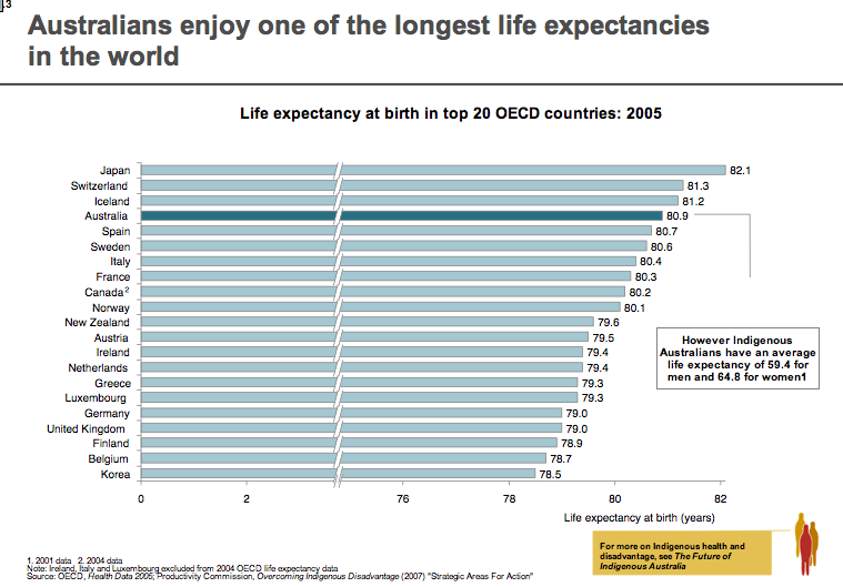
This is a very dense slide, stacked with data points. As it’s a handout as well, the very small print down the bottom won’t be an issue. It’s not the sort of slide I would include in a presentation, but given that the slide is really part of a briefing process to be consumed prior to the summit, it perhaps makes easier reading that a text-filled paper.
What I do like about it is that while the graph itself gets a header, the slide’s header tells the story: “Australians enjoy one of the longest life expectancies in the world.”
This is super-important when you use slides loaded up with either graphs or text (when you can’t do otherwise) which can overwhelm the reader when projected: i.e, cognitive overload. So label the slide right up top with what its take home message is. Later on, in private, audience members can delve into the details. But during the gabfest, treat each slide like a newspaper story: great headline to get the reader engaged, then show the supporting evidence in detail which you will talk to – either using the current slide or on a new slide drawing attention to detail.
Ok, let’s move further into the slide stack and see how things go:
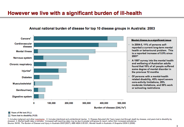
Again, this is not the sort of style you want to include in a slide show presentation – it’s just overwhelming. But as a dashboard-style compilation of data and commentary, it has its merits. But let’s not kid ourselves that this is a good slide without an accompanying handout for people to read at their own pace. It’s an orientation slide, but I have real fears that the facilitator will use it as per a standard presentation, no doubt using a laser pointer to highlight various areas.
Personally, to highlight one of the areas, Mental Illness, I would have used different colour bars, as well as the text box over on the right. It’s interesting from a personal perspective to see how the slide mentions the rapid growth of mental illness, yet the new Health Minister is considering limitations to the population gaining access to psychologists as part of a new program initiated by the previous government.
Let’s leap into some slides which for me break some of my personal rules for presenting:
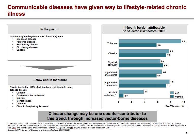
On this slide, we see two ideas set side by side, which could have better conveyed their message on two separate slides, somehow joined with an appropriate transition. The slides have no action, and make the audience work quite hard to make the causal connections. Now, the audience is very bright, and so they can more readily make the intended connections quickly. But when the summit releases its final decisions and recommendations, and begins a process of rolling it out to the general population who are not exposed to these dashboards on a regular basis, let’s hope that the slide design takes into account non-academic populations who would do better with a more dynamic presentation style.
One more slide for illustrative purposes:
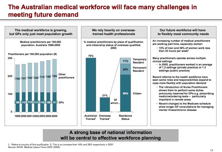
Take a look at the left panel of the three above, and notice how close the dates are: 1999200020012002.
This is really making the audience work hard, as well as the density of the information on this one slide. If the author of the slide was trying to make cogent comparisons or lead us through a story of panels 1 through 3, it’s not easy to see. Again, as a dashboard, it’s OK, especially if as an academic you’re used to seeing such diagrams. But again, one hopes that in the final publication, such slides give way to more illustrative ones where the reader more easily grasps the ideas and their connections.
If you want to see the entire stack of slides, go the Summit’s homepage and download a selection just to see for yourself how the highest echelons of government doles out information. Ask yourself if you were presenting, how would you change the slides.
There’s a comment section, so please use it and provide some feedback.

