Monthly Archives: October 2013

What I wrote two years ago about the next version of Keynote (File under: Psychologist displays fortune telling skills)

In a response to a comment on a previous blog entry on Presentationmagic.com written two years ago here, I agreed with the commenter about our shared hopes for the next version of Keynote. At this point Keynote was almost three years without an update. Here’s what I wrote:

<<<<<lesposen | October 21, 2011 at 11:12 pm | ReplyEdit

It’s a good question (about Apple’s interest in updating Keynote) I’ve pondered too, and not just about Keynote. It’s likely Steve (Jobs) approved a roadmap for Apple’s future products four years into the future, at the least. So his hand will still be present in the next update of Keynote. Given its long gestation and how PowerPoint has played copycat in its latest version, I’m guessing to prepare for Keynote Pro X, a major rewrite a la Final Cut Pro X. Lots of gnashing of teeth and tut-tutting about Apple’s choices, but ultimately a huge improvement. Fingers crossed.>>>>>

Powerpoint so far has Apple beat when it comes to working with object layers on a Keynote slide. But perhaps the solution is in your pocket (if you carry an iPhone there)

One of my much hoped for features for the next update to Keynote is a more user friendly, visually appealing means to organise objects on a slide.

Power users have often given their presentation some extra oomph – a Wow! factor – by having objects appear from behind other objects, move to the front and then perhaps disappear behind other objects. This gives a presentation something of a 3D feel, helping to move away from boring text displayed in a flat disengaging manner. You can try and get away with plentiful text by adding some shadows, animations and greying out sections of text to highlight others.

As humans we’re built to see the world in 3D to help us detect movement, distance and relationships between objects both to defend ourselves against potential danger, as well as to attract us to food sources. There is also the small aspect of sexual attraction and seeing the world or at least a potential sexual partner in (fully rounded) 3D has much to offer (ahem!).

For some time now, both Keynote and Powerpoint have allowed users to move and align objects on a slide, sending them forward to backward, or to the front of a stack of objects or to the back.

Unusually for Apple, there has never been a visual means for doing this on a Keynote slide. You couldn’t drag an object behind another – you had to use a primitive menu item (or its equivalent keyboard shortcut), as you can see below in Keynote 5:

Voila_Capture4This is hardly intuitive, easy or granular. There was a menu bar too to give a visual reference to layering –  Front Back – but it’s very primitive in Keynote 5:

Voila_Capture7

And because of Apple’s insistence on not allowing you to rename groups or objects in your build order inspector (this covers all versions of Keynote including 6), you get, below, these kinds of confusing build lists where you have to really be on task to know which object or line is selected.Screen Shot 2013-10-30 at 9.06.37 pm

Voila_Capture6

Notice in the build list just above with all the line builds, it finishes on build 19. But if there were 25 builds you couldn’t extend the build window to see them all in one hit; you have to scroll down the list, which means the very top builds, perhaps where you’ll drag these last builds, scroll off the table. Not good.

Keynote 6 has improved this somewhat so you can enlarge your build list and see all your builds – no more scrolling.

Each time you click on a build, the object will highlight on the slide. If the object is hidden behind layers of other objects, you won’t see its outline or a transparent effect so you can see just which object you have grabbed, but merely its resize handles – again, not very useful. I’ve occasionally found myself trying to move such “highlighted” objects, but I’ve only succeeded in moving the top most object. Meaning I can get caught in a merry go round of undo and redo commands. Clearly, there’s plenty of room for improvement.

Over on the iPad and the iPhone and Keynote for iOS6 and now 7, we got our first clue that an interface change was on its way for desktop Keynote. Because we move objects around iOS screens with our fingers – we actually “touch” the object – Keynote’s user interface on them needed a different paradigm.

Here’s what it looks like with respect to object layers on the iPhone:

IMG_2245

So having highlighted an object – its handles show up as blue dots – we can move it forward and backward with our fingers, not by touching the object but via a slider control. The iPad controls are much the same, and you see notches on the line corresponding to elements on the slide.

This interface design was not found on Keynote 5, and has not made its way into Keynote 6 at this point. The look and feel of an older Keynote for iOS has been reproduced in Keynote 6, suggesting its new interface is not yet fully baked, below:

Voila_Capture8

Notice how the iOS7 version slider controls have not made their way into desktop Keynote.

A potential solution to see the arrangement of the objects in a visual way has already been offered to Apple from Microsoft’s Powerpoint for Mac 2011.

Below is a video I made after firing up my Powerpoint and importing a slide with multiple objects lined up overlapping each other which I created in Keynote 6, and exported as a Powerpoint file. It has ten overlapping elements and in the video you can see how Powerpoint represents these objects and allows you to move them and change their order. Note, however, that in moving them, their location on the slide doesn’t swap with the object it’s replacing – that has to be done manually once you’ve satisfied with your new order.

Naturally, Apple doesn’t want to blindly copy what Microsoft has done here, and kudos to its design team. I don’t use Powerpoint sufficiently to know if this solution works out well, so let me know if you use it frequently and if it’s just a pretty face or is truly functional.

Apple needs to come up with a better solution than just a slider control. And I do believe that solution is in your pocket if you have an iPhone with iOS7 installed.

One of the new features of iOS7 is its new Safari browser with a new twist on something that’s been around for a long while: Coverflow. In the Safari browser, Coverflow has become tabbed browser such that we can see all the open tabs in an animated form, as seen  from my own iPhone 5 in landscape mode:

I think perhaps now you’re starting to get the picture. Let’s take the same 10 objects inserted onto a Keynote file I used for the Powerpoint movie, and play a little with how it might look in Keynote 6. When you watch the video, below, note that I have taken some liberties with the rather empty tool bar and filled it with the front and back tabs, and played the same iPhone movie, this time in portrait mode, with the objects (the websites) popping a little to make the connection between scrolling through the popup movie and the highlighting or calling out of the object on the Keynote slide as it become the front object in the movie. It’s not pretty or that accurate, but you’ll get the idea:

What do you think? Wouldn’t it be preferable to have a visual analogue of  object layering on a Keynote slide rather than rather primitive Forward and Back tabs?

If a dumb shmo like me can come up with this, let’s hope the geniuses at Apple can bring us something truly special and functional.

Finding inspiration for better presentations (in the light of Keynote 6): Virgin America’s cabin safety video

In a previous blog entry, I used the comments section in reply to a reader, suggesting he follow my lead and look to TV current affairs programs to seek inspiration, especially in the face of the denuding of Keynote’s feature set.

The invitation was really about looking far and wide for inspiration for persuasive message delivery, especially in the face of so many other distractions competing for your audience’s attention.

No one knows this better than commercial airlines. Remember all those videos as the flight is taxiing which ask you to pull down firmly to get the flow of oxygen going into your mask in the case of the loss of cabin pressure?

ASIDE: (This very infrequent event concerns commercial pilots more than the loss of an engine inflight. It means getting down from cruise altitude – which might be 40,000 feet to one where passengers and crews can breathe without assistance – about 16,000 feet: uncomfortable, but doable.

This is because those masks are attached to a collection of spherical cylinders distributed throughout the aircraft cabin which each contain about three minutes worth of oxygen. Which means a rapid descent about three times faster than the usual. Expect busted ear drums and much discomfort and panic in passengers.)

So when they say “pull down firmly” on the yellow masks which drop down from the ceiling, they mean give it a firm yank which breaks a seal which starts the oxygen flow. If you just pull it down gently, and stick it over your nose, nothing will happen. In this case, the placebo effect will only get you so far! In a recent Qantas incident, this is what  happened with many passengers complaining after landing that their oxygen masks didn’t operate. It’s more that they were oblivious to the cabin safety message denoting “firmly”. You’ve been notified!

In the video below, from Virgin America, its creators have decided to challenge the usual complacency of passengers, and make an attention-grabbing safety video. Perhaps even the flight attendants in the plane will be dancing along, although I’m guessing they will be instructed not to. Now, pay close attention to how the video designers included text in the cabin safety video. Not just is it included Karaoke-style but its animation also captures the word meanings and keeps you engaged.

It’s actually a great excuse to include it on my blog, a really fun and inspiring video in one of the most conservative domains – commercial aviation. I think only Air New Zealand comes close.

Air New Zealand’s recent in-flight safety briefing videos:

A (not so) Quick and Dirty workaround for the loss of builds and transitions in Keynote 6 – a temporary set of solutions while the engineers put the fixes in.

In a previous blog post, I sympathised with Keynote users who’ve upgraded from their tried and true 32-bit Keynote 5 to the latest 64-bit Keynote 6. For some the loss of much-relied upon features has proven a deal breaker.

Fortunately, upgraders have discovered that when when they performed their App Store free upgrades, Mavericks put aside their iWork 09 files (Keynote 5, Pages 4 and Numbers 3) in a separate folder. All can be used under Mavericks, taking advantage of its better screen spanning properties, with all their special features, builds and transitions intact.

But for those eager to try Keynote 6 (perhaps because so far it truly is faster and more stable, and it does contain some improved features such as a more elaborate Magic Move transition), let me offer some caveats and some ways around some of its limitations.

1. Certain builds and transitions have been deleted in their transition (ahem!) from KN5->KN6. Since there is no third party transition facility or modules to bring into Keynote 6, we can only hope that these obsolete transitions, which some say are still in the Keynote 6 package, may be liberated in a future update. In the past, Keynote’s preferences have allowed a tick-box to have obsolete transitions made available.

It’s a matter then of either proceeding ahead with a mission critical presentation using Keynote 5, or importing it into Keynote 6 and substituting new builds and transitions for the broken ones. That might be a lot of work for large files with complex build sequences, and a presenter on a limited schedule.

2. Until you can find the time to make this adjustment, let’s imagine for a moment you want to combine some of the improvements in Keynote 6 with a selection of some of your favourite slides which contain builds which no longer work.

I’ll use an example of my own which momentarily caused me to curse the Apple Keynote engineers until I developed a workaround.

The Setup

I frequently run workshops for psychologists on how IT can improve their practices. I especially focus on how IT can help both measure and offer interventions for anxiety. My suggestion to my colleagues is that rather than asking patients to rate their anxiety on a 1-100 scale (known from the 1960s as SUDS – Subjective Unit of Distress Scale), we could use inexpensive IT equipment to objectively measure a parameter of anxiety – heart rate variability or HRV – and help anchor the subjective to the objective.

I usually spend some time going through the biology of arousal and anxiety, its brain foundations and links to heart function – not all psychologists are well-versed in such matters.

One of the things I impress upon them in setting up the demoes which follow, is the history of using the human heart as a measure of emotion, when historically the brain was seen as merely a body part producing phlegm (as in phlegmatic, one of the ancient humours). The heart historically, according to Aristotle, was the residence of the soul, of emotion and intelligence.

And so to bring some entertaining weight to that, I show the audience a Keynote slide which visually demonstrates movies with the word “heart” in their title, while simultaneously, on the same slide, playing short snippets of well-known songs with the word “heart” in them.

To do this, I use the Smart Build “Turntable” effect to rotate movie covers – downloaded from IMDB – while play music snippets derived from an iTunes Music store search (I also own some of the tracks) and recorded using ScreenFlow, my screencast software of choice.

Here’s a section of it where I have exported the Keynote 5 file to a Quicktime format (then uploaded to YouTube. Let’s hope the short snippets do not attract a copyright notice, nor the cover art):

This gives you an idea of what the audience would see.

Now let’s take the same slide and import it into Keynote 6, and see what results:

Yuck! Unuseable.

So what to do? Well, as long as one is happy with the background theme as is (its Spotlight from keynotethemepark.com), simply export this one slide as a Quicktime movie of high resolution (might become a large file) and then import it into your Keynote 6 slide deck. As it turns out, you actually have even greater control of the Smart Build (a “Smarter Build”?) because you can control the resultant movie – stop it if you want to make a comment and advance it by scrubbing through with your mouse. No one will notice if it’s not a “true” build sequence, and no one will care it’s a movie. Only you will know that.

Here, I’ve used ScreenFlow to show you the QT movie in Keynote 6, then have it play full screen as it to an audience, below:

Now while I did this with Smart Builds you could do the same with lost transitions and other builds you’ve created for existing Keynote 5 presentations which you’d dearly like to have a place in a new Keynote 6 presentation. Just export the slides as a Quicktime movie, do some fine editing in Screenflow or a similar software – even iMovie – or Quicktime itself (I still like to use Quicktime 7 Pro), then import into Keynote 6.

This is a rather quick and dirty (actually, not so quick) effort to deal with the changeover period between the two Keynote versions.

Unfortunately, I have also been in touch with third party developers who confirm that the current Mavericks/Keynote 6 combo has destroyed the alpha channel masking of Quicktime movies. And for that I have no quick and dirty solution other than once more contracting the slide you wish to use in Keynote 5 and importing it as a QT movie of high resolution – no pixelation please!

Let me show you what I mean by the loss of alpha channel using another slide from the Heart Keynote deck referred to earlier, imported into Keynote 6:

Notice how the large red heart initially looks fine, but once it starts pulsing (its an alpha channel QT movie), a black box appears around it. In Keynote 5, you don’t see the black box, just the pulsing heart. By the way, I showed this slide with another 10 or so pulsing hearts to the Keynote team in Pittsburgh and it looks like one can now take a png file of the heart and use the “pulse” build to get a heartbeat going in Keynote 6.

Let’s hope that whatever has caused this loss of alpha channel – a real deal breaker for some presenters and developers – gets attended to quickly by the Keynote iWork team and in a show of good faith, lets unhappy Keynote campers know there is a bright future. A return to Powerpoint can wait another day (or decade).

Let me know in the Comments section if you have discovered some workarounds for the feature loss in Keynote – nothing too overwhelming, please!

Keynote 6 retains hyperlinks, but they’re buried treasure – further thoughts on Apple’s management of iWork (and a quote from Klaatu).

In my previous blog entry, my first about Keynote 6, I wrote that one of my liked features – hyperlinking slides, files, websites and emails – had gone MIA: Missing in Action.

But today I had cause to look at Keynote for iOS 7 and it has retained hyperlinks, here: Voila_Capture812

So, in Keynote on the iPad, you go the Spanner (Tools), select “Presentation Tools”, then select the first item in the drop down menu: Interactive Links.

The familiar hyperlink menu items will show themselves, in much the same layout as occurred in Keynote 5 for the Mac, along with their shortcut or alias blue arrows and associated functionality.

By now, the thought will have occurred to you: “If this feature exists within Keynote for iOS, and there is parity between iOS, Cloud, and Mac OS, where is it in Keynote 6?”

Well, here’s a screenshot of it in Keynote 6:

Voila_Capture3

As you may have noticed, there is no Inspector or obvious button, menu bar or “thingy” of any sort to guide you to this Keynote element. For reasons best known to themselves, the Keynote engineers and UI designers decided not to replicate the iOS layout, only the functionality it seems.

So, how do you create Hyperlinks as per Keynote 5?

1. Highlight (select) an object on your slide.

Voila_Capture813

As you can see, it’s the blue square, now with white “handles” on each side and corners to resize it.

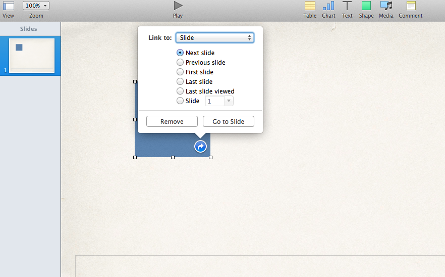
2. Place your pointer over the object, still selected, and hold down the Control key, and click your mouse or trackpad to bring up a menu list. In this case, below, the “Add Link” option is highlighted.

Voila_Capture814If you click on this menu time, something familiar from Keynote 5 will make itself known to you:

Voila_Capture815An important question some of you may be asking, about now: How does Keynote 6 handle hyperlinked slides in Keynote 5 files? Do they get lost and messed up?

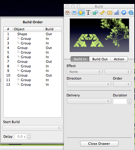
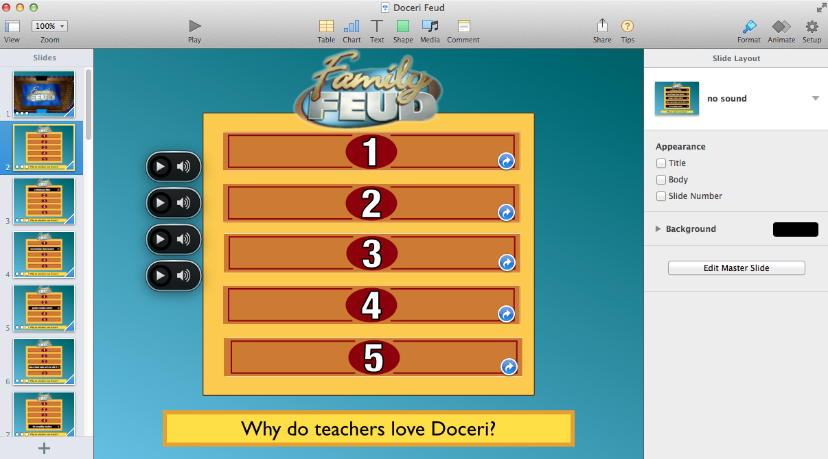
To answer that question, I imported a Keynote 5 “Family Feud” file I had created as a gift to the guys at Doceri, the iPad-based software I use to monitor and annotate my Keynote presentations. It’s very complex, containing 35 slides so all possibilities could be covered for a typical 5-item contest. (It’s based on a Keynote 3 deck I used from here, which you will need to convert to Keynote 5, before converting to Keynote 6!). Here’s what it looks like, complete with sound files – one for correct, one for – buzzzz – incorrect, and two others for the intro and outro music themes:

Voila_Capture818

Notice how each of the five answer boxes has the familiar hyperlink blue arrow. This is a very complex test for hyperlinks, and here are all the answers revealed when the game ends:

Voila_Capture817

I am pleased to say all the hyperlinks and related sounds remained intact, and useable. By the way, I use Doceri on my iPad when I play this game in my workshops on various subjects. Touching the bluish area outside the answer panel will produce the “wrong answer” buzz, while touching any of the black answer panels, initially with just the number on them in the first illustration, will cause the panel to “cube” down and reveal the answer, along with the pleasant “bing” sound to denote Correct!

Further thoughts on Keynote 6, and iWork’s future

These past few days of experimentation and curiosity-seeking with Keynote 6, complete with the discovery of hidden features, have helped confirm my previous thinking about Keynote’s path, going back in this blog more than a year or two.

I have previously written that all the wishing and hoping for a Keynote update might produce an Oscar Wilde epithet:

There are only two tragedies in life: one is not getting what one wants, and the other is getting it.

Predicting and hoping as I had that one of the biggest improvements to Keynote would be the addition of a precision timeline to better manage builds, transitions, movies and sounds, I also suggested this would require a complete interface rebuild. There had been hints dropped by Apple that this might happen: One way was at Macworld presenting a Presentation Magic workshop where a new Keynote team hire had attended who specialised in User Interface design. The other was Apple more recently had advertised for additional designers to join the iWork team.

Knowing what had occurred with both iMovie 08-09 and Final Cut Pro/X, I was preparing myself for the same to happen to Keynote. I would get what I wanted but at considerable expected cost. This in fact is what has happened.

But the rebuilding of Keynote was not merely an interface or veneer issue: It’s clearly a rebuild from the ground up to make parity and thus compatibility with Keynote in the cloud (for Windows users if they can dare tear themselves away from Powerpoint), and Keynote on iOS devices with their 64-bit chips.

(Judging from the Apple discussion groups for Pages 5, we Keynote 6 users got a frolic in the warm Tahitian beaches!)

This is the all important Activity Monitor graphic that begins to tell the story:

Voila_Capture819

Keynote 6 (blue icon) is 64 bit, and Keynote 5 below it is 32 bit. And for good measure, the current Powerpoint for Mac (2011) is:

Voila_Capture820

There’s a roadmap happening here. 64 bit ought to offer faster, more robust management of Keynote files across all Apple platforms which are 64 bit.

But the speed of the Keynote app is only a small part of the story. At the moment, Mac presenters – and now with Keynote in the Cloud and iPads, we have Windows users too – have numerous presentation software choices. But the big two remain the FREE Keynote on whatever platform (with hardware purchase or iWork 09 upgrade), or the purchase of MS Office or Powerpoint alone for a couple of hundred dollars, or a much cheaper educational bundle or a freebie thrown in by a reseller. Whatever.

There is also cloud based Google presentation software, as well as a number of open source projects of varying capabilities and compatibilities.

Apple knows how many recent copies of Keynote 09 and Keynote iOS are out there via monitoring of its online App stores. It can see where its buyers are: desktop vs iOS. We know 170 million iPads have been sold, all of which can use Keynote for initially $9.99, and now free. Hmm… how many copies of Keynote for Mac OS do you think are out there, being used on Macs? To paraphrase Steve Jobs (2007): “Are you getting it yet?”

Power users of Keynote, like Final Cut Pro users who abandoned ship, have every reason to feel Apple has thrown them under the bus, including all those – like me – who “sold” the Mac platform to Windows users on the basis of Keynote 5’s attributes alone. Any Keynote power user who has followed the usual fare of Powerpoint demoes at a conference or convention has become adroit at discussing each software’s pros and cons when audience members shocked at what a computer can do on a big screen – shocked, I say! – come up and are crestfallen to discover you didn’t use Powerpoint (they kinda knew that) and Keynote is Mac only, at least “back then”.

Now many may feel that, just as Apple cannibalises its own products when it introduces a new iPod or iPhone, they too are being fed as human sacrifices (OK, calm down, their work is) to lesser mortals: non-power users, Johnny-come-latelies who have not paid their dues during Apple’s beleaguered days, and who have come to the Apple community via iOS devices, not Macs.

It’s as if Apple owes power users and pro presenters something for their patience, loyalty, proselytising, evangelising, cleverness and demoing. As a long time President of a Macintosh user group (iMUG), I’m very aware of our place in the Apple firmament: more of a pesky nuisance than anything else. Apple resellers too have discovered their place in the same universe, soon after Apple opened their own bricks and mortar  as well as online stores. We know how that worked out, and is still evolving.

It’s another way of saying: This Keynote is not for you, but the millions who will put it to good use with their first Mac and their first iPad, and perhaps even their first presentations. There: I’ve said it. Get used to a new reality.

So, stay with Keynote 5 and the years of building great, Powerpoint-busting Keynote files, which will still operate in Mavericks on laptops which will have better power usage. Buy an AppleTV and a Kanex VGA-HDMI adaptor so even with older VGA projectors you can be wirelessly roaming the lecture theatre with your Macbook Air or iPad (mirroring and controlling the Air via Doceri or similar).

But every so often, break out Keynote 6 and see what it has to offer. There ARE some improvements, and I and others will blog about them soon.

There’s clearly plenty of room for Keynote to improve. We’re at the bottom of an upgrade cycle, not the top. If you return to Powerpoint, where will it go next? More bloatware masquerading as new features because Microsoft has manoeuvred itself into a corner – its hardware is not setting the world on fire, competing with its own OEMs who are not happy. It needs to keep selling software because that’s its business.

So every two years or so, its Office suite gets a visual overhaul accompanied by much muttering – think Ribbon – and features which just bog it down. There are those who can do wonders with Powerpoint, and each year they meet and show off what their presentation software can achieve, here. (One day, its convenor Rick Altman, will work up the courage to invite a Keynote specialist to attend to give demoes and comparisons – Garr Reynolds and Nancy Duarte don’t count since they themselves would likely not self-describe as Keynote specialists or evangelists, but more presentation skills builders).

My advice is this: Learn from the Final Cut Pro/X users who stayed the distance, as well as taking a more long term view of where Apple is heading. It knows that in a few years time, laptops will become even less conspicuous and PCs will be relegated to “Big Iron” kind of duties in number crunching and rendering farms. Apple doesn’t just know, it’s working to make it happen.

The A7 chip, iPad, iOS and 64 bit computing is the beginning of the next cycle of personal computing, and Keynote is at the beginning of its next development cycle. It marks the end of presenting with Keynote as we used to do it. Those using Powerpoint simply don’t know it yet, but their usual way of presenting will not stand up to the task of 21st Century learning, creativity and knowledge management.

So, you have a few choices as I see Apple offering it. To paraphrase Klaatu,

Your choice is simple: join us and think and present differently, or pursue your present course and face disengagement.

Keynote presentation power users: Don’t upgrade to Keynote 6 until you’ve read my experiences with the new version. You’ll save yourself much grief. (The news is not all bad).

It’s now been a few days since the October Apple keynote announcing new products and services. Much to many Keynote presentation software users’ initial delight, Keynote 6 was announced, almost five years after the last significant update.

I write “initial” because for many, to judge from Apple’s own discussion support groups, and others on Yahoo, this update feels retrograde, with too many existing elements cast out, and insufficient hoped-for new features added.

Indeed, some expected they could open their existing and in some cases very complex Keynote 5 files and expect them to somehow be transformed magically into something ethereal. Or at least just work.

I did this too, only to watch a shopping list roll down before my eyes, of missing builds replaced by a default “dissolve”, missing transitions – ditto – and missing fonts.

This of course was the same experience I “enjoyed” when I opened Keynote on the iPad the first time in July, 2010, again with the hope of full compatibility.

When that didn’t happen, and another year went by with no upgrade to Keynote (but numerous updates to the iOS version), Apple’s intentions for iWork became clear.

So, before you go installing iWork – actually the three apps that used to be referred to as iWork – please bear the following thoughts I have previously cast on this blog in mind. And then I’ll make some recommendations. Don’t rush in – I did before the free update for iWork DVD installed apps actually became free (it took about 24 hours after the October keynote), and paid $40 for Pages 5 and Keynote 6.

On this blog, I have suggested, not based on insider knowledge, but a long time user and observer, that Keynote 5 would not receive an update until there could be parity between iOS and Mac OS versions.

With the A7 chip and Mavericks, and the maturing of the “iWork in the cloud” beta,  that has come about. It’s a distinct poke in the eye to Microsoft and we long term power users of Keynote are the poker. We have been sacrificed on the alter of “progress”, parity, and another nail in the Microsoft hegemony/monopoly/”we control the vertical – we control the horizontal” – attitude to the consumer.

But I also predicted much gnashing of teeth from said Keynote users would parallel our colleagues in the Final Cut Pro sector who had hoped for further evolution of their professional “It pays the bills” software, only to be rendered (ahem!) Final Cut X. For some it felt as if an iMovie Pro had been thrown at them: They were insulted as power users. The same can be now said to be happening to Keynote power users, who’ve been with the program for a decade.

Many in the Final Cut Pro world of course left for seemingly greener grass and the open arms of Adobe and Avid, who facilitated this unexpected gift from the gods. But those who stayed with the Apple program have apparently received their reward as FCP X has matured, and now we see it matched to the Mac Pro. One can reason with some predictability that the same  iterative process will happen with Keynote given how well it had been selling on both desktop and iOS devices, and especially for the latter, the generation of schoolchildren with iPads who will never touch Powerpoint.

For now, I am following my own advice:

1. Install KN 6 (and Pages 5) on the Mavericks partition on my Macbook Air (Haswell). Do not install on the Mountain Lion/Keynote 5 partition. KN6 does not work under ML. (I have a developer license for Mavericks). Make sure your Time Machine has been put to good use.

2. Duplicate mission critical keynote files and transfer them to the Mavericks partition, and convert them to KN6 and see the tragedy that unfolds…. dissolve, dissolve, dissolve…

2a. IMPORTANT:  If you have installed Mavericks on a single partition  and now have KN6 and KN5 on the same hard drive as your KN5 files, don’t double click these files to work on them. They will open in KN6, which will try to convert them. If you want to work on them in KN5, rather than play in KN6, first open KN5 then either use the “Open…” menu item or drag the files you wish to use onto the KN5 icon in the dock.

Mavericks sees KN6 as the default for ALL Keynote files. You’ve been warned.

3. See if some of my proudest achievements in Keynote can be fixed in KN 6 (e.g. shaking book) or at least repaired or even improved; hey, you never know. (Have Kleenex tissue at the ready). Update: there are improvements to be made, and even less clicking in some cases. I will post later how I fixed and improved the Shaking book effect. I do believe Apple was inspired by it via the inclusion of a new “jiggle” effect, as well as a new “pulse” build.

4. Explore which of my third party KN stuff, from developers like Jumsoft, etc., remain compatible, including motion background themes (QT looping) movies. Monitor their websites for signs of life.

UPDATE: Sadly for now, Quicktime movies with transparent backgrounds which I like to use a lot are currently broken. Much unhappiness in the 3rd party add-on industry over this. For many,  this will mean staying with Keynote 5 not just to keep doing what they’ve been doing, but even for creating new presentations from scratch. If you open these same files with their transparent QT movies in KN5 in Mavericks, they work. Below, an example of a beating heart from Jumsoft, and what happens in KN6.

5. Check out how my helper apps may have been affected, e.g. Doceri for annotating slides, and whiteboarding in Keynote. UPDATE: Doceri is fine – phew! OTOH, Animationist with its beautiful titling effects, will suffer for the same reasons as listed in 4., above: transparency loss.

6. Keep reading blogs and Apple discussion lists for hidden gems (yeah, right! Much gnashing of teeth currently. Most major websites such as Ars Technica, iMore, CNet currently all carry mainly strongly negative “what were they thinking/smoking” jibes at Apple’s iWork engineering team.

7. Watch for KN 6.0.1 to address some of the shortcomings, bugs, etc. This has got to be a long term process and will surely test many long term users resolve. Prezi will welcome them, some will return to the bosom of Powerpoint (“The herd may stink, but at least it’s warm”) while some like me will divvy the work between KN5 and KN6 in the short term.

8. Stick with my day job as a clinical psychologist, and presentation skills trainer where even current KN on the iPad is better than how most use Powerpoint on the desktop – seriously. That’s not to say Powerpoint on Windows doesn’t have a hugely impressive feature set – it does. But 95% of presentation only ever use 5% of its capabilities – in other words, dull, or replete with the most awful “art text”.

9. My guidance to you: If you’re doing mission critical presenting right now, stay with KN 5 even on Mavericks. Only if you’re starting a new project from scratch, or have the time and energy to update your older files to KN6 (and learn what repairs you’ll need to do), do you employ KN6.

10. There are some immediate disappointments. I am unhappy to lose the Fall transition; the lack of a timeline for precision build timings appalls; while item grouping has improved (more on this in a later blog article), multiple grouped items are all still named “Group”, making it difficult to navigate busy files with numerous groups needing to be layered. Smart builds, like those rotating turntables and object swapping has been dropped. The Keynote engineering team were always disappointed in their take-up, even though they had a huge splash when Steve Jobs first showed us the iPhone. Remember the spinning elements: “It’s an iPod; it’s a phone; it’s an internet communicator – are you getting it yet?”,  created with Smart Builds.

UPDATE: The loss of hyperlinking within a KN file, and between KN files is for me, a serious one. It will change some of my conceptualisation of knowledge transfer, and my attempts to be more immediate and less linear in my teaching.

One must remember that KN1 initially did not have hyperlinking, and it made its first appearance many years later. It’s not the most used of its features to judge from Keynote workshops I have conducted; of course, after I showed what it could do in terms of audience engagement, I’m sure many explored it further. I do expect it to return in a KN6 update.

FURTHER UPDATE: It’s there in KN6. But buried. I am working on a new blog article about it.

11. Slide editing of Quicktime movies remains the same: Imprecise, and only one “In” and “Out” point for each movie. I would have hoped how movies can be edited on the iPhone might have made its way into Keynote, but it will surely come later.

So, in summary, it’s not the gee whiz, pull out all the stops, show us what you can really do Apple upgrade starved Keynote artists had been hoping for after five years. Our imaginations filled the void, ignoring where Apple is making its money, with iOS devices.

But now that we see a road ahead, powered by A7 chips in iOS devices which will no longer be referred to as toys, or media consumption devices (go back and rewatch the Apple video showing the diversity of iPad uses which starts with the wind energy generators), these content creation devices will drive Keynote further.

There may be a surprise awaiting us with a Keynote Pro with a look and feel of Apple’s Pro software like Final Cut X and Aperture (we can dream), but for now there is a workflow for power users, and that is to keep doing what you’re doing with Keynote 5, and find the time to play with Keynote 6 and become curious and explorative. There are some hidden surprises I will blog about soon.