Monthly Archives: April 2008

Are my Keynotes killing Hollywood’s senior actors?

Those of you who’ve been following my treatises on presenting or who have attended a workshop I’ve conducted on presentation skills, will know the emphasis I place on story telling.

I’m certainly not alone in this endeavour, and others like the Heath brothers have talked about the importance of story telling in their recent book, Made To Stick.

I’m always trying in my workshops to come up with new ways to persuade people of the importance of letting each slide become part of the overall story you’re telling, be it to sell ideas or goods, educate and inform, or brief an audience on your current research. And that each slide in its own way has a story to tell, or at least assist you to tell.

At Macworld 2008 where I presented on presentation skills (evaluation form available if you want to see it courtesy of IDG Macworld), I had planned to introduce a few new slides to illustrate to the audience, by involving them in a “theatre of the mind” activity, just how important story telling is in our world.

But I pulled the slides the night before because of worries over copyright, once I knew my presentation would be recorded. They were to be clips from well-known movies which were to illustrate my point, but being unsure of what constituted “fair use” in the USA I pulled the slides.

Later in Australia only a few days after returning from the US, and with no possibility of my all day workshop being videod, I included the slides, to great effect.

Here’s what I was trying to do.

Over several slides, I showed excerpts from films important to me, covering more than 40 years of filmgoing. Some of the actors in the clips were still alive, some had already passed on.

Not all in the workshop knew all the films, but most had seen some of them, enough to get my central idea of the importance of story telling.

I chose clips which were film highlights, perhaps even passing into common speech. But for this audience of mental health specialists, I let them know these clips told a lot about me, the presenter, because of what they all had in common. These clips illustrated not just memorable scenes, but collectively, they represented a peak in the story arc, an “Oh my gosh” moment where the story zagged into new narrative territory. These are scenes you wait to see again, even if you’ve seen the film many times. They are an emotional highlight.

Let me illustrate with some stills from the movies:

1. In the Heat of the Night (1967) – Sydney Poitier

\

Martin Luther King was still campaigning for human rights when this Academy Award winning film was released.

In this classic scene, Sydney Poitier is confronted by a Mississippi small town police chief, played by the late Rod Steiger. An industrialist bullding a new plant has been found murdered in the small hours of the morning, and Poitier has been taken in for questioning having been found waiting in the train station by Steiger’s deputy, and with more than a hundred dollars in his wallet. (This is 1967 after all).

Aggressively questioned by Steiger (who thinks he’s got his murderer standing in front of him) about where he got the money, Poitier tells him he earnt it, only to be rebutted with “Colour can’t earn that kind of money.” Asked what work he does to earn the hundreds of dollars now on the table, Poitier responds, “I’m a police officer!” Soon enough, Steiger discovers that not only is Poitier a “colleague” but he is Philadelphia’s finest homicide detective.

Later, after he’s seconded to the case against his own wishes, Poitier doesn’t hand over some FBI lab evidence he’s sent for. Steiger makes fun of his first name, Virgil. “Now that’s a funny kind of name for a nigger boy that comes from Philadelphia. What do they call you up there?”

To which Poitier replies with a phrase that becomes the title of a follow up movie, “They call me Mister Tibbs!”

2. Planet of the Apes (1968) – Charlton Heston

\

A year later, the first of a franchise of science fiction films featuring the evolution of man to ape began when Chartlon Heston landed on a planet where the apes ruled, and humans were mute and experimented upon.

In one scene, Heston, playing astronaut George Taylor, is captured and taken to the centre of an adobe village where he is taunted by the local adolescent chimps. Mauled once too often, he screams to an astonished crowd, “Take your stinking paws off me, you damned dirty ape!”

But the scene I included comes at the very end of the film, where Taylor (Heston) has captured the Minister for Science, Professor Zaius, whom he thinks knows the answers to how the planet is the way it is, with simians running the show.

On horseback, armed with his rifle (of course), and local female companion, Nova, he confronts Zaius for the last time:

George Taylor: A planet where apes evolved from men? There’s got to be an answer.

Dr. Zaius: Don’t look for it, Taylor. You may not like what you find.

A minute or so later, as Taylor rides along the shoreline, he confronts the explanation for the planet’s situation. (I won’t spoil it for those who haven’t seen it).

3. Jaws (1975) – Roy Scheider

\

Several years later, Steven Spielberg took a rather unknown novel and turned it into box office gold, keeping people away from beaches for years.

In the scene I’ve chosen, the fish hasn’t been sighted, his presence known to the audience by a musical phrase which must be one of the best known after the opening sequence of Beethoven’s 5th symphony. Scheider, playing a small town police chief joins old shark hunter Robert Shaw and young rich scholar of things fishy, Richard Dreyfuss, out in open waters to hunt the shark down.

In the setup to the scene, Shaw is quietly repairing fishing nets, Dreyfus is playing solitaire on the deck, while Scheider is “chumming”, throwing out offal to attract the beast. When he does, he and the audience share in the frightening moment, with Scheider slowly backing into the cabin, not taking his eyes from the ocean, before uttering the words, “You’re gonna need a bigger boat!”

4. Capricorn One (1978) – Sam Waterston

Almost ten years after the first manned landing on the moon, the general public had become a little jaundiced with NASA’s continuing Apollo launches. Mind you, some had put forward conspiracy theories that the landings were all faked, so taking this as a story plot, Peter Hyam’s film constructs a manned mission to Mars. But NASA’s budget has been cut to the bone, and so its director, played by Hal Holbrook, sets up an elaborate scheme to fake a landing and safe return, expecting the three man crew, played by James Brolin, O.J. Simpson and Sam Waterston to go along with the plan, for the good of the company.

When Holbrook suspects Brolin’s character, Colonel Brubaker, will not keep the secret, he unrolls plan B which will see the astronauts disappear. Breaking out from their desert-based Mars simulation, the astronauts escape in a sleek Learjet, only to crash land it in the desert when it runs out of fuel.

Each astronaut goes their separate ways according to the compass in the hope that one of them will make it back to tell their story. O.J. is captured first, while Waterston finds that his chosen direction takes him to a huge outcropping he’s got to climb. Exhausted and dehydrated, he begins the climb, telling himself a joke in the form of a long-winded story about how to to gently break bad news. As he reaches the punchline and the outcropping’s peak, he looks over the edge, only to find…

I won’t spoil it for you, but the camera pulls back from Waterston’s character and we get to see what he has just seen… and we know then that Brolin will soon become the last man standing.

An irony in the film is that Brolin’s character is eventually rescued by a journalist played by Elliot Gould who has been suspicious all long. Do you know the connection in real life between Brolin and Gould? (Hint: She’s a rather funny girl).

5. History of the World – Part 1 (1981) – Mel Brooks

...these fifteen.. oy..ten commandments

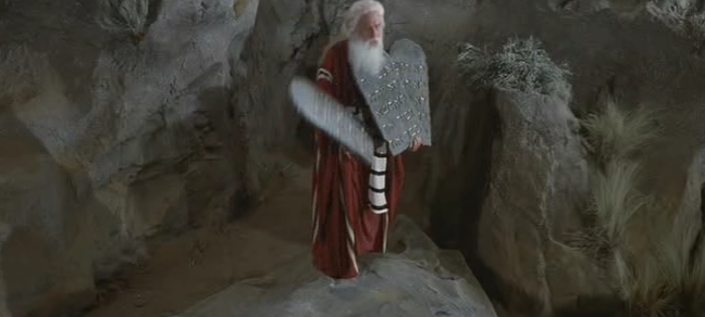
I had planned to show a scene from this film to 120 lawyers at a professional meeting on teaching presentation skills… but I chickened out. I was running short of time, having condensed a day’s workshop into an hour’s presentation, so decided to discard this sequence.

I wanted to draw the lawyers’ attention to man-made commandments when it comes to slides, especially the ones that say “follow the 6 x 6″ rule, no more than six lines per slide, with no more than six words per slide.”

I wanted to say that presenters follow this mantra as if it was a commandment, but it’s a hoax, with no evidence to support it. In the film clip, Moses, played by Mel Brooks come down from Mt. Sinai carrying three tablets, of five commandments each.

But as he speaks, he drops one: “Here are the fifteen (drop, crash).. oy… ten commendments the lord gives us.”

I wanted the audience to equate this humorous piece with challenging “laws” of presenting which have no foundation.

And so, in my workshops where I use these clips, I ask participants to share with their neighbours films like these that have them pausing to watch and wait for their favourite scene, to emphasise the power of story telling, and how it’s so important to acknowledge when presenting.

Oh, and the title of this blog entry? A few weeks after I presented this workshop, Roy Scheider from Jaws died, then a few weeks later after another presentation, Charlton Heston died. I am hoping like crazy I haven’t put the mozz on any surviving actors in my slides.

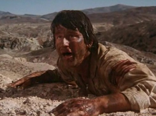
UPDATE: September 28, 2008 – I had thought of including the famous scene in “Cool Hand Luke” where the prison superintendent, played by Strother Martin, says “What we have here is a failure to communicate.”

Strother Martin let's Paul Newman know of a failure to comminicate.

Strother Martin lets Paul Newman know of a "failure to communicate".

I include mention of it in this update to honour the passing of a true acting mensch, Paul Newman, on September 26.

What are your favourite scenes you would use if you were running a workshop like mine?

Australia 2020 summit – an exercise in Powerpoint-poisoning or great use of dashboards?

In November 2007, Australia tossed out its conservative government of eleven years, rejecting the direction the government was taking the country. The prime minister of the day had strongly aligned himself with the US president, and taken the country to war in Iraq and Afghanistan. Many complained about the government’s attitudes to human rights both in Australia and abroad, and the then-opposition proved a most attractive alternative. This was despite Australia enjoying a particularly strong economy.

The now-opposition is in disarray with its new leader (the previous prime minister lost his own seat, something which has only happened once before in Australia’s history) having approval ratings of less than 10%, compared to more than 70% for the current prime minister, who is now in China and letting the Chinese government know his opinion of their human rights stance, particularly with respect to Tibet.

One of the election promises made by the now-prime minister, Kevin Rudd, was to have a summitt of Australia’s brightest thinkers, who would come to the nation’s capital in April 2008 for a multi-day talkfest, and set an agenda for future policies, constructing a snapshot of life in Australia in 2020.

Naturally, with numbers limited to about a thousand, many hoped they would be tapped on the shoulder, while others took advantage of application forms for the consideration of the talk-fest’s organising committees.

The talk-fest is divided into various categories designed to help plan Australia’s future, and the area of Health is one of these areas where “experts” have been invited to share their knowledge. The list of the those attending has been published, and it’s no surprise that the list is heavy on academics.

The Government has also published some orientation papers to help set the agenda. These have also been published online, on both Powerpoint and pdf format. The pdf file is a converted Powerpoint stack.

Now far be it from me to cast doubts on the process so soon, but it seems to me that if the talk-fest days are to be held under the auspices of the Powerpoint method of knowledge sharing, I have to wonder just how much can be achieved. I’m hoping no data projectors will be used, and handouts of the slides will be merely a starting point for discussion. I’m also hoping that some excellent scribes using techniques for recording and comparing ideas will be present. But given the stacking with academics who live and die by Powerpoint, my hopes aren’t high.

Let’s have a look at some of the slides so far made available. Here is the “cover slide” attendees will likely see projected somewhere in the meeting room:

Here\'s the first slide in the deck

Now my guess is that all the first slides in decks for all the summit meetings will look the same – you know, keep the brand. For me, since the talkfest is really about people, a crisp photo to get the attention would work better, but since this is a gabfest with lots of words being exchanged amongst academics (mostly), pictures have little place. That’s their loss, but my guess is that’s how most of those attending present anyway.

Let’s have a look at slide 3:

longevity

This is a very dense slide, stacked with data points. As it’s a handout as well, the very small print down the bottom won’t be an issue. It’s not the sort of slide I would include in a presentation, but given that the slide is really part of a briefing process to be consumed prior to the summit, it perhaps makes easier reading that a text-filled paper.

What I do like about it is that while the graph itself gets a header, the slide’s header tells the story: “Australians enjoy one of the longest life expectancies in the world.”

This is super-important when you use slides loaded up with either graphs or text (when you can’t do otherwise) which can overwhelm the reader when projected: i.e, cognitive overload. So label the slide right up top with what its take home message is. Later on, in private, audience members can delve into the details. But during the gabfest, treat each slide like a newspaper story: great headline to get the reader engaged, then show the supporting evidence in detail which you will talk to – either using the current slide or on a new slide drawing attention to detail.

Ok, let’s move further into the slide stack and see how things go:

Again, this is not the sort of style you want to include in a slide show presentation – it’s just overwhelming. But as a dashboard-style compilation of data and commentary, it has its merits. But let’s not kid ourselves that this is a good slide without an accompanying handout for people to read at their own pace. It’s an orientation slide, but I have real fears that the facilitator will use it as per a standard presentation, no doubt using a laser pointer to highlight various areas.

Personally, to highlight one of the areas, Mental Illness, I would have used different colour bars, as well as the text box over on the right. It’s interesting from a personal perspective to see how the slide mentions the rapid growth of mental illness, yet the new Health Minister is considering limitations to the population gaining access to psychologists as part of a new program initiated by the previous government.

Let’s leap into some slides which for me break some of my personal rules for presenting:

On this slide, we see two ideas set side by side, which could have better conveyed their message on two separate slides, somehow joined with an appropriate transition. The slides have no action, and make the audience work quite hard to make the causal connections. Now, the audience is very bright, and so they can more readily make the intended connections quickly. But when the summit releases its final decisions and recommendations, and begins a process of rolling it out to the general population who are not exposed to these dashboards on a regular basis, let’s hope that the slide design takes into account non-academic populations who would do better with a more dynamic presentation style.

One more slide for illustrative purposes:

Take a look at the left panel of the three above, and notice how close the dates are: 1999200020012002.

This is really making the audience work hard, as well as the density of the information on this one slide. If the author of the slide was trying to make cogent comparisons or lead us through a story of panels 1 through 3, it’s not easy to see. Again, as a dashboard, it’s OK, especially if as an academic you’re used to seeing such diagrams. But again, one hopes that in the final publication, such slides give way to more illustrative ones where the reader more easily grasps the ideas and their connections.

If you want to see the entire stack of slides, go the Summit’s homepage and download a selection just to see for yourself how the highest echelons of government doles out information. Ask yourself if you were presenting, how would you change the slides.

There’s a comment section, so please use it and provide some feedback.

It’s time for a change! Welcome to Presentation Magic…

After several years using Blogwavestudio as my blogging software, and housing my presentation thoughts on my Cyberpsych blog, it’s time for a change.

Actually the change was foistered on me, after my seemingly indestructible Powerbook G4 (c.2004) got a cracked screen courtesy of your’s truly, and Blogwavestudio couldn’t make the transition from a PPC to an Intel-based Mac. It didn’t help either that the software developers, from Korea, were nowhere to be found.

Blogwavestudio was hardware-bound: I had to have my Mac with me to blog and publish. Sure, I could write an entry then wait to get to the Powerbook and transfer it. But that was tedious, and with the iPhone due for launch in Australia sometime this year, the invitation to blog at will is likely to prove too strong. I can’t tell you how many blog entries I’ve developed on train trips, or while waiting for someone, and not had the opportunity to publish it almost immediately… in which case, it vanishes.

With WordPress, I’m hoping to blog more often, and enable a better comments system to run, as well as Web 2.0 features like tags, categories, and other social networking possibilities.

Why the title “Presentation Magic”?

Well, this was the name given to my presentation on using Apple’s Keynote at Macworld 2008 by Paul Kent, Macworld’s Director. This was my first time at Macworld at it came at Paul’s invitation, as he was a reader of my Cyberpsych blog which covered things Apple as well as presentations.

The actual presentation I gave went over well, and I’m hoping to return to the US this year to offer more presentations and training for those ready to change the way they present.

The “magic” in the title doesn’t refer to doing extraordinary things with Keynote or Powerpoint. It more refers to how magic is an important part of human life, something that both entertains, intrigues, confuses, and persuades us. All things that presentations are capable of performing.

As a psychologist, I have always been interested in illusions and how humans can be fooled. In my clinical work, patients are often “fooled” by the messages their bodies send them, and perceive danger where it doesn’t exist, thus narrowing their opportunities.

Good presentations are effective by understanding how the human mind works, and strive to use current knowledge of the cognitive sciences to help audiences understand complex messages.

More than ever, audiences are being bombarded with presentations which are presenter-focussed. Magicians are always audience-focussed, knowing how audiences function and surprising them when their misdirection leads to an “aha!” moment.

The audience doesn’t really care how you pulled off your magic, they just want to be entertained. Professional audiences who have come along to be educated, and wish to leave knowing more than what they knew beforehand, aren’t interested in how you performed your magic (ie., animations, transitions, etc). That might interest those in the audience who too are presenters. But the special effects are there as augmenters of the presenter’s knowledge base, to help him or her transfer knowledge in the simplest and easiest manner. Easy for the audience that is, often hard for the presenter, as they need to be creative, well-rehearsed, and of course, knowledgeable of the subject at hand.

That’s why good presenters are paid well, get invited back, and are sought for training: their talents are in short supply!

In the next few months, I’ll be elaborating on my presentation ideas, keeping this blog updated frequently as new ideas come to mind, and I give presentations and use the blog as a journal to debrief myself. I expect you’ll learn heaps as you read the articles.

But be aware that many of the ideas you’ll read are quite subversive, and you may not be able to present in your usual fashion once the ideas penetrate possibly years of traditional presentation giving. Certainly, that’s the feedback I get after people have seen me present about presenting: Doing the walk and the talk at the same time is profoundly interfering to how most people present currently.