Category Archives: Presentation Skills

An Apple tablet: Desirable for music and presentations, but oh so much more!

With rumours of an Apple touch tablet not abating, I want to elaborate further on my presentation-centric post below, where I suggested the new touch device could have multiple uses other than as a music device. It would of course be an ideal e-book reader, and one can image a user interface which simulates a page turn.

Using one finger flicking from right to left moves it one page, using two fingers (something Apple has already demonstrated on the iPhone/iPod Touch and Macbook Pro) would move it to the next chapter, while a double tap might take you back to the Table of Contents or Index, with another double tap taking you back to where you left off.

Hovering your finger over a word would bring up its dictionary meaning, complete with synonyms and antonyms, while publishers could include a hotlink to other works of the same author at various places within the pages. Reference books of course would hotlink to journals and PUBMED and Library of Congress listings, as well as the increasing library of reference works within YouTube.

One can imagine children no longer needing to lumber great quantities of books to school, and publishers could easily keep books updated as new studies emerge. I’m offering an educated guess that (pardon the pun) educators will be keeping a very close eye on what any Apple tablet with bring, and what may emerge in an App Store setting. Not to mention newspapers and magazines updating on a regular basis (upon a paid subscription of course): newspapers on the hour or with breaking news, and magazines on a daily basis. The tablet would offer an instant “Letters to the Editor” social commentary area, with the better letters chosen by an editor and highlighted, much like that found currently in the New York Times.

But what of commercial uses? I’ve already suggested its utility as a presenter’s tool, allowing annotation and creation of presentation slides on the fly. I want to go back some decades and see what can be learnt from the application of technologies to familiar situations.

In the sixties when I was but a teenager, one of the most popular restaurants in Melbourne – a trendsetter – was a place called McClure’s, just off the city’s main central boulevard called St. Kilda Road.

Patrons sat in booths and open tables with menus already provided prior to being seated. You looked through the menu then picked up the telephone at your table and rang in your order, much as you did if you ordered take out from home. There were still wait staff to bring you your order or to answer questions, but it was a cute idea at the time, no doubt modelled on an American experience.

Now just imagine you bring your iTablet to the restaurant and when you open your browser it automatically opens to the restaurant’s menu via a wifi auto setup. You can flip through pages with illustrations of the food or drinks, and read some history the chef and sommelier have provided of the restaurant’s food and wine. You can even check a list of ingredients if you wish and have an updated calorie count of your entire meal. Those with special food needs will find this a real boon, and we’re already seeing something similar happen with diabetic apps on the iPhone/iPod touch platform.

You could even pay for the bill and leave a tip, all online if you chose. But why wait until you got to the restaurant to check out the menu and prices? Why not do it before you leave, and place your order – and yes, pay for it – on your way. Now of course, for some restaurant experiences such automation would be anathema. You want the interaction with the staff, to question them about the food and wine, and enjoy a rich dining experience in a more traditional sense. I’m merely painting a picture of where things could go, and probably already are to a degree with the iPhone.

Let’s move to an art gallery now. You visit a new exhibition, and rather than picking up a booklet, you hook into the wifi once more and tour the exhibits, listening to the artist describe his or her works, and providing you with an online place to offer a bid.

What about Real Estate? Enter a property you’re considering purchasing and rather than taking back with you those expensive and wasteful multicoloured brochures, you download on the spot the property’s details and a copy of the sale contract to peruse with your lawyer. You also get a virtual tour to share or review and engage in a conversation with the realtor at some other time.

So, while it may be the case that music and entertainment appear to be the early targets for an enhanced fuller sized iPod Touch, other commercial realities will no doubt emerge. Think how hospitals, airlines, and even law enforcement might find uses for the device. The idea will be to stop thinking of it as a laptop computer or a netbook equivalent, and thus keeping yourself stuck in old ways of managing your knowledge.

Think of it more as an electronic valet, not quite what the original Knowledge Navigator was conceived to be, but not that far off either. Especially if Voice Activation and control is where the action goes. More like the electronic newspaper featured in Minority Report, for now at least. (See the music video clip of the film, below, especially @ 1m29s)

A device like this has been coming for twenty years or so. Not a PC, not a netbook, not a tablet computer as they currently exist, but a new way of interacting with data.

Are you ready for it?

Will a Keynote-capable Apple tablet cause a paradigm shift in how presentations are given?

Rumours of an Apple tablet-based form factor have been circulating for years now, ebbing and flowing like the tides. When Apple released the iPod Touch, the rumour mill wound up again, as users and pundits alike wondered how easy it might be to see a new platform develop, not with desktop-style applications, but apps. available on demand from the iTunes App Store.

The success of the iPhone/iPod Touch as a mobile platform, rather than as respectively, a cell phone and music player, means that many users will come to see these devices as multi-purpose, and set expectations for even more capability as the products further mature and gain wider acceptance.

The iPhone/iPod Touch family are becoming the Swiss Army knife of mobile technology: supremely capable devices for specific purposes which don’t try to be something they’re not. You can cut through many things with the Swiss Army knife scissors and knives, but you wouldn’t use them to cut down trees.

Apple will release a tablet to the market place not because it can produce one – heaven knows, if any company can make such a device, it’s Apple – but when it has  identified an unmet desire or it can create a new market which is embedded with consumer desire.

In other words, either the marketplace exists but is until now poorly serviced with brain-dead products leading to consumer unhappiness – such as the cellphone business which was deemed “mature” and “impenetrable” by so many pundits – or Apple creates something new. Not something left field new, which causes people to say “Where did that come from?”, but new, as in “Why didn’t I invent that” or “Of course! It’s so obvious!”

An Apple tablet, as expected as it is, and later to market than PC tablets which are really Windows-based warmed over laptops, will only come to market when it can do what PC tablets can do, but do it with panache, desirability, and end user delight. Like the iPhone/iPod Touch twins, it will have multiple purposes, including all the features bar the cellphone features of the iPhone. It will sport a decent size software based keyboard which will allow an external wireless touch-typing keyboard to be attached via USB or wireless. The onscreen keyboard will either disappear when not in use, or perhaps become translucent so the full screen can still be viewed when performing editing functions.

I think we can forget about handwriting recognition and thus pen-based tablet functionality. Like reading paper-based material, writing will also decrease in frequency (save for writing your signature on documents) and keyboard and gesture or touch screen operations will be the standard input method.

How else might an Apple tablet go beyond current tablet usage and delight endusers? (You know, speaking with my Windows/PC-using colleagues, I get the strangest looks when I mention “computing” and “delight” in the same sentence. My Apple using friends, especially recent switchers, just smile back at me, with the barest of winks or nods).

More rumours keep emerging that an Apple tablet will not be a computing platform as we know it, but will be a tool to further achieve Apple’s dual aims of furthering its chokehold on digital media and doing so in a magical, customer-delighting manner. Except for developers where I expect the same model of developer frustration will ensue, subject to FCC approval!

But what if a tablet could do double-time as a very fancy remote control and slide enhancer for Apple’s presentation software, Keynote?

bluetooth tabletFor some time, I have toyed with a Wacom Bluetooth tablet, now deleted from the current range of excellent tablets from this well-known manufacturer. I have used it to control slides, and use a mouse at long range in workshops. But as an annotation tool, to allow me to draw on the screen to provide live call outs, or underlines, or write in my own scrawl, it doesn’t succeed. While there’s third party software available, when in presenter mode, it’s just too difficult. Because you must look up at the screen to see what you’ve written or drawn, your attention moves from your audience to the screen – fine occasionally, but not something you want to make a habit of at the risk of losing audience connection.

keynote-remote1Already many people are using their iPhone/iPod Touches to control their slideshows, together with previews of upcoming slides, but that’s as far as their usefulness goes. What if the multi-talented tablet could also be used to contain the slideshow itself, to allow on-the-fly annotation of slides, to change them on the run (out of sight of the audience), to access the web or instant chat or Twitter/facebook, and perhaps raise presenting to another level professional presenters have yet to imagine? (Don’t worry about how the tablet connects to the data projector  – that will be the easiest part of the challenge).

As I have written elsewhere, and keep repeating, an increasing number of presentation attendees have tired of the tried, trusted yet ineffective method of presenting you’ll experience in 99% of presentations you can randomly download from the web, or see attending a workshop, conference, or inhouse seminar.

I’m not saying Keynote is the cure, and Powerpoint 2010’s developers have acknowledged this change themselves by emphasising their updated product’s “cinematic” qualities – albeit almost seven years after Steve Jobs used the same term when he introduced Keynote.

If the rumours are true we might only have to wait a month to find out if a tablet device truly is in Apple’s future. My hope is that with its possible release, Snow Leopard’s upping the ante with its new Quicktime and Core Video capacities, and possibly a Keynote updated to take advantage of these developments, those of us in the presentation marketplace will be thrown a challenge by Apple to upgrade our own skills. If I’m right, we’ll experience a paradigm shift in presentation giving. And it couldn’t come faster, thank you!

Learning from Skeptics to take your Keynote presentations to another level

I’m currently wrapping up a several month long project for my old college professor who first introduced me to the practice of psychotherapy using something called Rational Emotive Therapy (now called Rational Emotive Behaviour Therapy or REBT). When I first learnt it, it was but about 20 years old, and still acquiring evidence for its efficacy. Now it is one of the mainstays of modern therapy, one of the cognitive behaviour therapies much in vogue.

He approached me with the view to creating a set of materials to take into industry to assist adult workers improve their emotional resilience in the face of workplace anxiety and stress. He had already developed a successful worldwide program for K-12 students, and wanted something that would appeal to both Gen X and Gen Y employees. One thing he understood, having seen my recent Keynote presentations, was that he could not continue with the cognitive style of Powerpoint for these corporate sessions (Check the Powerpoint-based image in the link above).

Over several months, I’ve educated him in the Presentation Magic way of message delivery, such that he has shifted how he now conceives his ideas, and fights his own “tradition” of lots of words on slides. He knows this will no longer cut the mustard, and indeed by shifting his conceptualisations, he has also shifted his theorising somewhat. At first, it took quite some convincing for him to swing around, but now he’s the one who sends me pictures, images and concepts which better illustrate his ideas.

So, as we enter the “wrap up, final tweak” stages, my storytelling friend, Shawn Callahan, has sent me a heads-up for a wonderful video from the Richard Dawkins Foundation (RDF – no, not the reality distortion field) where Skeptics President, Michael Shermer, offers ways to see through baloney non-scientific explanations for events in the world around us.

The video, which you can see below on YouTube (don’t go there quite yet),  displays some wonderful means to convey several messages, using live action video, stills, cartoons, and animations. One day, I’m hoping all this (well, perhaps not the cartoons) could be reproduced in Keynote.

Voila_Capture217

1. In particular, when you look at the video, note the opening scene with the multitude of screens, which then, about 28s in, brings up Michael Shermer, below, to introduce the video’s purpose.

Voila_Capture218

2. Then look at the scene at 40s where Shermer talks about visions in toast, and notice how his image has been alpha-masked so that the toast comes up behind his embedded video – can’t do that in Keynote at the moment, but fingers crosses that an updated Quicktime will allow some form of masking to occur.Voila_Capture219

3. At 1m 24s, you’ll see an animation featuring an old-fashioned typewriter and lettering effects. The latter can be achieved in Keynote now, but the vertical swivelling of the image (around the Y axis) is something that would add much to Keynote’s capacities. Given what we’ve seen achieved in Keynote’s current transitions using Core Video, this build effect ought to be achievable, including the subtle spotlight feature.

Voila_Capture220

4. At 9m 11s, notice the document manipulation builds. This is one of the builds I’ve been trying to achieve in Keynote but it’s effortful. How nice it would be if this was a simple-to-effect build. It’s one of the areas of development I discussed with the Keynote team – to focus extra attention on document manipulation to add to the speaker’s authenticity – which I hope they follow through with.

Voila_Capture221

Notice how effective the presentation video is, even if you may not agree with its premises. Look beyond that, and focus on the presentation’s production qualities and its effective use of visuals – not one bullet point in sight, and no chintzy clipart. The animations help add appeal otherwise the video might take a dour quality, leading to a turn-off factor.

Finally, here’s the video below. Enjoy!

Presentation Magic hour long presentation for educators coming up August 1

My next Presentation Magic workshop is a semi-public hour long presentation for educators coming up August 1 in Melbourne, at the Coburg Senior High School.

There are activities all day for educators to bring them up to speed on matters Web 2.0 and other technologies relevant to teaching in 2009. At the end of the day, I’ll have an hour to present some of my latest ideas including showing some of the slides I demonstrated to the Apple Keynote group in Pittsburgh last month.

The day is being co-ordinated by some of Australia’s leading education software and hardware suppliers, and places are limited to 200.

You can register for the entire day, and the organisers have also allowed you to register for my Presentation Magic hour separately.

You can visit the website for more details and registration options here.

Powerpoint 2010 takes it up to Apple’s Keynote – the game of leapfrog is truly on!

I’m currently working on two longish but rather profound blog entries about presenting for specialist audiences, and more on attention-grabbing techniques.

One thing that caught my attention overnight was the next video in the Microsoft Office 2010 (for Windows) series. This one features Powerpoint 2010 and demonstrates three new transitions. You can see the video via Microsoft’s posting of it on YouTube, below. Watch it first then scroll down for my commentary. See you in a moment.

This video is clear demonstration that the Office team have been working hard at overcoming Powerpoint’s visual deficits when it’s compared to Apple’s Keynote. The comparison is obvious, because in the video we see at least one copycat transition, very similar to Keynote’s Mosaic transition.

What’s important to note is that the already existing transitions in Powerpoint 2007 which have found their way into 2010’s version have been significantly improved in terms of smoothness. This suggest quite a lot of under the hood coding improvements, and perhaps a better matching of Powerpoint to improvements in the Windows operating system, especially Windows 7. The descriptions on the opening page of the video of Powerpoint’s beefed up video performance is testament to a team who have become tired of seeing their presentation software kicked around (yes, I admit it, by people like me, and deservedly so), and been given the resources to take Powerpoint to another level. Whether that translates into a vaccine against “Death by Powerpoint” I don’t know, because it could also mean Death by a Thousand Lashes” if endusers slavishly incorporate razzle-dazzle just for the sake of it, rather than be audience-centric, as I advocate.

(This is where Keynote users would chime in and say, “Don’t hold your breath, Les”).

It’s clear to me the Powerpoint team have been keeping a close eye on developments in the Apple world of presenting, and have become adept at not just playing catch-up, but leap-frog. I can only report on what the Powerpoint team makes public in these blog discussions, rather than anything I might learn privately, and we can all expect further teasing YouTube videos from the Powerpoint team in the very near future as Office 2010 has now been seeded to beta evaluators.

What this may mean is that the automatic assignment of beautifully rendered photos and maybe text, and wonderfully smooth and innovation transitions in a presentation does not mean it’s been done in Keynote, as is the case when comparing Keynote 09 with any current form of Powerpoint – Mac or Windows.

That distinct advantage would appear now to be heading to a new status of “once upon a time there were two different ways to present”.

I’m confident the Keynote team will play its role in the leap frog game, but I’m not sure it will be “more of the same, only better.” Now, I have no insider information to share with you, but I have the vaguest of feelings that with Snow Leopard and its new CoreAnimation/Quicktime X components, we may see a new version of Keynote which will not just leap-frog Powerpoint (which is in “catchup”, rather than “leading the way” mode its seems to me) but it will head presentation slideware in a whole new direction.

I think I’ll start preparing a new blog entry: “When Keynote meets Snow Leopard on the new Apple tablet: Presenting hits new heights approaching broadcast quality graphics” or “Powerpoint is to Coyote what Keynote is to Roadrunner”.

Your thoughts?

More suggestions to the Apple Keynote team: EyeWonder’s Pagemorph and other attention-grabbing techniques

One of my RSS feeds I dutifuly check out each morning (and often when I have a moment throughout the day) is John Gruber’s Daring Fireball. Good, pithy Apple-oriented commentary, unafraid to speak his mind, and usually on the money with his opinions.

Today’s stories contain one about a newly released online advertising technique he bemoans, but one which offers up an exemplar of “one man’s poison is one man’s meat”.  Gruber draws attention to something called PageMorph (below):

PageMorph BMW advertisement

He quotes Gavin Malley from the Online Media Daily:

“And consumers thought a blinking banner ad was hard to avoid. Taking attention-seeking to a whole new level, rich media company EyeWonder on Wednesday debuted a new home page-takeover ad that appears to manipulate a surrounding Web page by shrinking, stretching, crumpling or otherwise animating a real-time screenshot of the page.”

Gruber himself adds: “The only way to beat this would be if they could figure out a way to get Flash to extend a finger from your display and poke you in the eye.”

So he’s not particularly enamoured of this form of advertising. I can understand this, as I’ve had my local Age newspaper have flash-based animation jump all over a story I’m reading online, and I have to wait for the thing to stop playing. I usually don’t and head off elsewhere.

But as I was reading more about the technology which you can too here, I got to thinking this would be a great Keynote transition.

There already exists a curtain animation from Keynotethemepark.com’s John Driedger, right: Keynotethemepark.com's animated curtains

In fact, John has created multiple colours in SD and HD sizes for a very reasonable cost, and I have used them in a number of Macworld presentations.

These are used as builds (curtains open is one build, curtains close is a second).

Jumsoft has a very interesting zipper animation which achieves a similar effect, in the sense it is a Quicktime movie you can hide an element behind, play the movie and reveal the next element.

Here’s a screenshot of it half way through its “reveal”:

Jumsoft's zipper animation

Remember, these are movies which play on each slide, and not transitions between slides. All they do is get out of the way and reveal what’s behind curtain number 1 or whatever you name it.

The animation Gruber talks about is one that could easily become a great transition in Keynote given its CoreAnimation capacity.

Here’s a movie screenshot I took with one of the first websites to use this device for BMW. The effect occurs about 20 seconds in, and then I click on the “close” (schleissen) button and the curtains roll back, below:

One of the things I also mentioned to the Keynote development team on my trip to them in Pittsburgh in early June which I blogged about was call outs: drawing attention to elements on the screen, in an engaging and “current” method, as compared to old world wooden pointers and laser beams.

The EyeWonder advertisers have a number of online promotional ads, where they tout the effectiveness of their use of callouts to draw attention to products which then become “active” onscreen for endusers to click on and follow through. Let me show you, because I described this desired effect to the Keynote team. Take a look below, where a hair product is highlighted, and becomes clickable, as an overlay:

EyeWonder ad overlay call out

EyeWonder ad overlay call out

If you want to see the entire 2.4 minute promotional video and see this effect and others in action (together with the CIO offering his tales of success), click on the video below:

Concluding remarks:

What to some people is an intrusion, and a sign we’re all going to hell in a handbasket, is to others an opportunity to grow a product, in this case Keynote because I’m not sure Powerpoint has the video cojones to manage such transitions. And here we have two possibilities to offer up to the engineering team as a challenge, but where the outcomes would be very worthwhile.

Presentation Magic visits Apple’s Keynote team part 2: presenting my wish list

A week after returning from the US, and after watching the WWDC Keynote featuring developments of Snow Leopard and the iPhone, I started this blog entry, ready to offer more from my visit with the Apple Keynote team in Pittsburgh. It’s taken a couple of extra weeks to get around to finishing it – it’s long – and I hope it’s worth your effort in getting through it. You can read Part 1 here.

Voila_Capture126

Some Keynote observers believe they saw new effects in their favourite presentation        software during the WWDC Keynote, but I’m of the opinion that we saw an updated      form of Keynote displayed using Snow Leopard as the OS.

I’ll illustrate this assertion with some screenshots, and couch it in terms of the main     assertions of my own presentation to the Keynote team two four weeks ago.

Let’s get started.

One of the things I teach in my Presentation Magic workshops, as well as individual tuition and coaching I offer to a rather select group, is to give serious consideration to the outcomes they’re hoping to achieve via their presentation. Using Richard Mayer’s thinking, are you attempting an information update (“here’s our latest product line up”; here’s how our service betters our competitors'”) or are you seeking what’s called cognitive guidance? The latter refers to teaching new skills and the transmission of knowledge to be put into action, such as the desire of an academic to impart his or her knowledge to an aspiring professional, or a trainer hoping to give workshop attendees the means to perform new actions, such as pilots moving from one aircraft type to another. Here, it’s insufficient to simply know systems are different; the idea is to learn how to apply that knowledge of difference to display competence with the new systems.

Whichever, I usually offer that seeking to have three new ideas or concepts conveyed (and hopefully remembered) in one presentation is often the best that can be hoped for, especially for complex ideas. That often means, depending on the time available, there is much repetition of the same three ideas, but using different concepts, metaphors or examples to demonstrate these ideas in action.

In thinking about my presentation to the Keynote group, I reviewed my own writings on what I wanted to see change in Keynote to make it more friendly to how I work. And this was in fact one of the reasons I was invited to address the team, some of whom have been following my writings, helped along by Macworld Expo’s recognition of my presentation acumen.

And I also reviewed the emails and discussions of others who also used Keynote in a variety of contexts, including academic, Fortune 500 and legal, medical and industrial settings.

Not being quite sure how the day with the Keynote team would play out, and not knowing the roles of those who’d be attending except in very general terms (“they’re from the design and engineering teams”), I decided that I’d stick with my own advice and focus on getting across as best I could three important aspects of Keynote I wanted either improved upon, focussed on, or newly included within the next Keynote update.

Now my list will be different from your’s no doubt, and it’s informed by how I think about presenting, and how I use Keynote (or would use Powerpoint if Keynote was unavailable). So I decided the best approach would be to initially discuss my general philosophy of presenting, with a special focus on the neuroscience that informs my approach, and then put my philosophy into action by showing several samplings of my own work employed in my workshops on presenting, as well as workshops on clinical subjects I teach, and consultancies I have been retained for recently.

The latter would help me from turning my time with the team into a “dog and pony show”, and feeling the pull to show special effects for the sake of it. No, better to demonstrate how I use Keynote professionally if I’m to be genuine in my putting to the team my desired improvements in Keynote. I also wanted to show some effects which I wanted to see either reduced by keystroke number in a future Keynote or not require me to leave Keynote for third-party software.  Indeed, I wanted to focus in more general terms on presentation skills which would invite the Keynote team to put their intellect towards, and inspire them to come up with, unique “very Apple” like solutions. These are builds or transitions or user interface qualities that inspire creativity and delight in the end user .

The three focii of my presentation

The three areas I focussed on were:

1. Timelines

2. Portfolio of slides

3. Call outs

Now for some Keynote users, these three items, which I’ll elaborate on shortly, are insufficient to allow Keynote to move to another level of capability. Certainly, I mentioned to the team my concerns that exporting to Quicktime so as to allow Windows users to see Keynote presentations in all their glory is problematical at the moment, for at least two reasons.

  1. The resultant files are huge. Perhaps with version Quicktime X we’ll see in Snow Leopard (and a likely Keynote update to tale advantage of OS X 10.6) they’ll be some changes to the size of files.
  2. Slides with animation backgrounds, so far only available from third-parties such as Jumsoft, cause Quicktime with manual advance options to “stick” so that the background movie plays on and on, unresponsive to mouse clicks to advance to the next build or slide. Also, if you have the same animation on two separate slides, it stops as you transit from one slide to the other – not a good look, and I’m sure one of the reasons we don’t see such animations built in to Keynote – yet.

I learnt, after showing some examples of slides with either background animations or lots of simultaneous movies playing, that this is something that concerns the team in that animations do not always play predictably and smoothly, and any “hiccupping” is brand-destroying.

Me thinks the prohibition against such presentation no-no’s has come from his Steveness himself, but that’s just guesswork on my part. I had one slide which showed about nine small heart-beating movies from Jumsoft playing simultaneously, and I could swear some of the team were sweating bullets waiting for the slide to crash!

Indeed, I have numbed some audiences by playing a 3 x 3 matrix of videos simultaneously to display Keynote’s capacity to resemble a giant screen matrix, then flipped them all to reveal another nine movies! Of course, I use very small mp4 files, but still, it’s likely I’m pushing Keynote and the Macbook Pro to its limits. Perhaps the 2009 Macbook Pros with their twin video cards are even more capable.

So let’s look at the first of the areas I mentioned in particular as needing urgent attention.

1. Timelines

Currently, Keynote asks its users to put up with some rather anachronistic timing effects both on individual slides, and across several slides. To judge by the “wish-for” lists supplied to me by other users, having accurate timings for builds is very high on the hit parade, which would move Keynote closer to a “Pro” application. This is especially so since at least two of Apple consumer-level applications, Garageband and iMovie, have employed timelines since their bundling into iLife.

Voila_Capture172What’s more galling is that Powerpoint 2007 for Windows has timeline features (left, from the Powerpoint 2007 for Dummies book), and Windows users of Powerpoint have seen their application enjoy outrageous success in elementary and high school contexts due to its ability to move objects and play sounds according to predictable timed sequences. Keynote asks you to time events in relation to the previous event by making repeated empirical efforts to check how many seconds after a previous build the next build should come. And of course, this can only happen on one individual slide, so that if you want a sound file – perhaps some background music – to play over several slides, it can’t – you need to complicate one slide with multiple builds to keep all the elements and the sound file “together”.

I want to add a couple of other remarks in this section to reinforce why I placed Timeline features high on my wishlist to share with the Keynote team. It comes after spending many months observing how others are presenting using slideware in a variety of contexts, as well as keeping a bellweather eye on the presentation blogosphere.

I shared with the team my prediction that as the Mac market share grows, and more Keynote-based presentations are observed at conferences and workshops (predictably in the technology sphere first, then academia), we will see a fork in the presentation road appear.

Down one fork will travel those who value the creative, visually-oriented style of Keynote, crisp  but minimal text, together with rich photographic quality images and graphs. Not to mention movies embedded within slides which the next version of Keynote will allow for quite interesting manipulations (that’s my guess and desire, not insider knowledge!)

Down the other fork will go those who prefer the ease of constructing “traditional” slide shows in the cognitive style of Powerpoint: lines of text preceeded by bullet points, clip-art, and for more contemporary users, “SmartArt” graphics to better illustrate business processes.

As one senior communicator in a major Aussie telco told me, “We use Powerpoint for our internal communications (discussing business processes), but we use Keynote when we need to get out of the office and generate razzle-dazzle.” By this he referred to the business desire to generate memorable, entertaining and persuasive presentations.

Where Keynote faces an uphill battle is in the empirically-bound domains, such as engineering, medicine, research as well as domains reliant on verbal rather than pictorial knowledge transfer such as law and the humanities. I have yet to see many Keynote-based presentations in conferences I’ve attended nor available for downloads on the web. Now it may be the case that in regular lectures in colleges, professors are shifting the way they present to accord more with adult-learning principles (which would give Keynote a look-in) but I’m strongly of the belief that you’re not going to see too many PresentationZen-style lectures in chemical engineering or legal faculties!

That’s not to say that Garr’s writings aren’t appropriate for these kind of presentations. But more that those who only focus on the pictorial aspects of Garr’s writings are missing out on other aspects both he and I emphasise, in particular story-telling.

2. Portfolio of Slides

I blogged about this idea on my earlier CyberPsych blog here, in August 2007, entitled “The mashup of Keynote and Mission:Impossible – next on my wishlist

The idea behind this is simple. If you regularly present your ideas to a variety of audiences, you’re likely to having several versions of the one presentation file. You modify it slightly to encompass ideas specific to an audience, or you update it to incorporate some breaking news. Perhaps you leave out some slides as irrelevant to this audience, and co-opt slides from a presentation stack for another audience because it’s become appropriate for the next audience.

If you’re like me, you have a variety of subject interests and find that you use a core of slides across these different subjects. Wouldn’t it be nice if you could gather all your slides from all your presentations into one library or storage area just as you can with iPhoto. Or as you can with Final Cut Server, drawing upon each slide as you need it?

I suggested to the Keynote team in Pittsburgh that one of the problems with current presentations is their emphasis on linearity. You stand before an audience and deliver your bon mots. Fine if it’s a twenty minute scientific presentation where the rules are simple: you’re one of several presenters in a colloquium or seminar and you take questions either at the conclusion of your presentation or as a panel member at the end of the seminar.

There’s no formal interaction with the audience (although in my Presentation Magic seminars I teach how to make your presentation interactive anyway using the principles of affective neuroscience), and they get no opportunity to ask questions during your talk.

That’s fine for a brief well-rehearsed presentation. But what of a different use of your presentation skills, such as a workshop, lecture or seminar where audience interaction is encouraged? One of the things I teach, which I’ll discuss in the next section of the blog entry, is directing your audience so that they ask predictable questions, or make predictable comments, which you are ready for, as if by magic.

This is where hyperlinking on slides becomes useful so that you can leap about in the one slideshow depending on the question asked and your level of preparation. (Believe me when I say this is a most under-utilized aspect of both Keynote and Powerpoint).

But what if you wish to illustrate the answer to a question with a slide or slide sequence contained in another file? Yes, you can hyperlink to that file, but you’d need to know in advance what to expect from your audience. To paraphrase ice hockey legend Wayne Gretzky’s alleged words-of-wisdom co-opted by many CEOs, including Apple’s Steve Jobs: “It ain’t where the puck is, it’s where the puck will be.”

Slight digression: In searching for the exact quote, as well as a screenshot of Jobs’ use of this famous quote from the iPhone January 2007 Macworld keynote, I located a Fortune magazine article from December 2007, post-dating Jobs’ keynote. Written by Jill Rosenfield, she tracks down the quote, having failed to get Gretzky himself to confirm it’s his to his father, Walter, whom Gretzky’s childhood friend suggests is the originator of the phrase.

Walter Gretzky confirms he is the orginator.

Walter confirmed that he had originated the quote and clarified the exact wording. “The quote is ‘Go to where the puck is going, not where it has been,’ ” Walter says. And does the truly great Gretzky consider this a good piece of advice to give to a professional hockey player — or to a hard-skating new-economy businessperson?

“Mama mia, no!” Walter says. “That advice is strictly for little kids. It’s just simple basics, like the ABCs. You have to know the alphabet before you can write. And naturally, going to where the puck is going is something that pros take for granted — or they wouldn’t be playing professionally. Besides, I’d never give advice to a pro. I’ve never played professionally in my life.”

Aha, let’s move on! My point so far is that while you can include all manner of slides in your slidestack just in case you might be called upon to use them, you can only prepare so much for how an audience will react to your presentation. If you really want to appear on top of your subject and really delight your audience with your authenticity, authority, and attention-keeping ways, why not be able to call upon any or all slides you’ve created along the way, and be able to access them without missing a beat or dropping out of your current slideshow in search of where the slides may be. With some of my Keynote files being more than 1GB in size, I don’t want to have to open up several files and see my Macbook Pro freeze under the pressure.

Here’s where my metaphor from Mission:Impossible needs to be explored.

Almost every episode of Mission:Impossible started the same way, the revelation of the Mission via a taped message on behalf of the Secretary complete with photo dossier (one exception is where a holidaying Jim Phelps, played by Peter Graves, finds himself in his small home town where murders are occurring and he is captured is Season 2, Episode 21.)

Voila_Capture174 From there, Phelps retires to his apartment and selects his team for the current               mission from his catalogue of agents (left). Some agents make regular appearances       in each episode, some (model, “Cinammon” – Barbara Bain) more than others                 (strongman, “Willy” – Peter Lupus). Often, Phelps chooses a specialist to go along         with the mission, perhaps a famous surgeon, or nuclear physicist, but usually                 someone with unique skills not even human chameleon Rollin Hand (Martin                 Landau) can emulate.

In one episode, the “specialist” was this moggie, shown in the famous lit  match opening sequence, below right:

Voila_Capture173

In this model, you the presenter are Jim Phelps given a mission by the conference organiser (“bring the group up to date”; summarise your latest research”; teach them your new procedures”) and do so in an appropriate manner (“fun, persuasive, authoritative, engaging, but please – not boring”); you then come up with your strategy or story line, and construct your slides to carry out that strategy.

The slides are your Impossible Missions Force personnel, often ones you have used before to great effect, as well as new ones which may be unique to the current mission. Perhaps if they prove exceptionally popular and effective, they, like the actors, might find themselves used again and again. Some slides might be so popular and well-received, that they inspire you to create a new presentation based on them, much like certain guest characters in television shows become spin offs to their own (e.g., Mork and Mindy spinning of from a Season 5 Episode of Happy Days featuring Robin Williams as Mork.)

What I asked for from the Keynote team was a “Delicious Library” archive of slides, where I could quickly sort through all my slides, meta-tagged by me for better retrieval offering me a quick preview when I click on the slide on my Macbook’s screen in presentation mode, out of sight of the audience who is unaware of my searching. Naturally, I need to keep a patter up while doing this search and I’ll need to move back in a natural fashion to the Macbook (I prefer to present away from the Macbook using a small remote). One day, I may even be able to search on my iPhone where the presentation may reside, or where I can perform the search with the iPhone acting as archive index and remote).

Whatever the case, I am hopeful I displayed to the Keynote team the usefulness of an “on demand” server-like operation for Keynote, not dissimilar to that for other Apple apps. such as iPhoto and Final Cut.

3. “Call outs”

If there’s one area where knowing in advance where you want your audience to go can be assisted, it’s your use of call outs. It’s one area which trainers of Powerpoint and Keynote usually emphasise because

1. it’s easy to look like a pro using call outs

2. it matches principles of adult learning

3. it offers a form of interactivity and audience engagement even in those linear twenty minute conference presentations

4. it’s a meme young audiences with possibly shorter attention spans will recognise from other media such as TV

What do I mean by a call out?

Let’s look at the Schiller-led WWDC keynote a month ago in early June which featured some new call-outs in an Apple keynote.

The following series of images comes early (about 6 minutes in) where Schiller is calling attention to the improved battery life of the all-aluminium built-in battery Macbooks.

An App-like clock starts the sequence...

An App-like clock starts the sequence...

A time clock starts the timed sequence. This is an animation which will use a sweep hand plus a wipe transition to illustrate its point.
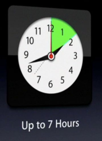
A sweep and wipe transition

A sweep and wipe transition

On the right, the sweep sequence a moment later shows progress approaching two hours, highlighted (a coloured call out) by green, the colour having multiple meanings. We often associated battery power with green (on a Macbook going its battery reserves shows up in red) and of course Apple has been pushing its “green” credentials for its notebook range.

But also notice the artifact produced in this animation, probably using multiple animation sequences. Look at the 730 mark for the ——- line. Almost invisible in the Quicktime movie, it’s seen with a screen capture.
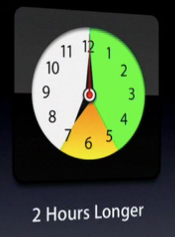
Voila_Capture129

In this next screen capture a moment later, we see another colour        introduced to demonstrate the extra two hours of battery life in new  Macbooks. In Powerpoint style, you’d simply write “two extra hours” and not  go to the trouble of creating animations. But keeping audiences attentive in  2009 requires eye-grabbing animations using familiar icons, as long as it  doesn’t detract from the central image for the sake of exploiting eye candy.

Here’s a another set of screen shots from WWDC 09 showing new animations not yet available in Keynote 09, which while not callouts in the traditional sense are worth commenting on….

Voila_Capture131

On the right we see an icon showing the number of recharges of a typical battery. The aim of this sequence is to demonstrate there is no need to fear non-replaceable batteries which offer many more charges before needing non-user replacement.

Like a fast moving speedo., the numbers quickly rotate...

Like a fast moving speedo., the numbers quickly rotate...

The unit “0” starts to rotate like a old-fashioned odometer picking up speed…

Voila_Capture133

Now things are really on a roll…

Voila_Capture134

Voila_Capture135

Almost finished at 1,000, the animation at around  6min 26 sec, includes some “physics” as the  numbers finish rotating to align at 1,000.

Now let’s look at some specific callouts which can be performed currently in Keynote 09, using a little imagination. Again, the idea is to draw attention to an important feature but not make the audience work hard to “get it”. The following call out could be completed in a variety of ways, but NEVER NEVER using a laser pointer, so 1980s and definitelyverboten in 2009.

Here’s the setup: Apple has decided that the smaller 13.3″ Macbooks in the current iteration have sufficient power and capabilities that they ought to be literally, rebadged.

We start here (12min 54 sec):

Phil Schiller discussed the new Macbook range

Phil Schiller discussed the new Macbook range

But then the focus of our attention is shifted…

Voila_Capture138

With Schiller out of the picture, but still commenting, a vague circle appears in the middle of the Macbook screen….

Voila_Capture139

Things begin to become clearer: the words MacBook Pro appear, and the effect is one of magnifying the words on the Macbook itself just below the screen.

Voila_Capture140

The appearance of the dock icons near the words MacBook Pro almost complete the call out….

Voila_Capture141

The call out is complete, and we learn that the Macbook moniker is to be retired (temporarily while awaiting a new product perhaps), and all aluminium Apple laptops are now worthy of the Macbook Pro title. Again, Schiller could have just made a lame Powerpoint style slide (below), but he would have been throttled by Steve Jobs even from his hospital bed!

How often do you see these unimaginative efforts to convey change?

How often do you see these unimaginative efforts to convey change?

There’s one more call out I want to highlight, because it too displays a shift in Apple presentations. Keynote contains a number of shapes available to help illustrate ideas, but they are few in number and style when compared to Powerpoint’s, which also has multiple call out shapes, below.

call out shapes in Powerpoint 2007

call out shapes in Powerpoint 2007

At the WWDC 09 we see Apple emphasizing a meme which has become stronger and stronger since the introduction of the iPhone and its iTunes-based App. store with their reflections and efforts to lift off from the screen. Take a look, below (1hr 50min):

Voila_Capture150

Notice the effort to give some 3D life into the callout bubbles, not possible at the moment in Keynote 09 without considerable effort and manipulation of gradients. I suspect in the next version we’ll see this kind of effect made possible with just one click or image choice. Right now, if a consultee asked me to reproduce this effect, I’d leave Keynote and go straight to BeLight’s Art Text 2 which gives you these effects immediately… just add text. (see below for part of the Template Gallery that comes with Art Text 2 – a real must-have for presenters).

BeLight's Art Text 2 template gallery - lots of fun!

BeLight's Art Text 2 template gallery - lots of fun!

To conclude this entry, the other call out style I showed  the Keynote team is one that has become popular in many current affairs programs where the host wants to draw attention to a published article and help the audience be sure it’s an authentic quote. Here’s one way of doing it, using the Daily Show and Rachel Maddow show coverage of the Mark Sanford affair:

Voila_Capture169

We see here a quote from an Associated Press coverage attributed to Gov. Sanford. This form of quotation – just printed text – is common and acceptable. See below the Maddow show version:

Voila_Capture170

What helps us believe it’s his quote is the picture of Sanford, just as the Daily Show has done. Text on its own is boring most of the time, especially on television, where a graphic designer will use it alone only for an important intended effect.

But the call out I emphasised to the Keynote team and animated in my own presentation to them, is a lift off from the actual AP media release, below. I use this effect with scientific publications too, about which my colleagues express surprise and discomfort. They like it, but they’re not sure if they should (like it), so conforming are they in using Powerpoint for text only, or for charts and graphs.

Voila_Capture171

The quote lifts off the page which is too hard to read in detail but conveys to the audience you’ve done your homework and tracked down the original source. The main point is then enlarged and brought front and centre. I asked the Keynote team for help in making this a task I could do in far fewer clicks and with more choice of methods.

In Conclusion

So that’s all I have planned to say about my trip to Pittsburgh to meet with the Keynote team, and share my ideas, vision and practices. There was more said of course, and I was briefly asked about graphs and charts which I illustrated showing how I break many rules to effect a story-telling effort when using graphs. Thanks to the team for indulging me for a few hours.

I’m hoping to see some of the Keynote team again soon when I revisit the US in August/September with visits to New York City and San Francisco, so here’s also an opportunity to catch up with any of you who like a to meet and discuss Presentation Magic principles.

Presentation Magic’s visit and presentation to the Apple Keynote Team – Part 1

Hi all,

It’s not every day that one gets a chance to visit with the team responsible for the ongoing development of one’s favourite piece of software, to be asked to do a presentation using that software for open discussion between developer and end-user, and to have a slide praised and queried by the manager of the team that put together the effects one used (motion)!

Well, that’s what happened to me Wednesday in Pittsburgh when I accepted an invitation from a senior member of the Keynote team to visit and present.

I want to thank the team for their warm reception of my work, their generosity of spirit and their reading of my blog which from time to time seems to have made some impact upon their conceptualising of future Keynote feature sets.

When I return to Australia next week, I’ll write in more detail of my visit. But off the bat, let me make it clear I signed no NDA and was given no secret information about upcoming changes to Keynote. Suffice to say, that work on improving Keynote continues apace, the team is focussed on the opportunities Keynote can give to presenters like me, and they are eager to understand how end users employ their product.

I can certainly offer guesses based on my observations and spontaneous responses to my ideas and slides, and formulate a speculative roadmap, but this should not be interpreted as anything more than educated guesswork. Moreover, I feel ethically bound not to speak of things I gleaned because the team acknowledged to me their race to best their competitors and the need for surprise and delight when introducing new feature sets, as we saw in the introduction of Keynote 09. While I and others had been steadily picking up  clues about KN09’s new features from Steve Jobs 2008 keynotes, the feature additions KN09 introduced were unpredicted delights, as well as extensions of previous feature sets.

I’m not the first presenter who uses Keynote to present to the team, and I understood that such invites are extended to those who use the product in either unusual ways (ie., in ways the team may not have expected Keynote to be used) or because there is recognition of the presenter’s status within the community, such as my workshops at Macworld these past two years. Both of these events have been related to my writings on Keynote, my obvious passion for the software, and the feature lists I have written of wanting, which have appeared in my blog writing over the years.

These feature requests have been written about with evidence provided as to why I want them included, how it would change my presentations for the better, and with evidence marshalled as to the impact on an audience should the features be included in a future version.

So in discussion with the team leadership, it was agreed that I would start with my philosophy of presenting, the scientific basis of my ideas, and then shown some real examples of presentations I have given to a variety of audiences.

I would do the talk by doing the walk.

And along the way, I would explain how I performed certain builds and why I chose to organise my ideas a certain way. Within the talk would be some feature requests of my own, plus those of others who had contacted me on the Apple Keynote group on Yahoo. I didn’t provide a laundry list, but preferred to do a presentation that offered the ocular proof of certain shortcomings, and offer evidence of how including my requests in version updates would be of benefit for a large number of presenters, justifying the development expense.

For every claim I made in my presentation, I tried to offer up evidence of its importance, and I did this by both example, as well as involving the team by having them observe my ideas in ways they couldn’t ignore. By this I mean I took advantage of my psychologist’s knowledge of neuroscience and perceptual systems to both amuse and educate the group. By the way, the group included both engineers and coders, as well as design interface folk, some of whom had only communicated with each other previously via videoconferencing (presumably iChat).

Some of the ideas I proposed for future versions had clearly been canvassed before, and had been either rejected eventually (for reasons I didn’t ask about), or are in development currently (I didn’t ask about those either, not wanting to get into NDA territory).

So both I and the assembled team had our own agendas to fulfil in this meeting. For me, it was a somewhat daunting task to use the builds, animations and transitions my audience has created, and who know how the magic was done, or who could easily work it out after a few moments. Quite different than other crowds where if you use Keynote in certain ways, you will get your fair collection of reinforcing “Oohs” and “Ahs” and even in front of a Keynote-crowd, a few “How did he do that?”

Nor did I want to do a dog-and-pony show to demonstrate my skills. There are others with far more talent at “Gee Whiz” stuff than I. No, the point was to illustrate my philosophy of presenting, provide evidence for how I see Keynote differentiating itself from its competitors, and how and why I see the world of presenting developing into “Presentation 2.0”. For Keynote to lead the way, I wanted the team to understand the improvements it could develop, and remove some of the hurdles (limitations and extra clicks) I have to work around currently.

I’ll go into more depth in Part II, and include material I only thought of afterwards (and regretted not saying while I had the team’s ears there and then), but there were two concepts I wanted to get across early.

These relate to the concept of “Presentation 2.0”, and for this I showed some slides from a stack I use in a presentation I give on Web 2.0 called, “Technology – how did we get here and where are we going?” This is a talk for technophobes (usually my psychologist colleagues) who are fearful they are out of the swing of things technical and need a crash course in technology updating. This talk allows me to expound on some of my ideas on the history of technology, and leads into the brain sciences and how, while technology may change swiftly, the reasons we use technologies haven’t changed much in thousands of years of human endeavour.

Now I need to point out that I had no idea of the level of knowledge the KN team had of my ideas, of whether they were au fait with the writings of Garr Reynolds and Nancy Duarte, leading Presentation 2.0 thinkers, and how the team used Keynote to give inhouse presentations. Was I preaching to the choir, or was there real learning to be offered up regarding presentation skills? Certainly, team management was very aware of Garr and Nancy’s work, and their philosophies and practices.

Nonetheless, I ploughed on, in the knowledge that my take on presentations was both complementary to Garr and Nancy, but also came from a different place, away from design per se, and more from human learning and the brain sciences.

I showed how contemporary media are employing some of the graphical designs I too employ in my slide construction, and why.

While showing these ideas, and asking for the team to consider making them come to life on the slide with less clicks and more options (within reason), I emphasised what I think is at the heart of Presentation 2.0 and its links with Web 2.0.

At the heart of Presentation 2.0

What’s at the heart of Presentation 2.0? Think for a moment where we are now with Web 2.0. There is a direct line between service and product provider, and consumer, such that consumers or end users can blog, or tweet, or facebook about providers and influence the decisions of other potential consumers. We get valid information about product reliability for instance from bloggers and commenters on blogs, as much as we do from mainstream media reviewers. Think about the reviews you read on Amazon which includes “official” editorial contributions and reviews by purchasers, perhaps much more like us, and thus to be considered more reliable than biased writers.

And there are a huge number of sites by which to locate reviews, recommendations, rumours and insider stories.

Put these the concepts together, as I did to the KN team, and you come up with two properties in short supply currently (or more than ever before): Authenticity (who do you trust) and Attention (who should I attend to, given competing sources of information and competition for my time?).

I wanted the Keynote team to understand that when I construct my slides these two ideas stay in my mind, and they are more to do with my audience than they are with me. I need to establish my Authority and Authenticity for my audience to keep engaged, and I need to know how the brain works, so that despite my endeavours to increase the former two A’s, I embrace the challenges to the other A, Attention, which can wander due to how our brains function.

I spoke of these concepts early in my presentation, because it helps explain why I choose to perform certain slide constructions, and how I contemplate the intended impact on particular audiences. This is why it was important not to do a dog-and-pony show, but to demonstrate my conceptualisations and how Keynote figured into them. Now I don’t know how any individuals in the KN team responded to my audience-centric approach, but I do know on occasions in responding to their questions, I had to work a little to get my point across, given the team is very much about the end user experience. But in my case the end user is my audience, and Keynote merely a tool to achieve a particular series of effects upon my audience.

So in offering up a set of features I wished to see included in future versions, I couched these requests in the context of helping me achieve my dual aims of generating Authenticity and demanding Attention. My hope on the day was that my audience in Pittsburgh would experience my authenticity, and thus my authority on the subject, not just from my writings, but from their own experience with me. And that I kept their attention despite competition from their high workload drawing them away from the meeting, and having seen all the Keynote razzle-dazzle before – since they constructed the effects!

Next week, when I return to Melbourne, I’ll write Part 2 of this blog entry, and include some of the features I requested, and show examples of things I overlooked to mention in the heat of the moment. And when the team members looked at each other, as if to say, so why aren’t we doing this?

How about a Presentation Magic Workshop in New York or Los Angeles in early June, 2009?

Hi to all my North American readers,

Just to let you know I’m making a quick trip to the US in June, and would love to catch up with readers, especially those of you who’d like a Presentation Magic workshop, seminar or training session. My visit to the US is very brief, and I’ll be combining it with a visit to a major presentation software developer where I’ll present my latest ideas, and then some personal time with friends for family celebrations.

So, the dates I have available are: New York City, June 4 (Thursday), and Los Angeles, June 8, (Monday). Here’s a great chance to see what all those very positive Macworld evaluations are about! And no need to worry about airfare or accommodation!

Best bet  is to email me: les at lesposen.com and let’s set something up to promote better presentations.

All day Presentation Magic workshop in Darwin October 1

Just got word from the Australian Psychological Society that my submission to present an all-day workshop as part of its annual conference – this year held in Darwin in late September – has been accepted.

It has been a long time coming, as I’ve been proposing it for the last three years and each time it was rejected. This year, I put in for three different workshops and a paper presentation, and was waiting for all four to be rejected! This is called “Learned Helplessness”. But the all-day Presentation Magic workshop has been accepted, and while it is aimed at psychologists in various academic and applied settings, it will have practical value for those in other professions as well. Not sure if you have to register for the entire conference to attend, or just be a day registrant to gain access.

Should be a lot of fun challenging my peers about their presentation styles, which generally are perfect examples of “Death by Powerpoint”. The workshop happens at the end of the conference so hopefully with my trusty iPhone (which by then might be a 4th Generation model) I’ll take lots of pics of others’ slides during their paper presentations, and then perform a “slide makeover” during the workshop.

UPDATE: This workshop will now take place on Thursday October 1. It is the only all day workshop at the APS Conference scheduled for Thursday, and with places limited to 25 it will likely fill up fast.

From the APS website, here is the list of all workshops. The link to read more about them is here:

“The following workshops have been confirmed: