
I took a recent opportunity to drop into my nearest Apple store at Chadstone, a major shopping centre in southeastern Melbourne. It was the first Apple store to open in Melbourne and even at 11am midweek it was buzzing with new purchasers, one on one training, and sales of accessories.
I hadn’t stepped more than a metre or so into the store when I was welcomed by an Apple employee, to whom I said I’m just looking, and proceeded to track down the new Retina display Macbook Pro.
I’m a year off updating my April 2011 Macbook Pro 15″, having just given it a big speed boost by removing the standard 500GB hard drive (albeit the 7200RPM model), and replacing it with an OWC 120GB solid state drive. I didn’t stop there, removing the optical drive, placing it in an OWC USB-powered case, and using an OWC datadoubler cage to place a 750GB Seagate momentum hard drive. The SSD contains my operating system and applications, while the Seagate has my documents and other files, as well as used as a scratch disk. How fast is the system now? Well, Microsoft Word now opens with one bounce, as does iPhoto with 3500 pictures.
More importantly it shuts down and boots up much more quickly, and I’m estimating the Macbook’s battery endurance has also increased significantly.
It will do fine for another year.
Equally important, it gives Keynote – my presentation application which I discuss frequently on this blog – a speed boost too, and it has a snappier feel to it when I’m in the process of creating new presentations.
Which all brings me to discuss the future of Keynote and its brethren apps which make up the iWork suite, which has not seen a significant update for more than three years. Meanwhile, Powerpoint for Macs and Windows have seen major version updates, Prezi is growing in popularity, and iWork apps for the iPad have seen several significant improvements, bringing them closer to the capabilities of the desktop versions.
Keynote users, which we can guess are growing in number to judge by the sales figures Apple publishes on the App store (it’s currently in the top three of paid apps), are asking the following questions, mystified by Apple’s seeming neglect of their favourite app.:
1. Is an update – or more plainly – a significant version improvement due some time this decade?
2. Will it have the same look and feel as the current version, or will Apple switch it to its “professional look”, seen in apps such as Final Cut X, Motion, Aperture, etc.
3. Will Keynote fully utilise Airplay in Mountain Lion such that in either Presentation or Mirror mode, a true wireless data projector connection may be made, either with the latest wifi-equipped projector, or via connecting AppleTV to an HDMI equipped setup
4. Will Keynote instead be dumbed down so as to provide greater compatibility with the iPad version?
5. If not, what new features will Keynote emphasize? Clearly, new transitions or build styles will come along, but is this sufficient to sustain interest in Keynote or are new useability features to be the name of the game in 2012?
6. Will Keynote make it easier for third party developers to come to the party, not just with new themes, but this time with new transitions and builds?
So what new features are the most desired and have any recent official Apple keynotes given a hint of Apple’s thinking about presentations?
After using Keynote for almost a decade, when it was almost featureless when compared to Powerpoint 2003, experienced users have developed their own workarounds for the application’s deficiencies, even if they must do so with clenched teeth.
The lack of a useful timeline remains for me the most glaring need to be fixed. Currently, rather complex slideshows, which Keynote begs to do due to its cinematic capabilities, are hobbled. The go-around is to create Quicktime movies of complex single slides, perhaps using iMovie, Motion or Final Cut to manage exact timings and mixtures of images, video, and sound.
Grouping images into a single image file is still troublesome, as Apple has yet to find a way to name each group on the one slide with its own name, rather than a generic, “Group”. Moving these groups forward or back with respect to each slide item, something novice users are unaware of, is part of elevating presentations to another level. I don’t think I’ve ever seen it taken advantage of in scientific presentations featuring Powerpoint. In Keynote currently, it’s particularly kludgy, and Powerpoint for Mac has a 3D view which Apple could think about improving upon. Using layers within a presentation slide raises presentations from ho-hum to something special.
The most recently observed Apple keynotes haven’t shown any easily detectable new features. For the next section, I’ll refer to the WWDC 2012 keynote of June 11 where new Macbooks were shown together with previews of Mountain Lion and iOS 6.
There were a couple of very neat effects displayed which can be reproduced using the existing feature set, but which require several steps rather than built-in effect generators. Let’s start early in the WWDC when CEO Tim Cook is describing how many more countries are will soon be able to access Apple’s App store.
If you download the video via the iTunes podcast feature, you’ll see a world map at 05:50 where Cook has several new countries “fly” in, overlaying in a different shade of blue those countries new to the app store service. I was able to reproduce this on one slide using the move and scale build in feature, but to do it over 30 countries is a pain.
It means utilising the shape feature to outline, then “cut” the country, use the Adjust image to shift the shade of blue, place the image off the slide, then create and combined “move and scale” to slide the new image in and over the country. Lots of work but quite an effective visual. Here’s Greenland (circled) flying in:
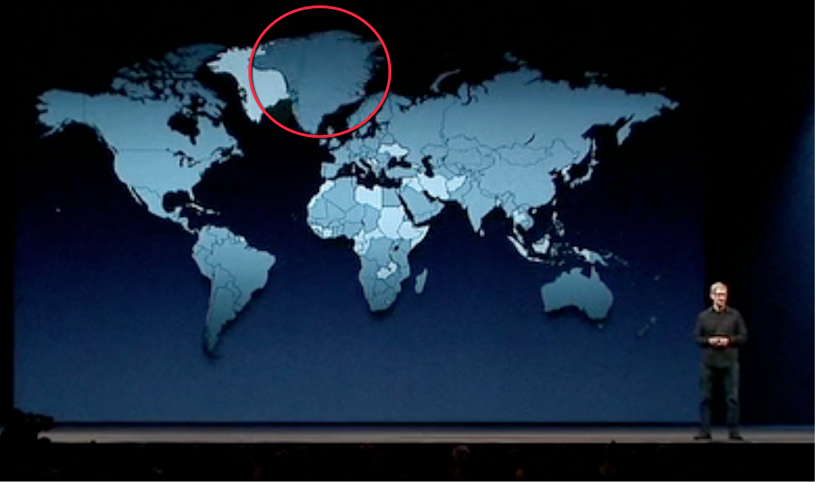
The hope we have is that the next Apple will make such efforts much less intensive, requiring much less mousing about. It’s easier of course if the map is built of separate country images, but the cut method I refer to is how I used the display above as a proof of concept that the fly in effect can be achieved in the current Keynote.
The next feature I want to highlight is just that – highlighting. While the map sequence shows elements flying onto the slide, an important feature of contemporary presenting is doing away with those awful laser pointers so favoured by those who won’t put the effort into preparing both their stories and slides ahead of time, preferring to appear “spontaneous” while wiggling green or red lights in dizzying circles.
When I visited Apple’s Keynote team in Pittsburgh a few years ago, I made it a special point to discuss the need for the team to understand the importance of “call outs”, ways of highlighting elements on the slide. This could be a set of cells in a Numbers spreadsheet, or an element of a photograph, or a line of text from a scholarly publication – something you want to stand out from the rest of the slide elements as something requiring the audience’s attention which you speak to, but by enlarging it or shadowing it or somehow calling it out, you still allow the audience to see where it belongs on the slide. This adds to your authenticity by showing the source of the quote, rather than merely typing it onto a slide.
Take a look at the slide (below) I created to get the idea visually:
Notice a few things: I have enlarged the main graphic which is taken from a PDF of a journal article I am discussing with the live audience. It’s intentionally pixelated and thus hard to read, because I don’t want the audience to race ahead and read it. It’s purposely difficult because within a moment of its appearance I am overlaying a much clearer image of the paragraph I am going to read to the audience.
What, you say, read a slide?
As I tell Presentation Magic audiences, the only time I read a slide is when it is a direct quote from a source I am displaying – never my own words on a constructed slide unless it’s a single word or phrase, but never sentences.
Remember – once you display a slide with words on it, your audience will read it whether you ask them to or not… so any time you put words on a slide it’s because you want them to read the words in preference to listening to you or because they read while you say the say words. Vision and sound work together to make it more memorable.
In the slide above there are two effects: As the main page appears, it immediately goes to pixelated form while the paragraph leaps off the page (notice the shadow effect) to grab attention. And as I read the slide, I say “and here’s the main point I want to make with this slide” and use the red shadowed box to highlight the sentences in the highlighted paragraph. This double handling take some effort to create on the slide, but in the presentation it runs seamlessly and produces an engaging sequence. It shows your audience you’ve really put some thought and effort into it for your audience’s erudition.
As much I tried to show the Pittsburgh-based Keynote team the importance of callouts, I reinforced this a few years ago at a Macworld Presentation Magic workshop when two senior members (one a new hire specialising in interface design) of the Keynote team attended my training. I didn’t announce their presence to the other attendees, as I wanted them to sit in as regular attendees. During the workshop, I spent considerable time discussing callouts, why I think they’re important in contemporary presenting, and some of the techniques I use to create various call out effects. I know the Keynote team members were very interested in what I did, and went away thinking about how to create these effects as part of the Keynote app attributes, rather than create them using a multitude of keystrokes and mousing about.
I am pleased to say, if I may judge from the WWDC keynote, that at least the concept of the call out has made its way into Apple’s keynotes. I have no idea if we’re watching a new Keynote which makes callouts easy to create, or the current one using the same or similar techniques I am using. Let’s take a look at these features from the WWDC:
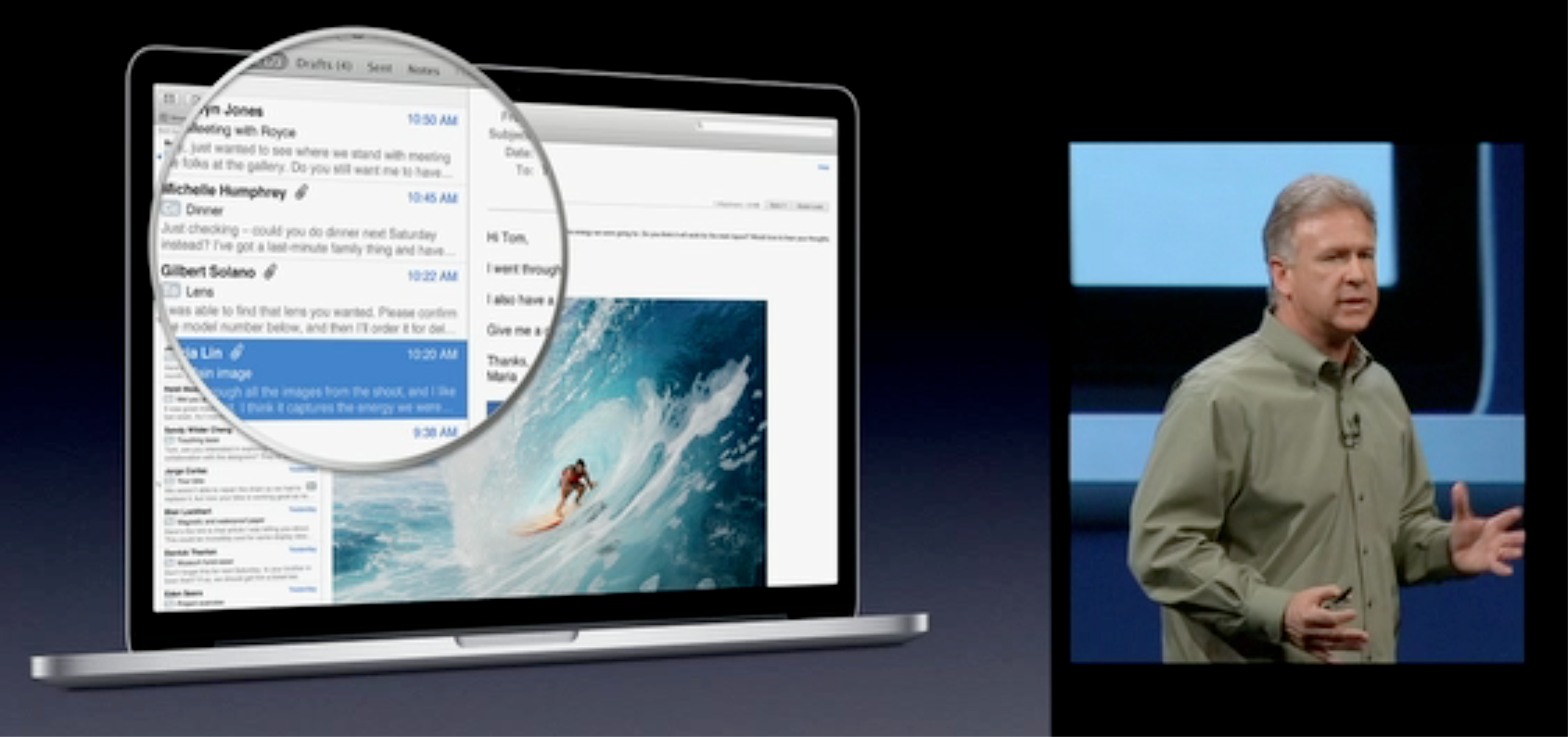
Discussing the screen resolution of the new Macbook Pro, Apple Senior VP Marketing Phil Schiller uses a magnifying callout to highlight the resolution improvements in Apple default apps, such as Mail.
This is not the first time this call out has been used, but it’s certainly the largest. Nor is it a built-in shape; the annulus is a 3D graphic selected to emulate a magnifying glass without the handle. Apple included such a glass with Keynote 1.0 as part of a selection of bundled clip art, not to be confused with the chintzy art included with Powerpoint (until the most recent Powerpoint for the Mac, when Microsoft included high res photo images.) I learnt it was Steve Jobs who stopped the inclusion of clip art.
Later, in the keynote, Apple SVP software engineering, Craig Frederighi, demoes various new features of upcoming Mountain Lion, due in a few weeks.
Notice below how he calls out a feature of new Safari, leaving unneeded areas greyed out compared to where he wants the audience to look:

This call out is repeated several times, as more features are displayed. This is easily done by transiting over several slides and seeming to animate the move simply by going from one slide to the next. This sequence occurs at 54:30. Here’s what the next slide highlighting the same feature set looks like:
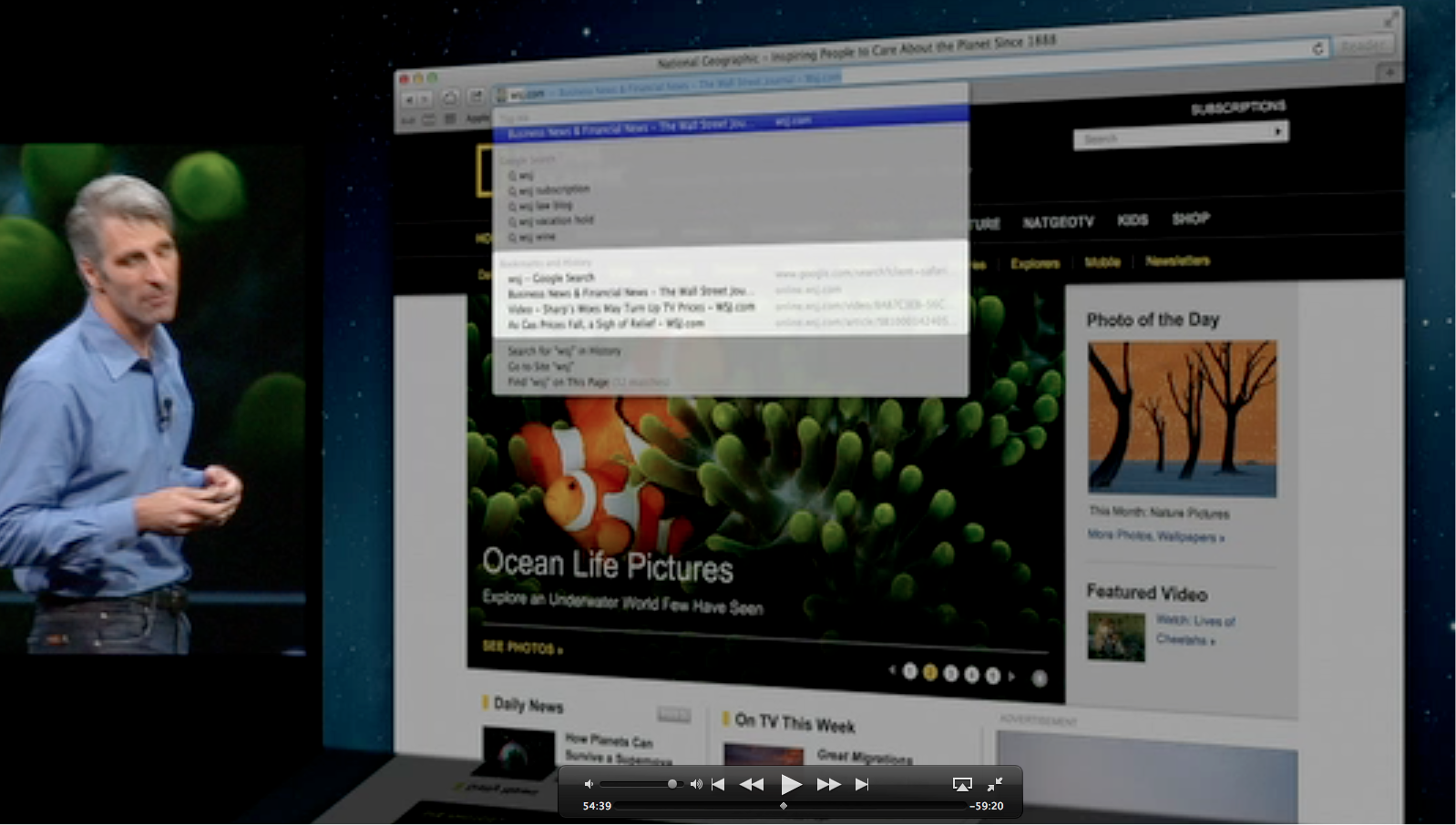
If you go to the keynote to see the sequence, you’ll see it’s a rather plain slide to slide transition.
I’ve taken another section of his talk which features a pulldown, and I’ve shown how to animatedly highlight various sections. Can you guess (below) how I did it?
Craig shows us a few more call out variations, which furthers my belief that if we are watching the new Keynote in action there will be a new call out feature in the next Inspector – watch:

This is the area of his presentation where Craig is demoing the iCloud sharing of Safari tabs across platforms, from Mac to iPhone to iPad. Alongside the URL entry area is a sharing and icloud icon. In the next illustration below, the call out of the icloud icon begins:

I’ve circled the cloud icon beginning its enlargement, part of the call out sequence, which concludes below:

While it may be a variation of the magnifying glass previously demoed, the former was not animated, so I’m tempted to think this is a build effect, which of course one could do now with the available feature set. But I’d like to be optimistic in thinking the Keynote team have really thought more deeply about the importance of call outs to give it a place in the next Inspector.
(Funny aside: Craig demoes a car racing game to show AirPlay in action in Mountain Lion. From his previous keynote appearances, he has developed quite a following it seems for his lush abundance of hair. Note in the highlighted picture below his racing nickname – click to enlarge:)

More evidence is available when Apple SVP for iOS, Scott Forstall demoes iOS 6.
We start with Scott and two images of iPhones. Note I’ve captured Scott looking down at his confidence or vanity monitor, a presentation skill he has yet to master (at least compared to the much missed S. Jobs).

Next, out pops a callout of an area of interest featuring Facebook. No grayed out areas, but an enlargement which pops. Again, one can do this with current build styles, but I’d like to think one could outline an area, and a build option would give you choices as to how it would be called out:

Now, another sequence to show this same call out style in action:

This is Scott demoing the new “Do Not Disturb” feature. Notice how the effect is to float the panel above the iPhone. Apple loves 3D!

This series of call outs in this year’s WWDC really highlights the feature, so if I may connect all the dots mentioned so far in this blog entry, I remain hopeful Keynote is about to be refreshed, perhaps soon after Mountain Lion is released in a few weeks.
There is more information to consider however, not all of it good.
Early in his demoing of the new Retina Macbook, Phil Schiller mentions how the system apps have been updated to take advantage of the extra pixels, such as Mail, Address Book and so on.
He then goes on to show how a select group of Apple’s “professional” apps have also been updated, and we see Aperture and Final Cut X. We even hear that Adobe apps are due to be updated for the Retina display too, as well as Autodesk.

Adobe Photoshop on the Retina Macbook

Autodesk on the Retina Macbook
But where is the mention of Apple’s other “professional” apps, like iWork?
Let’s not give up hope however. When I went to the Apple store in Chadstone I opened up Keynote on the Retina Macbook. I took a picture with my iPhone of the Theme Chooser, and I’ve overlayed it on Keynote on my current Macbook Pro. You’ll need to take my word that Keynote on the retina Macbook is quite observedly pixelated, much like an iPhone app which is blown up 2x on the iPad is pixelated (Click on the image below to enlarge it):

In conclusion, I wonder how long Apple can live with itself allowing Keynote to look so… impoverished and uncinematic on its premier Mac. Let’s hope not for long, especially if Retina display iMacs and other Macbooks are allegedly not far away.
UPDATE: I’ll be in the USA (New York City) and Canada (Toronto) in late August/early July of you’d like to set up a Presentation Magic training day or seminar. Email me at les(at)lesposen.com or tweet @lesposen


Dear Les:
I think that Apple has the technology to add a lot of animation tools to Keynote and has had that technology for a long time, but the problem is Apple sells animation tools for professionals and has some incentive compatibility issues: if animation tools on Keynote become too good, some customers might postpone buying the pro animation tools.
As for callouts, I second your need for better highlighting tools; I’ve had to make do with various work-arounds, though some are actually very easy to create with magic move, like this: http://www.youtube.com/watch?v=dqZ-KV1wSao
I think quite a few people would like some form of annotation and interactivity in the presentation, especially for the smaller presentations (audience < 100-200).
Personally I'd like a better way to make the script/presenter notes/teleprompter text available on the secondary screen during the presentation.
Let's wait and see what happens.
Cheers,
JCS
Agreed, Jose.
I’ve already been beta testing new vanity monitor and annotation software for the iPad, and asked the team responsible to see if they can include a twitter feed, especially for those attending scientific conferences, where presentations have a moderator who can pose questions. Given Apple’s current motives to include Facebook and twitter as system defaults, it will be interesting to see if Apple incorporates them into its premium presenter software.
I don’t know if Keynote’s beefed up animation skills would canibalise its other apps. I think people are already doing this, and as we know Apple often sees its main competitor as itself!
What if instead of just beefing up Keynotes animation abilities, Apple added Motion 5 support for Keynote. Animation then becomes a single product with already present third party support. You could create rigs in Motion that would work in Keynote. There may be some things that may not make sense to do for a presentation, but those could be left out for creating a Keynote rig.
A callout feature would be pretty awesome. But I think it would be more likely that Apple’s presentation designers are just utilizing other software such as Photoshop to create callouts. I can easily imagine that, rather than using the outline tool to separate countries from a single image file as you described, they simply used separate image files of each country and placed each of them on the slide to fly in.
Your idea of a timeline is growing on me. Have you played with Tumult’s Hype, the HTML5 application? It’s meant for dynamic, interactive websites, but I recently had the epiphany that it would be a fabulous presentation tool. It has a timeline that allows you to manipulate multiple elements over time.
And with the iBooks Author’s integration of Keynote decks and HTML5, I woudln’t be surprised if Keynote was built around HTML5 much like Hype. It would allow authors to more easily create dynamic and interactive images for their iBooks without needing to know much about HTML and web programming.
Yes, I’m aware of Hype, but haven’t taken the trouble to download and learn to apply it. The release of iBooksAuthor, still in v.1.0 has clearly taken time from the iWork team, but at least Keynote’s inclusion in it workflow and feature set means there’s life in the old dog yet! Perhaps when iBooksAuthor goes to version two, perhaps with Mountain Lion’s release, the stars will align, and out will pop Keynote 12!
Pingback: Dissecting an Apple keynote | Apple Stocks
Pingback: Dissecting an Apple keynote | The iDoctor
Pingback: Dissecting an Apple keynote | TUAW - The Unofficial Apple Weblog
Pingback: likeithateitshareit » Dissecting an Apple keynote
Pingback: Dissecting an Apple keynote | Design City
To be honest while some of these can be executed fairly easily (duplicating the image then masking with a shape and doing a scale or pop build-in), I’d prefer they not make it easier so my presentations stand out more. Maybe that’s just me being greedy though. On a serious note though, there are some opportunities such as the ones you called out, and the option for HTML5 export, but also improved video export as some of my builds can get too complicated to be correctly rendered. That and/or the ability to include layer changes in builds would be great as well.
Dear Les,
I’ve been reading your RSS feeds for a long time in silence, and I really appreciate it!
I apologise if I get off the tracks a little bit. I also live in Melbourne and been to Chadstone some other day to see the new Macbook Pro, amazing. I am most impressed with the SSD drive and heard of this OWC installation. I’d love to upgrade my iMac, but I would never do it myself. Can you tell me where did you do this installation? Did it void your warranty?
Thanks and congratulations for the great site!
Marco, I did the installation myself. OWC includes on its website videos of each procedure and the datadoubler kit to replace the optical drive comes with all the necessary tools. The SSD was the easiest to do and replacing an original hard drive will not void warranty. The optical drive is a little more challenging as the screws to remove it are less accessible and there is care to be used to detach the wiring which will be used for the hard drive which will sit where the DVD used to be. If I needed to have my Macbook looked at under warranty, I’d have to put the DVD back in. All told the double transplant took an hour of concentration. The placing of the DVD in the OWC external drive is a few minutes work and very easy. The speed difference more than justifies any worry over warranties! OWC goods are sold here by macfixit.com.au at excellent prices.
Pingback: T.VE
Hi Les – If you get info on any of the iWork apps, you’ll see an option for opening in low resolution mode. Uncheck that and you are running in retina glory. That said, when I uncheck it for Keynote, all of my existing presentations are effected unfavourably. I have no clue why Apple ships it that way and that the inshore display models haven’t been fixed, but there you have it.
Of course, Apple has now updated iWork soon after the release of Mountain Lion, if only to take advantage of the new Retina Macbook as well as iCloud capability, with iWork.com beta now concluded.
Hi Les,
While I was looking for something i remember to have seen in your blog (which i did find), i came across this entry. In the meantime, i’ve discovered an app that makes it easy to highlight sections of a screen. It is called Voila and available in the App Store. I bought it when it was on sale and must say i like it. You can highlight a section, blur the background and give the highlighted section a nice drop shadow. It’s all a matter of a few mouse clicks. Other options are available as well. Enlarging a highlighted section like shown by Apple is not a supported feature, though.
Ronald
Yes, Voila has been a long time favourite accessory app for Keynote. The developers once gave a presentation of it at Macworld in one of my workshops a few years back.
Regards
Les