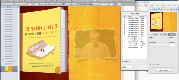
Thank you to all those who’ve come by to visit my website following the podcast with David and Katie over at the Mac Power Users’ site.
I thought as a reward I would post a video of the “Shaking Book” effect as I call it, which I discussed in the podcast. I start most of my workshops, no matter the subject, with it. It follows my first slide which is usually just the title of the presentation du jour. The point is to inform the audience that no matter what they may learn on the day, I’m hoping they walk out happy they attended, and this is indeed what I actually say.
But the other unspoken message of showing the shaking book slide, right up front, is several-fold:
1. This will not be your usual dull, disengaging Powerpoint.
2. Even if you’re an old hand at presenting, and have attended lots of such trainings, you ain’t seen nothing yet = raising expectations (Contrary to Barry Schwart’z message)
3. Stamps my authority as an expert Keynote user since the effect is not one you can merely select but must create yourself, thus displaying a depth of knowledge of what Keynote can accomplish.
So, here’s the video, and beneath it, the Keynote slide and the Inspector so you can go figure out how it was done.
Now, there is a little more to this video than first meets the eye. Go back and have a second look. Note that the video seems to come between the open pages of the book, not from behind. Your mission, Mr. Phelps, is to figure out how that was achieved.
And here’s the Inspector (click to enlarge):
There is a little more to it in terms of what all these elements in the Inspector achieve but I’m sure you can figure out some of the magic for yourself!
PS. I will not be returning to Macworld 2013 next February. Perhaps in 2014 depending on the direction Macworld heads.


Like the podcast a lot. Thank you!
Hello Les
I know you’re a big fan of Viola… don’t know if you know this built in OS X shortcut for screen shots. Hold down cmd-shift 4 to take a screen shot as normal and drag the marquee around the item you’d like to select.
If the marquee isn’t in exactly the right place, hold down the space bar. The selection area now stays fixed, but you can move the whole rectangle anywhere you like on the screen. If you lift your hand off the space bar, you can continue to resize the marquee, but now in the new location on the screen.
In this way, you can drag the selection marquee anywhere you want on the screen (preferably somewhere where you can see the pixel numbers) then hold down the space bar and move the correctly sized rectangle right over the part of the screen you want.
Cheers
Alan
It’s a good pickup for those who dont want to go to the expense of buying software, but I do like how I can resize the marquee to get the area just right, plus all the other things Voila does. It’s been on special recently for half price.
les
FYI: The Flightwise Fear of Flying Blog link on your page is dead.
Came here after hearing you out on Mac Power User. I am just saying hi.
Alan, great shortcut. I use the built-in screen shot (and screencasting) features of OS X heavily. Being able to move that marquee around is a useful tidbit.
Les, I loved your podcast and I’m so glad I discovered your site. I also work and teach clinically (emergency medicine). We (unfortunately) rely on power point to transmit the latest information and it is always done horribly. I’ve referenced Garr Reynolds, Nancy Duarte, Cliff Atkinson, and other presentation gurus, but their audience tends to be people in sales. They can use the slides with few details, artfully designed, to good effect to convince people to adopt their message / buy their product / etc. This works well for these emotional pitches.
In medicine (as I assume psychology), there is often hard data and complex concepts to be conveyed. This is usually put up as an illegible table scanned from a journal article and the 6-words per line, 6-lines per slide (which by the way, I believe comes from a misapplication of George Miller’s “Magic Number Seven +/- 2”). I’ve had people tell me, “hey, even in medicine, you’re always selling” advocating I use the business pitch approach.
I really liked your idea discussed in the podcast of scanning in a journal article and blurring a back layer, allowing the front to pop out. Do you have other tricks to convey such detail in your clinical talks?
Thanks again for such a wonderful blog. I’ll be spending time browsing through the many posts.
Rahul