Category Archives: Presentation Skills

Updating the Shaking book effect – better or worse than the original?

I’ve had sufficient comments and time on my hands to play a little with this opening slide for most of my presentations.

I altered the video’s outline to be less “ripped”, made it tumble rather than pop out of the book, and gave it a landing “splash” using the Anvil build (can you work out how I did that?) What do you prefer – the original, or this modification?

The Shaking Book effect in Keynote

Thank you to all those who’ve come by to visit my website following the podcast with David and Katie over at the Mac Power Users’ site.

I thought as a reward I would post a video of the “Shaking Book” effect as I call it, which I discussed in the podcast. I start most of my workshops, no matter the subject, with it. It follows my first slide which is usually just the title of the presentation du jour. The point is to inform the audience that no matter what they may learn on the day, I’m hoping they walk out happy they attended, and this is indeed what I actually say.

But the other unspoken message of showing the shaking book slide, right up front, is several-fold:

1. This will not be your usual dull, disengaging Powerpoint.

2. Even if you’re an old hand at presenting, and have attended lots of such trainings, you ain’t seen nothing yet = raising expectations (Contrary to Barry Schwart’z message)

3. Stamps my authority as an expert Keynote user since the effect is not one you can merely select but must create yourself, thus displaying a depth of knowledge of what Keynote can accomplish.

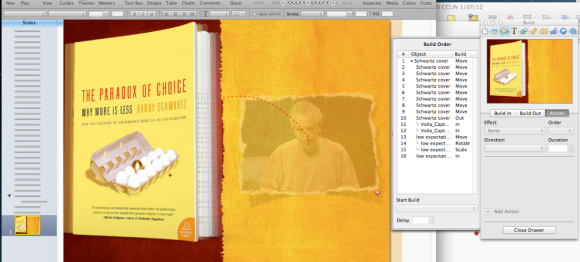
So, here’s the video, and beneath it, the Keynote slide and the Inspector so you can go figure out how it was done.

Now, there is a little more to this video than first meets the eye. Go back and have a second look. Note that the video seems to come between the open pages of the book, not from behind. Your mission, Mr. Phelps, is to figure out how that was achieved.

And here’s the Inspector (click to enlarge):

Image

There is a little more to it in terms of what all these elements in the Inspector achieve but I’m sure you can figure out some of the magic for yourself!

PS. I will not be returning to Macworld 2013 next February. Perhaps in 2014 depending on the direction Macworld heads.

Presentation Magic interviewed about presentation workflow, Keynote and helpful presentation equipment on the 5×5 podcast: Mac Power Users

I had an opportunity yesterday to be interviewed by lawyers, bloggers and Mac Power users David Sparks and Katie Floyd for their Mac Power Users podcast on the 5 x 5 podcast network. Our subject was Presentation Skills and workflow, and Keynote gets a good mention as well as some of the other tooks I use.

You can hear and the podcast and note links to items mentioned here: http://5by5.tv/mpu/111

The podcast is more than 90 mins and I hope you enjoy. Feedback and questions welcomed. You’ll hear us occasionally walk over each other and me do more than my customary “ums and “ahs” due to the nature of Skype audio (I’m in Australia and they’re in the US on the west and east coast).

Aside

Back earlier this year, I wrote a simple headline (below) suggesting that if Apple could stream Paul McCartney over its AppleTV arrangement, why not return us to the 1990s and stream its keynotes? Well, perhaps someone at Apple was listening! … Continue reading

PayPal Here, a card reader and app for taking payment on your iPhone or iPad finally comes to Australia, getting in before Square and Apple’s likely credit card system.

Some time back, I introduced a video from Square in my “IT for Psychologists” workshops which I offer in Australia. At the time, Square was just beyond being a startup.

Square offered a small hardware device which plugged into your iPhone headphone jack and communicated with its own app so you could accept credit card payments. The Square card reader “swiped” the card, and the money would soon enough be transferred to your nominated bank account.

The video still excites many of my colleagues even though it was made several years ago, and it’s yet to be made available in Australia. It’s been reported that Square has since enjoyed an investment from VISA after initial warnings of “security issues” from Verifone, a maker of card readers More recently, Square has expanded its wares to purposely include iPad-expanded abilities for point-of-sale businesses.

There has been talk of Square coming to Australia, where many psychologists use those old bank-leased card readers, which usually means you also need to have a landline, or a more expensive 3G model. Some like to use it because one bank has arrangements with Australia’s Medicare national medical health scheme, allowing payments to be made directly into the psychologist’s nominated account.

But for the many solo psychologists who work in multiple locations, these solutions are not particularly cost-effective, since one pays a monthly fee for the lease, as well as a percentage per transaction, a 30c fee, and other ancillary set-ups fees.

It’s essentially a monopoly situation, which I have rejected in my own practice.

For those who want to pay me by credit card, they receive ahead of their appointment, advice that credit card payments can be made via PayPal, with a surcharge of $5 to cover the fees I am charged (a little under 3%). This keeps the banks in their place.

The other electronic alternative (cash is certainly accepted; cheques are a dying monetary exchange system in Australia) is direct debit, where the patient can make an online payment from their bank account. Neither they nor I receive any costs for this transaction. For that reason, I have the apps of the most popular banks installed on my iPad, so patients can either pay at the end of the session using my iPad, or pay at home or their office. Many now use their own iPhone during the session to make their payment. Once they use my bank details, websites usually keep me as a preferred payee and those details don’t need to be entered a second time.

The case for an iPhone or iPad enabled payment system is a no-brainer. One wonders, what with the Samsung vs Apple trial currently under way, if Apple ever thought its iDevices would be used this way. After all, even in its own Apple Stores it formerly used Windows CE-based portable card scanning devices.

These were replaced, perhaps with a big sigh of relief, with iPod touch units and an EasyPay system, as its called. At left, is an Apple Store employee in Perth, Western Australia using one when I visited in June 2012.

The units incorporate both a card reader and a bar scan reader and after taking your money, a receipt will be emailed to your nominated address. If you’ve purchased before, your details will quickly come up from the server and speed up the process.

More so, you can now use an EasyPay app on your own iPhone to make your purchase without even sighting an Apple Store employee!

Apple’s modded iPod Touch showing the bard card reader in action, purchasing an AppleTV remote

Apple EasyPay app at work in the Apple Store

Returning momentarily to Square, some have mooted it might make an excellent acquisition for Apple, as reported in the New York Times recently, above.

What makes the NYT report incorrect is its report that the Square service is “a unique electronic payment service through iPhones and iPads”.

There are several competitors, not all of whom use a card reader. One is ICCPay, which I also mention in my IT workshops, below (Shame on the NYT for not doing its homework).

The app needs to be used with a gateway linked to banks, and for some people these extra steps may prove to be a hurdle.

With the next iPhone not very far away, others have suggested Apple has its own plans for an iPhone based payment system, using Near Field Communications (NFC). With iOS6 coming with a coupon and ticket app called Passbook, it may also be the case that Apple will later allow iPhones to act as credit card terminals, perhaps utilising technologies from its Apple Store EasyPay setup.

While all this is in the not-to-distant future, Australian and US iDevice owners have another system just coming onto the market from PayPal, called PayPal Here. Below, the US website announcing its availability.

The Australian PayPal site shows a “Notify me when it’s ready” sign but some time back when it was first mooted coming to Australia, I applied to go on PayPal’s waiting list. This was back in April. In recent weeks, I was notified things were on the move. Last week , apparently in preparation, my PayPal account was suspended, pending receipt of documents pertaining to security questions, including if I was at all politically connected to anyone in the public eye. Seriously. I had to fax or email documents containing my photo ID and birthdate, as well as documents showing my name and current address, such as a utility bill. I used my US Passport business VISA for the former.

This was accepted eventually, and I was in business, even though the small triangular card reader was yet to arrive. The free app was available to be used however. Doing this has drawbacks, though.

1. Entering card data manually, with a purchaser’s finger signature and three digit CVV, attracts a higher % commission (about 3%), and

2. It takes 21 days to clear into your PayPal account, plus a few more after that to go into your nominated bank account.

Fortunately, my card reader arrived by courier yesterday, after being notified by PayPal Australia to expect it in 3-5 business days. It actually came just a day or two after that email, with its courier tracking details.

Here’s what the container box looks like:

The box includes an adhesive label you can place at your business entrance

Here’s the physical unite – it measures in imperial terms, 1.5″ x 1.5″ x 2″ approx

Here are a number of shots I took with my iPhone showing the boxing of the unit. This might not quite match the unboxing of a new Mac, but still….

It’s nicely done, complete with the adhesive label to place on your front door, and PayPal’s local support number. I haven’t tried to reach support yet, but would think that anyone trying to compare various payment systems ought to incorporate a comparison of support parameters, such as time spent waiting, quality of answers, followup, etc.

Using the unit requires you to download the free PayPal Here app from the App store. It is set for the iPhone, but will happily expand to 2x appearance on the iPad without much pixelation.

There can be a problem with iPhones with cases which make full insertion of the card reader difficult which I have already discovered with certain cables.

The card reader, unlike the Square unit, contains a triangular cover which partially rotates and “grabs” the iPhone preventing the unit from swivelling. Again, with a thick iPhone case, this feature just gets in the way. I have  swivelled the unit, and held it for a successful card swipe, but clearly if one is to use it frequently, it might require the temporary removal of the case.

The app., by the way, allows you to practise swiping without incurring fees, and as a way to test the functionality of the card reader.

Let’s now go look at the app itself, which has a number of interesting features.

The first is the “Open for Business” screen, above,  which connects you to PayPal to show balances, as as well the means to input items and information about your business.

There are a variety of settings, above, where you can list your inventory and give each item a sale price, and keep a running total of items being purchased. It night be useful for a bar or restaurant,  for instance, collecting table orders.

Each item can have its own amount and description, above, quite useful for those working garage sales or fleamarket transactions.

The app also includes a handy calculator, above,  to keep a running total going…

The app also includes the option, above, of putting in your business information, including either your mapped place of business and/or your correspondence address, as in a post box.

There is also the opportunity to track sales figures, both past and pending, above.

Items sold may include not just physical goods, but services too which can be itemised. There is also for goods, an area to display a picture of the item next to its description and cost. The picture can be imported from the Photo app, as you can see, below.

The option to take a picture on the fly could turn out to be very useful in some circumstances. There also exists the option, like Apple’s EasyPay system, of emailing a receipt to the purchaser. Handy to develop a marketing list of email addresses…

There are some questions that remain however.

Will the card reader work with all cards, and what of worn cards? How well will it work with the next iPhone, if rumours of its headphone jack heading south to the bottom of the unit prove to be true? And what is its future should Apple release its own credit card system in the near future?

The beauty of the PayPal system is the small size and thus portability of the reader, the data safety via encryption offered standard by PayPal, the well thought out version 1 of its app, and the public’s general awareness of the PayPal brand.

It’s also relatively easy to use and navigate through the various app screens, and the costs are very good when compared to what’s already out there. While it’s currently limited to VISA and Mastercard credit and debit cards, the lack of AMEX and Discover might be a concern for some. Mind you, I can’t recall the last time a patient tried to pay for a session with AMEX.

I’ll  update this blog entry once I start to make some “sales” with the unit, and report back on its actual usefulness.

Dear Technology Section Editor: Ten ways you know your tech journalists should be switched from covering Apple Inc. to say, Microsoft or RIM

Dear Technology Section Editor ,
Mainstream Media Publication,
Anytown, Anywhere

Dear Sir/Madam,

After many years of observing your publication in operation and as it attempts to make the transition to a digital news flow, may I offer the following reasons why some of your syndicated, featured, or freelance writers, be they journalists or bloggers or members of the kommentariat at large, may cause you to shift their fields of interest. Or:

Ten ways you know your tech journalists should be switched from covering Apple Inc. to say, Microsoft or RIM:

1. They refer to any success Apple enjoys as being due to its legions of “iSheep”, “fanbois” or cult believers who will indiscriminantly buy anything Apple due to Apple’s vast marketing budget and prowess. They will perhaps give a very brief mention to design and production qualities, but keep the focus on slavish followers.

2. They damn Apple for not having the courage to enter the enterprise market and compete head to head with Microsoft, thus revealing they haven’t seen or heard Steve Jobs’ metaphors of trucks and cars, and a post-PC world, nor do they understand the term “flight to the bottom”.

3. They rabbit on about “market share” and how low is Apple’s with respect to the desktop OS, while conveniently ignoring Apple’s quarterly profits, growth and customer satisfaction surveys. Oh, and its market share with respect to the iOS-powered devices.

4. They hold up examples of failed Apple products as to why Apple might fail with its next rumoured product… “remember the Pippin, the Newton, The Cube? See, Apple doesn’t get it right always….”

5. They admonish Apple for releasing or spreading rumours there will be a product “soon” but one which Steve Jobs said Apple would never do. This is used  as an example of Apple’s lack of trustworthiness, but bald-faced lying. iPod Video 5th gen., anyone?

6. They report on how worried Apple should be because they really believe RIM is about to turn the corner and blow the tech world out of the water with the next Blackberry with its new OS. Or Microsoft will do it with Windows 8, or Nokia will… you get the picture.

7. They do “exclusive” product review “showdowns” between vapourware products no one has been able to put side by side e.g. “Who will win? We compare Microsoft’s Surface RT versus Apple’s iPad 7 inch.”

8. In predicting Apple’s future, they can’t help themselves from referring to Microsoft “saving” Apple from oblivion at the time of Steve Jobs’ return in 1997, with an investment of $150 million in non-voting stock, thus perpetuating demonstrably untrue folklore.

9. They include current quotes from Steve Wozniak about contemporary Apple issues like design, functionality or competitiveness, things he would be best to leave alone for oh…  the past 20 years, and the next 20 to come.

10. They continually present you with articles about Apple which are lists of ten things Apple could do differently, should be doing, are not doing, are doing worse than anyone else, etc., etc. And they spread all ten over 5 pages to demonstrate how they are truly clickwhores, which badly reflects on your publication.

These are my ten. Dear Reader, I’m sure I’ve missed a few… can you assist with your own, and assist Dear Editor out of this dilemma?

Aside

I took a recent opportunity to drop into my nearest Apple store at Chadstone, a major shopping centre in southeastern Melbourne. It was the first Apple store to open in Melbourne and even at 11am midweek it was buzzing with … Continue reading

Pilots, presentation skills and preparation: The crash of Air France 447 into the Atlantic – The official French investigative report shows what pilot training and presentation skills have in common

If you’ve attended a workshop or seminar of mine, whether about presentation skills or technology or health, you’ll know I sooner or later introduce something about commercial aviation.

I have a passion for this, and partly earn my living from working with patients who suffer fear of flying, which affects a significant number of people, and cuts across profession, gender, intelligence and age amongst notable variables.

Above, you will see the cover of a just published technical report into the causes of the total loss of an Air France Airbus A330 a little over three years ago, while making its way from Rio De Janeiro to Paris. There were no survivors when the aircraft was lost over the Atlantic having entered a quite severe weather pattern.

Very modern and ultra-reliable aircraft like the A330 don’t just “fall out of the sky”, and its mysterious loss was compounded by the difficulty of locating the tell-tale cockpit voice recorder (CVR) and the “black box” which records the total flight experience with respect to the aircraft’s performance. These two devices when recovered usually enable investigators to piece together likely causative factors, together with recovery of as many aircraft parts (and human parts for that matter) in order to put together a plausible story.

Sometimes, mechanical failure is the total reason for catastrophic failures. But it is rare when there is no human involvement in such failures, whether it be on the flight deck, in a radar facility, in an engineering maintenance facility, in the original aircraft supplier’s building facility, including all the sub-contractors supplying parts, or an airline’s navigation and flight planning department, all of whom can contribute to the ultimate loss of the aircraft.

Each of these involves humans, and so the field of Human Factors is an important one in both the prevention of incidents, training of personnel, and helping to explain when all seems to fail, as it did in Air France 447 in 2009. Total hull losses of modern aircraft are very rare when pitched against the total number of flights undertaken each year. Indeed, as I show my patients on my iPad (projected onto my wall in a 6ft x 6ft picture via an AppleTV), there are thousands of aircraft in operation at any one time, 24/7. The app I use is FlightRadar24 ($2.99) which shows traffic, airport info., aircrafts routes, and various aircraft parameters in real time. You can see what it looks like below:

Notice in the very bottom right corner it says: “Showing 72 of 2063”.

This is because the app has detected 2063 flights worldwide, and this is at 3:30pm AEST, which is early morning in Europe. I usually say to my patients that at any time, there are on average 7000 commercial aircraft flying, going from and to departure and destination points at any one point in time. Essentially commercial aviation is the safest form of mass transport, after elevators and escalators.

For some patients, this is comforting; for others it’s not where the action is. But when events like AF447 occurs, everyone in commercial aviation sits up and pays attention, especially airlines which operate the same aircraft type. It’s an anxious time, especially when it’s the first total loss of an aircraft type, for fear some design fault or build issue has finally shown its ugly face, and potentially means the entire fleet of such aircraft across all airlines needs to be grounded.

I recall working with Qantas pilots in Sydney in the months after AF447, and later visiting their A330 simulators, where I learnt the world’s airlines including QANTAS were attempting to simulate the known events of the Air France loss, to see the potential contribution of pilot versus aircraft systems. Here’s me at the simulation centre near Sydney International airport:

This was about a year after the loss, and only speculations were being entertained as no recovery of information systems had occurred.

Ultimately, using very advanced and expensive equipment, recovery of parts and telltale recorders miles beneath the Atlantic surface occurred, and investigators began to meticulously piece together the contributing events to AF447’s final moments.

I’ve downloaded the French investigators’ (BAE) report, and it is a very detailed, technical report which owners of A330s will be poring over this weekend.

One of the regular aviation blog sites (Flightblogger) I read captured my attention with its current entry, reporting on the investigative outcome:

Two short paragraphs of the Air France AF447 investigation report offer an (sic) curious insight into the brain’s response to aural alarm signals – and might go some way to explain not just the crew’s failure to recognise the A330’s stall but why terrain-warning systems sometimes seem to bark at pilots to ‘pull up’ in vain.

Stall warnings on the ill-fated Airbus sounded continuously for 54 seconds. But the inquiry report, sourcing seven different research papers, states that aural warnings demand the use of cognitive resources already engaged during periods of high workload.

“The ability to turn one’s attention to this [aural] information is very wasteful,” the analysis says, adding that the rarity – and even “aggressive nature” – of such warnings might lead to their being ignored.

Studies on visual-auditory conflict, it states, show a “natural tendency” to favour visual over auditory perception when information acquired by both senses appears to be contradictory.

“Piloting, calling heavily on visual activity, could lead pilots to a type of auditory insensitivity to the appearance of aural warnings that are rare and in contradiction with cockpit information,” the analysis adds. Visual-auditory conflict during heavy workload translates into “attention selectivity” which accepts visual information but disregards critical aural warnings.

Those of you who have been to a Presentation Magic workshop will acknowledge almost instantly why this sub-section leapt off the page at me.

In the course of the workshop, attendees learn about the multimedia theory of persuasive presenting, using research from the field of affective neuroscience to promote this understanding.

It follows a model of Don Norman, formerly an Apple Fellow in Apple’s early days, a psychologist and engineer now part of the Neilson-Norman group, who speaks of our emotional relationships with technology.

He reminds us that we have at least three ways of interacting with and understanding the world outside of ourselves. Here is the final slide I use, having built it up discussing in turn each of the three elements you see below:

It is Norman’s plea to industrial and software designers (link to his 2003 TED talk) to take all three into account when designing everyday things for humans to use. Those technologies that seem to attend to these elements become indispensable and beloved by their owners, such as the iPhone and iPad.

When we drop down a level from thinking and planning – a top of the brain phenomenon, literally – we use our senses to make sense of the world. For humans, the sense we primarily use is visual, and between 40% and 60% of brain real estate is devoted to processing visual cues. Think of all the things we do with vision. We detect:

1. Size and difference in size between objects

2. Distance – is one object further away or closer than another

3. Speed – how fast is an object travelling, a combination of 1. and 2. above

4. Colour

5. Motion – coming closer, or moving away from us. In aviation, this is helped by colour because a silouhetted aircraft can fool us in terms of its direction. So the left (port) wing tip has a red light and the right or starboard has a green light, remembered by the mnemonic, “There is no red port left.” 

6. Transparency, or we can see the spatial orientation of objects behind or in front of each other.

7. Texture – our eyes pick up edges, smooth areas, folds, etc., and our brains can assign meaning to these elements in a haptic fashion, meaning we can assume what the object will feel like when we run our hands over it.

8. Sameness or likeness, such as with faces. There is a region of the brain, the fusiform gyrus, whose task it is to recognise faces. See neursoscientist Vilayanur Ramachandran’s fascinating TED talk for what happens when this area is damaged.

9. Balance – our visual system works intimately with our vestibular system so we know what’s up or down, or where we are in space at any one moment. Disagreements between the two senses, which is what happens when you’re momentarily weightless – rollercoaster, fast moving elevator, sitting in the back seat of a car with limited vision, on a boat in heavy swells – will usually have you feel very uncomfortable and nauseous.

Our other senses – hearing, taste, touch, and smell are all important too – but not at the level of the visual sense. On the other hand, in terms of priorities, your dog makes sense of its world in this order: smell, hearing, vision.

They have nostrils which smell in stereo so they can detect location of a smell in very small amounts. In working dogs, their outer ears, the pinnae, can independently swivel to act as funnels to give extra location detection too.

If you go back to the Air France investigative report, it confirms what I’ve been teaching in Presentation Magic talks: give priority to the visual display of information in a timely manner, building up a complex story so as not to overload the viewer, and keep words on the slide to a useful minimum. Audiences don’t just read words (more quickly than you can physically say them) but they sub-vocalise them so they “hear” the words. This can put their automatic actions in competition with the visual sense, and a mixed or diluted message is perceived.

Here’s what the Air France report said (p.105):

In addition, studies on the visual-auditory conflict show a natural tendency to favour visual to auditory perception when information that is contradictory and conflicting, or seen as such, of both senses is presented [4, 5, and 6]. Piloting, calling heavily on visual activity, could lead pilots to a type of auditory insensitivity to the appearance of aural warnings that are rare and in contradiction with cockpit information. A recent study in electrophysiology on a piloting task seems to confirm that the appearance of such visual-auditory conflicts in a heavy workload situation translates into an attention selectivity mechanism that favours visual information and leads to disregarding critical aural warnings [7].

If we generalise this to presentations – or if only the pilots and their trainers had attended some presentation training which featured sections on affective neuroscience – it reminds us once more to stop piling words on slides, or too many pictures for that matter, because we unwittingly ask our audiences to engage in cognitive overload. A narrative flow of ideas, using both spoken word and images consistent with those words, minimise overload and allow for greater information management abilities.

In aviation, that means you stay on task managing what’s called “situational awareness”, while in presentations it means your audience stays engaged, curious and likely to eventually “connect the dots” in a meaningful way.

Personal connection

I first learnt of the primacy of human factors in commercial aviation following the total loss of an Air New Zealand DC-10 on the Antarctic plateau, when in 1979 this most sophisticated aircraft for its day crashed into a dormant volcano.

This despite the presence of a very experienced crew and commentators on board with significant experience of the region.

This total loss has proved significant in many ways. The New Zealand Royal Commission, led by Justice Mahon became a model for such investigations. The initial findings by the nations’s Chief Investigator, with his experience limited to lighter aircraft, and which placed the blame principally on the flight crew, were overturned in the Royal Commission, which (to make a complex story rather simple) found the correction of a long term navigation error itself to be an error, placing the aircraft on a direct path to the 16,000 foot mountain, covered in snow.

(Aside – some have held Mahon’s investigation in high regard as a worldwide turning point in hull loss investigations including human factors. The Erebus disaster also shifted the field of traumatology in rescue workers, looking at how such workers can be helped to recover from the awful sights and smells they witnessed. The key psychologist who investigated this is New Zealander Tony Taylor.)

Unaware of their situation, which the pilots likely believed was 20 miles from the mountain as per their briefing and charts, the aircraft headed down its plotted course. The trained observers looking out the flight deck windows did not see anything out of the ordinary, an example of confirmatory bias: we see  what we expect to see…

But two questions ought to leap out at you if you do not know the story of this crash on Mt. Erebus in 1979.

1. Why didn’t the pilots see the mountain?

2. Why didn’t the radar warn them?

To answer 1., again rather simply, it appears a polar visual event called White Out was present at the time, creating an illusion of cloud ahead and obscuring the mountain. Unless they knew a 16,000 foot mountain was dead ahead, the flight crew would have been deceived by this polar optical illusion that all was safe, and they remained 20 miles away from a direct line to the mountain. Again, they saw what they expected to see. This is because our eyes are merely data detectors. The data is sorted into useful information in our brains, where it is compared to known past events, and sense made of it.

The Royal Commission called numerous experts to give evidence, but the evidence on white out was given by Ross Day, who was my psychology professor in my undergraduate days. He was an experimental psychologist with an interest in perceptual illusions, and his evidence was convincing. When Justice Mahon visited the crash site on the one year anniversary of the incident, he serendipitously the white out phenomenon onboard a Hercules aircraft, confirming the illusion as discussed by Professor Day. In 1974, when I was Professor Day’s first year student participating in his lectures and experiments, I had no idea what he was teaching me – dry experimental science – it would one day became a subset of what I would teach others in Presentation Magic workshops.

To answer 2., one needs to know the Bendix weather radar on board the DC-10 had two “mapping” modes. One, with the nose-located radar aimed downwards, scans land terrain for features. At the 6000 foot cruising altitude of the DC-10 over Antarctica, it would likely instead have been set to locate weather activity directly ahead, looking for water droplets indicating rain and thunderstorms, something to be avoided for the comfort of passengers.

So why didn’t the weather radar detect the snow on Mt. Erebus? Because the density of the snow would have absorbed the radar signals, meaning it was a dry location compared to the individual moving particles of water in rain, hail or falling snow. Mt. Erebus would not have been perceived ahead unless the flight crew knew to look for it directly in front of them. Eventually, as the aircraft approached the mountain at significant speed, another set of radar instruments detected low ground clearance, and an automated voice called out “Pull up! Pull up!”. (See the section from the French BEA report, above).

From the recovery teams’ information, the crew responded as per their training (to judge from the full power “go around” settings discovered), but to no avail.

With aircraft becoming more and more automated, the tasks of flight crew continue to change, and the more important human factors become in terms of human conditions such as attention, engagement, activation, and rehearsal. These bear an uncanny resemblance to the skills needed if presenters are to conduct presentations which are engaging and make a difference in their audience’s lives.

How the New York Times technology blog, Bits, perpetuated the myth of a mental illness due to mobile phone use: Or, Follow the money

You may not have noticed it, but lately the New York Times has been running a series of long feature articles taking Apple Inc. to task. Whether it be about the human conditions of its manufacturing plants in China, or about its employee welfare in its US-based retail stores, the NYT has been casting a stern eye over Apple’s operations.

The Times also maintains its own set of technical blogs and writers, some producing rather hip columns about all things technical and gadgetry. A coupe of days ago, one of its writers whose Twitter account I follow, Nick Bilton (@nickbilton) tweeted the following which caught my psychologist’s eye:

Clicking through to the article Nick cites reveals a piece in the Times Bits technology blog for June 21, 2012:

The picture you see is of a rather contented Jerry Hall in the Broadway production of The Graduate where she plays Mrs. Robinson.

The article, by Nicole Perlroth, focusses on how smartphones, such as Apple’s iPhone or Samsung’s Galaxy III to name the two most popular examples, are changing certain behaviours, previously taken for granted.

She cites a number of published surveys looking at how Americans’ relationships with their technologies are changing, such as the Harris survey conducted for online security company Lookout. One of its products is an app you can employ to find your lost cellphone. Here’s the opening paragraph which sets the stage for the survey findings:

Perlroth in her opening remarks states:

“Americans are clearly addicted to their smartphones.”

To non-Americans, it seems Americans are addicted to calling many things which they perceive to be outside the range of “normal” behaviour an “addiction” with all the stigma and negative stereotyping that goes with it, along with the eventual 12-step program modelled on Alcoholics Anonymous.

I get enquiries from local Australian media about such “addictions” and related dangers on a regular basis, being as I am a “go-to” person for journalists seeking local flavour for internationally-sourced articles such as the Times.

Perlroth to her credit reminds us that Harris-type surveys are not scientific in nature, citing Harris’ own spokesperson. Later in her article she introduces us to a new psychological concept, the fear of losing one’s cellphone:

Psychologists recently tried to coin a name for the fear of losing a cellphone. It’s called nomophobia — which stands for “no-mobile-phone phobia”— and apparently it’s on the rise. The vast majority of survey respondents — 94 percent—said they lived in a perpetual state of fear that they might lose their cellphones. A similar study of cellphone owners four years ago found that only 53 percent felt that way.

The first line of the quote caught my attention because it’s the first I’d read that my professional colleagues were at it again constructing neologisms. This is an important concept at the moment as much vigorous debate continues in the world of mental health as the American Psychiatric Association prepares for publication of the fifth edition of its Diagnostic and Statistical Manual (DSM). The Manual is frequently cited in courts of law and insurance precincts as it defines illnesses which can explain illegal actions, provide or restrict workers’ compensation, and allow for admission to hospitals, either voluntary or involuntary. These are some of the purposes to which it is expected to be put, as well as its use in research so as to make sure experimental subjects meet the criteria for inclusion in studies which say might compare various treatment regimes. Thus the multibillion dollar pharmaceutical industry is an interested stakeholder, and some of the misgivings being voiced have centred on those who are developing the DSM and their connections to “Big Pharma”, as it’s referred to often.

So, I wondered who these psychologists might be who are “trying” to come up with a new diagnostic term.

To find out, one does what one does in mid-2012: You Google the term, and see what first comes up in the search results. Here they are:

The two returns that caught my eye as I cast my view down the list were the Wikipedia entry, and the entry of February 20 from the local Sydney Morning Herald: Nomophobia – fear of being without your phone – on the rise.

Local entries for me are important to follow up on, to see if any colleagues I know have been sourced, or if something I have blogged about has been cited.

What we find is in fact a Los Angeles Times reprinted article, and my journey around the internet echo chamber begins.

The term Nomophobia seems to have its most recent mention from an online survey, conducted by yet another online security company, SecurEnvoy from the UK. Like US-based Lookout who commissioned Harris, Securenvoy commissioned OnePoll to do its online survey, replicating an earlier survey conducted in 2008, when apparently Nomophobia was first “identified”. We’ll come to that original article in a moment.

So far, no mention yet of any psychologists giving the term any credence, although the LA Times piece offers the following:

So, this is how you go from a fun and light piece where we can all have a little laugh at ourselves and our relationships with technology to a real and treatable illness possibly requiring medication.

If you go the Securenvoy’s website where its CTO and co-founder Andy Kemshall discusses the survey results, the impetus for the polling becomes clear by virtue of mentioning his company’s product:

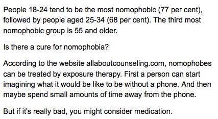
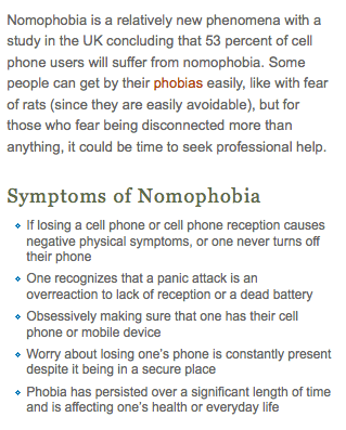
And once more showing the echo chamber in full force, here is a section of allaboutcounseling.com’s article on nomophobia:

The original survey says nothing about “symptoms”, but now we have a “real illness” with symptoms not unlike other well known phobias, such as they ones I treat in my psychology practice. The conclusion that “53% of cell phone users, based on the Securenvoy polling will suffer from nomophobia” is plain laughable.

So what was the original 2008 article which first mentioned Nomophobia?

Well, it seems to come from the UK Post Office who also commissioned a study of more than 2,000 mobile phone users by YouGov.

It’s “telecom expert”, Stewart Fox-Mills said:

“Nomophobia is all too real for many people.

“We’re all familiar with the stressful situations of everyday life such as moving house, break-ups and organising a family Christmas.

But it seems that being out of mobile contact may be the 21st century’s latest contribution to our already hectic lives.”

So this is the inventor of the term, it seems, as even Wikipedia shows no earlier citation than this 2008 UK survey.

And my brief research into Mr. Fox-Mills suggests he isn’t a psychologist, but the Head of Marketing for the UK Postal Service. (I tried to locate the original research at the Royal Mail’s website, but the link was dead).

So it seems every few years, as smartphones continue to evolve and become the standard communication device, we will see these same surveys dribbling out, the mainstream media echo chamber leaping onto it, dial a quote researchers and dare I say it psychologists asked for their opinion to give the fluff piece gravitas, and more members of the public either thinking they have an illness, or poking fun at psychologists for making up illnesses to drum up business.

What is true it seems is that the old saw of “Follow the money” holds true for Nomophobia, and it’s a pity the Newspaper of Record, the New York Times, has got itself caught perpetuating nonsense when a little research could have steered the story to something more useful and interesting, such as the history of moral panics due to generational adaptation to things technological.

UPDATE (June 26, 2012):

I located the ZOMM bluetooth-powered device while googling around looking for Bluetooth 4.0 specifications for an upcoming blog post. I so like this easy and inexpensive potential solution for lost iPhone and Android devices (as well as iPads, and more) I thought I’d include a promotional YouTube video, below. Enjoy!

Aside

If memory serves correctly, reality TV shows have been around for about a decade starting with shows like Survivor and Big Brother. Others may argue that shows like Candid Camera, started and hosted by Alan Funt, were the real beginning … Continue reading