Last week I showed you some advanced text rendering options for Apple’s Keynote presentation software.
Following the first part of a two-part workshop for psychologists, conducted this past weekend, I wanted to show how one can bring in hand-written text appropriately onto a Keynote slide so as to keep the presentation spontaneous and engaging.
In this case, I was introducing colleagues to how the iPad could be utilised in practice, and started with how Steve Jobs introduced this “magical device” in January, 2010, to see it initially panned by its critics, then become the fastest uptake of an computing device.
I took some screenshots from the keynote, eliminated some text elements, then introduced annotations by hand. If your preference is to see how to use Keynote in a basic fashion, there are many tutorials on the web to seek. I’ll be looking to demonstrate more unusual uses in future posts.
Each Apple keynote, such as the one delivered last week showing new MacBooks and the AppleWatch, brings with it much excitement and anticipation from a variety of audiences.
Tim Cook, as the Ringleader corralling the variety of speakers – some from within Apple, others from associated companies displaying their wares – likely has the final say over the form of the keynote, having perhaps learnt at the feet of keynotemeister, Steve Jobs.
I don’t think it’s my imagination but I do believe since he began this central role some keynotes ago when he formally became CEO (not just Jobs’ interim stand-in), Tim’s presentation style and confidence has vastly improved.
I no longer cringe at what appears to be his earnest but seemingly inauthentic speech patterns. He truly seems to have come into his own and is really enjoying his role of ringleader in what can often turn out to be a three-ring circus of various product displays during the keynote.
The challenge he has is recognising how to deal with the variety of audiences Apple keynotes attract.
Thinking about who your audience comprises is one of the things I speak of consistently during my workshops. Audiences for Apple’s keynotes are diverse. From investors and shareholders, through to its own employees – maybe learning of Apple’s products for the first time such is the secrecy within the Apple campus – and then going on to the general public, the enterprise, education, religious organisations and perhaps a never-ending list of Apple users and non-users alike.
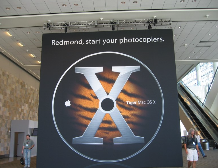
There is of course another audience – Apple’s competitors for whom Apple once displayed a “Redmond, start your photocopiers” banner in the Moscone centre during one Macworld Expo introducing OS X Tiger. Now it would likely to be: “Seoul, start your 3D printers”.
From Extremetech.com
There is perhaps one other group for whom Tim and his presenting team give little consideration.
There is a group of people, like you have come to this website, who consistently look at these keynotes for indications of where Apple’s flagship presentation software, Keynote, may be going. It is here that we see Apple’s live beta testing of new features it is considering for the next upgrade to Keynote.
At its introduction at Macworld in 2003, Steve Jobs famously said that he was Keynote’s main beta tester before its release as a stand-alone $99 product for the public to buy. (Those 5000 attendees at the 2003 keynote were lucky enough to get a free copy, plus a free iSight firewire camera). So, each keynote, a group of Apple Keynote users carefully follows the presentation, not just for the content, but for the process of delivering the content.
What’s become clear since Tim took over has been the space and time given over to high production value movies inserted into the keynote. That’s because the processes of manufacture that Apple is now employing are so complex words alone are insufficient and if a picture tells a thousand words then the movie tells 100,000 words.
No doubt, as you continue to go to others’ presentations and perhaps give them too, you will see more and more people inserting movies, and I do believe there’s a fine line to be drawn between just enough and going overboard.
I also believe Apple has begun including more animations, not necessarily those deliverable by Keynote, in its efforts to best illustrate the workings and philosophy of its products.
The Main Course (Entree)
In this blog entry, I want to focus on a text insertion method I have been employing for a number of years, but which I saw included in last week’s keynote, perhaps for the first time, but for once in very clear view.
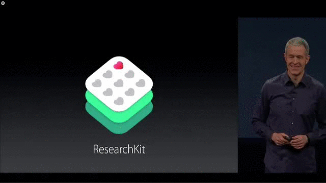
Fortune reports on Apple’s plans for Medical Research at SXSW 2015
It’s featured in what was a surprise inclusion that none of the rumour sites picked up on.
Yet it received almost universal acclaim from websites, developers and of course the medical community. I’m speaking of Researchkit, and new relationships Apple has forged with a number of international research institutes investigating some of the world’s most pressing chronic health issues. Perhaps the icing on the cake was that Researchkit was also to go open source and not be restricted in the long term to Apple devices.
Tim Cook himself did not do the Researchkit demonstration, but left it to senior vice president of operations Jeff Williams. If Jeff has done a previous Apple keynote, I can’t recall, and a few people have suggested his presentation lacked polish.
That seemed to make no difference at all to most in the audience who grasped almost immediately the importance of Researchkit. For many, it would have been an example of how Apple can use its technology muscle to give back to the world.
Jeff had three main points he wished to make. He could have used a tried-and-true bullet point method, as most other presenters would have. But instead he chose to use some animations to bring in each point as a stand-alone message. I have used the same technique in many of my own presentations for the last couple of years, so it was great to see it validated in an Apple keynote.
I’ve taken a section featuring Jeff from the keynote, and I’m going to show you how I can reproduce it so that you too may include it should you find a practical reason to do so. It’s one of a number of ways to bring text onto a slide in a meaningful way, rather than simply select text on the slide and work your way down a bulleted list.
I have converted the MP4 video from Apple’s own podcast into a GIF which will replay over and over again, so you get an idea of what we’re trying to do here.
It starts with Jeff, to the right, and the research kit logo centre screen. The logo then moves to the left, leaving “white space” for the text to fill.
As you can see, the entry and exit of the three sentences are done by a cube animation. We first saw such an animation highlighted as a slide transition when Jobs first introduced keynote more than a decade ago, and I recall thinking to myself when I saw it, that this was not your father’s PowerPoint.
In later versions of the cube slide transition – now available but poorly rendered in PowerPoint, and perhaps now overused in Keynote – the effect has been applied to text and object rendering within a slide (cf. transiting between slides).
Rather than use the blog entry here to describe what I did to replicate Jeff’s keynote, I created a YouTube video walking you through the various steps I took so you can follow along and stop it where you need, while you duplicate what I’m doing in your own Keynote file.
We’re currently in the throes of Apple changing the look and feel of its operating systems.
iOS 8 has just been released, revealing the influence of Apple Senior VP Jony Ive in bringing a flatter look. Yosemite is around the corner and it too will show a quite different feel from the desktop operating systems of the past few years.
When Apple makes these large scale changes, it introduces design memes which are often copied. Witness the original Bondi Blue iMac of 1998, and how it changed not just Apple’s design standards, but that of many other technologies, bringing multicoloured translucency to many non-IT products, for better or worse.
In iOS8, Apple has introduced Healthkit, a series of services combining both apps and hardware which resides on your iOS devices.
Below is a representation of some of its services:
Here, on the left you can see the Dashboard, with Calories burnt in orange above a Sleep measure, in blue, below. On the right, you can see a variety of health services and measures incorporated into Healthkit.
I now fully expect that these visual representations of data points will become a design meme many will choose to follow, with their crisp sharp images and icons.
(UPDATE: The folks at UI design outfit, Mercury, have offered a graphic of iOS8 elements here. Below is the healthkit range – click to enlarge).
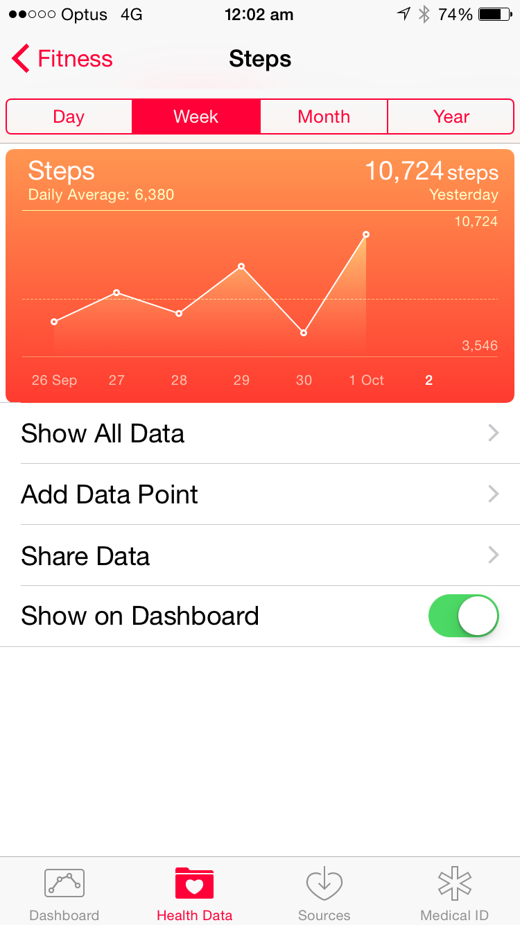
Here’s a screenshot I took of my own iPhone 6 screen showing steps taken these past few days:
I want you to note Apple’s use of dual advanced gradients. One is the entire orange soft edge rectangular shape containing all the relevant data, chart and information, going vertically from an orange to an almost blood red.
But I want you to also note the line chart showing how many steps I took the last few days, from September 26-October 1. Note in particular the area under the series of white lined data points, which too has a gradient from light orange to a darker hue.
I wanted to know if this design meme could be replicated in Keynote unassisted by third party drawing tools. This is one way I hone my Keynote skills, by setting myself challenges to reproduce what may have been constructed in professional design software.
The task then was to create an advanced gradient embedded on an advanced gradient.
In the video below, I walk you through one set of solutions, so that those with rudimentary Keynote skills can learn to apply some of the software’s deeper elements, such as grouping, drawing, outlining, gradients, colour matching, opacity and layering.
Bear in mind, the means I show may not be the only way to do this, and if you have more economical means (i.e., less mouse clicking), let me know in the comments.
In January 2003, when Steve Jobs introduced Apple’s presentation software, Keynote, at Macworld, he emphasised its “cinematic” qualities. By this he meant its adroitness using high quality images, text and transitions between slides. His presentation at Macworld elicited many “Ooohs” and “Ahhhs” when he demonstrated cube and dissolve transition, something the dominant platform of its day – Microsoft’s Powerpoint – could not perform with such slickness.
Jobs then elicited many cheers when he announced the $99 Keynote would be given free to all the Macworld attendees, and indeed, just like Powerpoint had become the first part of the Microsoft Office puzzle to form, Keynote became the first part of iWork.
The history is a little more political in a sense, however. 2003 was the year the five year agreement between Apple and Microsoft was to end. The story is now well known but often misinterpreted that on his return in 1997, Jobs declared the desktop wars were over, Microsoft had won, and Apple didn’t need Microsoft to lose for it to win also. As a sign of good faith, and as part of a legal arrangement due to its use of Quicktime technologies, Microsoft invested $150 million of non-voting stock (often said to have saved Apple from the brink of bankruptcy by those who insist Microsoft “saved” Apple), and Apple gave Internet Explorer pride of place as its browser of choice. Microsoft also agreed to continue developing Office for the Mac for five years.
Some would say this was a very important vote of confidence in Apple, as well as perhaps preventing accusations of monopoly operations on the part of Microsoft. The full story can be read in any number of places, but perhaps start here.
Almost twelve years later, the world of technology is a very different place. But one aspect hasn’t changed much at all, despite the evolving use of technologies and their increasing power, and that’s presenting complex information to a variety of audiences, something that forms the basis for this blog site.
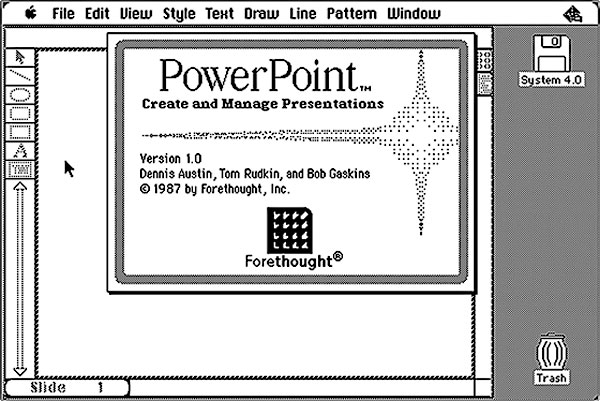
It still feels to me as I travel locally and internationally that many presenters still present as if they’re using overhead projectors, for which the predecessor to Powerpoint – Forethought – was developed, so that the Macintosh Plus and Apple’s Laserwriter could produce overhead transparencies.
These presentation remain text and chart heavy, and of course if all you show is text, there is no need to give consideration to how you transit from one slide to the next.
But of course film makers, from the time in the early 20 century when film could be edited and glued back together, understood the role of transitions in helping tell a story, especially when that story was fictional. Do remember that in its early days, films usually depicted real life events, often biblical or historical in nature, and eventually evolved to create motion pictures featuring new stories.
Transitions between scenes became a tremendously important audience cue, telling them if they were to be transported back or forward in time, or to another location, or into a thought sequence of one of the characters, and so on.
They formed imaginary bridges between scenes, allowing – along with the editing process – for filmmakers to shoot out of sequence. A language of transitions was created, and it was this vocabulary that Jobs referred to in 2003, distinguishing Keynote’s cinematic qualities from that of the more pedestrian Powerpoint.
It should come as no surprise that Keynote was developed for Jobs’ own style of presenting, having its origins – at least from a design point of view – as a NeXT application, Concurrence. This occurred at a time when Jobs was making his second fortune, taking ownership of Pixar, and steeping himself heavily in the machinations of the film industry. (Do locate that link to Concurrence for an exceptional first hand insight into the origins of Jobs’ presenting skills).
Both Powerpoint and Keynote distinguish themselves by their various themes, builds and transitions. There is a vast third party market for themes, and one only needs to attend a few science conferences to see how regularly certain Powerpoint themes appear, almost as if to say “This is the default for Science Presenting”.
Apple itself for its own elaborate keynotes rarely strays from the Gradient theme, and many Keynote users stay with this for their own presentations. Transitions between slides however do not see a third party plug-in system, unlike that for Apple’s professional moviemaking siblings, like Final Cut and Motion, the latter allowing you to create your own transitions for Final Cut.
These are professionally oriented programs. Keynote can be used for school projects as well as multimillion dollar deals and also appears on your iPhone, iPad and laptops of lower processing power. I’ve always wondered, and occasionally written, if Apple will introduce a plugin system for its builds and transitions, expecting or at least half hoping that with each update or upgrade of Keynote, this feature would be added.
Alas, even at version 6, Keynote’s transitions remain immutable; indeed, some got left out in going from version 5 to 6 to allow greater parity amongst all versions of Keynote, including online. Another aspect of version 5 that was overlooked, but thankfully now included in the latest version of Keynote, is movie transparency. That’s important for the next part of this blog entry.
The other features I had expected would make their appearance by now would be some kind of Apple timeline in Keynote for making more precise builds and transitions, and that of grouping and naming items. Group several items into multiple groups on the one slide, and they’re all named Group, not even Group 1, Group 2, etc. Combine that with less than stellar manipulation of layers on a Keynote slide and you have a lot of frustration at your finger tips. Not enough to send me over to Powerpoint, but the Microsoft product has certainly done a lot of catching up in recent upgrades, although it remains less than cinematic in its output.
So, is there a way to introduce new transitions into Keynote, ones that better help you tell your story and help you stand out from the crowd who are going to town using cube transitions and other overused elements?
Well, yes, in the shape of Telestream’s Screenflow software, one of several “helper” applications I use when creating my presentations. That in combination with another third party maker of transitions, Flowtility.
Screenflow may have started out as a screen capture tool – a feature that’s now even built into the current Quicktime application – but it is now way more than that. It is still a great tool for developing training tools, showing how users how to become familiar with the operations and functions of applications. It comes with a timeline, sophisticated means to add media then manipulate them, text rendering, and so on. And it also comes with built-in transitions, just like Keynote and some too have been borrowed from the motion picture business.
There are times when I want really precise build timing on a Keynote slide but sometimes, it’s just too laborious to use trial-and-error, as it stands now. So what I do is have all the elements and their builds on a slide in “as-close to final but not perfect” fashion then export that slide – on its own – as the highest quality Quicktime export I can. That file is then imported into Screenflow when I can make adjustments to fractions of a second, and even add new elements if the mood strikes me.
When I’m satisfied, the Screenflow file is exported, once more as a high quality Quicktime file, into Keynote where it will be observed by a none-the-wiser audience, and perhaps intrigue any Keynote users as to how the effect was done.
As a corollary, many Powerpoint heavy users know I don’t use their favourite presentation tool because some of the effects can’t be achieved in Powerpoint.
Unfortunately, as with Motion and Final Cut, you can’t “lift” Screenflow transitions and dump them into Keynote in some ersatz plug in system. But you can use them, and some of the third party transitions now available for Screenflow, in Keynote with a little sleight of hand. These third party transitions, from Flowtility, are really quite interesting, but as usual, one must be cautious rather than kitschy.
Flowtility allows you to download transitions as transparent movie files which can then be imported into a variety of apps such as iMovie, and of course Keynote. Here is a selection of its movie files added to a Keynote file.
In this case, the transitions occur on the slide, not between them. Your task is to remove the items your transiting from at some midpoint of the movie’s playing when the entire slide is obscured, use the Disappear build out feature, then immediately use the build in Appear feature for the new element you wish your audience to see. See my instructional video below to see how to do this:
In the case above, you don’t need to use Screenflow at all – just the transparent movies imported into your Keynote slides. If the movies play too fast or slow, find a copy of Quicktime Pro 7 which allows you to change the playback speed, up or down. This will allow a greater or lesser pause time when the slide contents are obscured.
In the next video, I have instead used another Flowtility pack imported into Screenflow. I have used an imaginary book as the element on the slide to be introduced or whisked away, but for the video below, the sequence looks as follows, from this Screenflow screenshot:
You can see the image we are working with, to its right are various media I can choose from, and below is the timeline with a thin red bar showing at what time point the transition – a camera shot – will occur.
The one image is “stretched” for a certain time – a few minutes in this case – then a cut is made every few seconds. Each cut, like an edited strip of film, is shifted to overlay the previous cut, and Screenflow automatically creates a transition area, the default of which is a dissolve transition, although this can be reset to the user’s preference.
One then selects each transition from a gallery, including the defaults, plus the addition of new purchased items. A small snapshot of each transition is embedded so you can see a static preview. In this way, you can “fake” a transition from one slide to another, by having a transition occur as a movie on the one slide. Here are some of Flowtility’s Pro transitions:
Your task is to know the content of the slide at the beginning pre-transition and what it will look like at the end. Your audience will be none the wiser.
There is one aspect you need to know.
Often, Keynote’s own transitions manipulate what’s on the screen and distorts or animates it as it moves to the next slide. Magic Move is a great example, and still underused by many. Others like Droplet manipulate the image before the audience’s eyes.
Screenflow’s transitions can do some of these too, but they are essentially parallels to Keynote and offer nothing new. The effects not seen in Keynote which interest us here function as you will have seen from the sample video above by obscuring the objects on the slide then revealing them.
That is, for a moment, the slide’s content is not seen, and this is where – like a magician’s sleight of hand – you replace one image or set of objects with a new set, which in fact is your new slide. This all occurs on the one slide, because what the audience is witnessing is a movie exported from Screenflow.
The next Keynote slide can be the end result reconstructed as a whole – or even a screenshot transited to – with an “Appear” transition in Keynote so the audience is none the wiser. This can be done with a click manually, or automatically once the Screenflow movie has stopped playing. Just remember which style of transition you’ve used.
The new slide could conceivably contain all the elements of the previous slide, such as text, images, backgrounds, etc., but represented statically. They then can be built out or moved individually, depending on your story.
So, that’s one way to add some new transitions to a familiar friend in Keynote. More advanced users may wish to play with Apple’s Motion software, but for many this will be going past the point of necessity.
On the other hand, I think all presenters who use Keynote would do well to download a copy of Screenflow and explore its virtues. In a forthcoming blog article, I’ll discuss how I use its ChromaKey or Green Screen effect to create more engaging webinars in concert with Keynote.
This year its organisers wanted to pay particular attention to the place of Technologies in mental health, and so I was tapped to offer a series of talks as well as presentation skills workshops.
The talks were part of a seminar featuring how to best understand how current and imminent technologies have a role to play in mental health in schools. The presentation skills effort was a one hour talk, showcasing the highlights of my half day and longer workshops.
All in all, there were about a dozen speakers, comprised of authors, psychologists, researchers and technologists including those from the Australian arms of Microsoft and Google, who visited the cities of Brisbane, Perth, Melbourne and Sydney.
The arrangement, as told to me by the organisers, was that each city would receive the same presentations. On the surface, that sounds ideal and easy: the same talk four times. But as it turns out for a few of the presenters, including myself, this wasn’t ideal and in fact we gave variations for all of our presentations. It was an iterative process, learning from each presentation what worked best and which slides and ideas appealed to the audience.
By the fourth conference I felt I had “honed” my presentations and delivered the “biggest bang for the buck”; that is, in the time I had these were my most impactful presentations.
During each of the conferences, conducted over two days including large auditoriums and break out rooms for smaller concurrent workshops, I was able to attend as an audience member and watch others in action.
For each conference, there were times when all the attendees (400+) would gather in one large auditorium to hear the speakers, including me on technologies.
What I, and the organisers, found interesting were those highly paid professional speakers who gave the same presentation each time. I was perhaps the least known to the audience of all the presenters and likely the least financially compensated, so I had to prove myself and win over the audiences with my content and presentation style. Which is why I welcomed the opportunity to present and improve each time.
By the fourth conference, three weeks after we had started, the organisers appeared a little frustrated with the “sameness” of the highly paid speakers. Perhaps they had become insensitive to the content after so many repetitions, or perhaps they became more critical of the content itself and the delivery style. Perhaps they had become more objectively reflective of the presentations without the anxiety of how the conferences were going over. (By the fourth, the series was considered both a financial and educational success).
I shared with the organisers my own sense of certain presenters “going through the motions”, whereas I had taken on board feedback and my own personal debrief to change my presentations. I was a little surprised when the organisers shared their own sense of disappointment and unmet expectations. Their highly paid speakers had been a drawcard and given the conference series some gravitas. But by the fourth presentation, the presentations had lost their punch and like the Emporer’s Clothes, were revealed for what they were: A collage of ideas, on passable slides, hung together with TED-type videos.
This was brought home to me in one of my presentation skills sessions when a very perceptive audience member, who had witnessed one highly paid speaker address the entire conference and had come away clearly disappointed, asked me about videos in presentations.
Usually, if I’m asked about videos, it’s more to do with issues of copyright, or more mundane aspects such as how to import videos into their Powerpoint stacks. (Thankfully, more recent versions of Powerpoint have made this more Keynote-like, with some built-in editing features in addition).
So, during my last workshop, I was taken aback when the audience member asked if there’s a scenario where you can put too many videos into a presentation. It was in fact the same thought I’d had the same morning witnessing the highly paid speaker I’ve referenced previously.
When asked of her concerns, the audience member seemed somewhat unable to describe quite what it was that was concerning her, which made it difficult to give a good answer. It also made it difficult that the speaker in question was in my audience!
I offered that there are no “rules” one can refer to, such as “no video more than 3 minutes long”, or no more than n videos per 30 minutes of presenting.
But afterwards, it bothered me that with so many TED talks being repurposed, presenters are now becoming lazy, using videos like old-fashioned cue cards or text-heavy slides to convey complex ideas. And this is what the conference organisers had shared with me, without being as specific: that their well-paid speakers were using others’ work to illustrate their ideas, and rather than using one or two very cogent and on-point videos, their presentations were now more than 50% taken up with the work of others.
Now, there is skill needed to locate and then include in one’s talk appropriate video materials. But it’s clear too that there comes a point when audiences see through this, the presenter has lost control of the presentation and instead has become the “host” of a collection of videos, like a version of Australia’s or America’s Funniest Home Videos.
Let’s review for one moment the obvious video failures we see over and over again in conference presentations by presenters who need to up skill their mechanical aptitude, such as:
1. Rather than smoothly transitioning to the slide embedded with a video, they need to drop out of the presentation stack (revealing the remaining 300 slides), locate the video on the desktop or in a folder nested three levels down, and open it in Windows Media Player so we can see the Play and Fast Forward buttons, and how much time remains. If we’re unlucky, they will not know how to have it play fullscreen, so we see a portion of their Windows desktop screen and all their short cuts.
2. The presenter hasn’t tested the audio system so the audience is either blasted or the sound is either mute or too low to hear. Then we watch as they “click, click, click” the volume button (if they can find it). Memo to Mac Users: Make sure you go to System Preferences->Sound->Sound Effects and leave the “Play feedback when volume is changed” unchecked, (below):
3. Presenters have chosen video of such low resolution that it has to be played the size of a postage stamp lest it pixelate so badly it becomes unwatchable.
4. Being a little smart, they drop out of their presentation, go to the YouTube page they have bookmarked, then wonder why the video isn’t playing (um, you need an internet connection) or if there is a connection it is so poor the video continuously buffers.
5. Not knowing how to edit using video software, they have dumped a half hour video onto a slide, haven’t cued it up, then dragged the slider to “about the right position” telling us what they want us to see is about to start “… about now….”
These are some of the mechanical issues so often seen at conferences.
But what of the conceptual errors in presentations?
The biggest problem as I see it is one amateur joke tellers make: they haven’t properly set up the story, so as to deliver the punchline and grab a laugh.
In the same way, I’ve witnessed presenters simply drop into a video and while it’s playing explain what the audience is viewing and why it’s relevant to their talk. Not just is it splitting audience attention – “what do I listen to – the video or the speaker?” – but it can easily leave the audience in a state of unease and confusion.
In my own experience, I spend time “setting up” the video or at least the point of shifting gears away from having the audience attend to what I’m saying, to what is on display on the screen. This is no different than a stage magician controlling the audience’s attention in order to direct or misdirect them.
So I might say, “One person who seems to understand this principle, is Dr. X. In addition to her writings, last year she presented at Conference Y, and I’d like to show you a little of her presentation. In particular, as you view this, notice….”
I then get the heck away from the screen and stand to the side of the room observing the audience. I always show video full screen, or embed them in a familiar object, such as a TV screen image, as below.
What you see above is a slide from a Keynote 6 stack from my Positive Schools technology presentation. It shows a scene from the “Crazy Ones” Apple advertisement of 1997. I placed the clip, which I finished at Edison portrayed in a still shot, in a portable TV set of the era, to set the scene.
The idea was to introduce the video, and then stop at this point and ask the audience if they recognise any of the people seen, such as Richard Branson, Maria Callas, etc. I then segue into a discussion of Edison and his inventions and how they upset existing industries including energy (gas), and music (Live musicians).
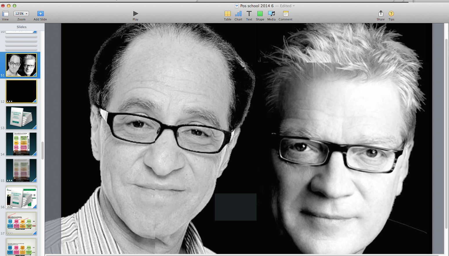
A curious aside: For my Melbourne presentation, I had discovered a wonderful video from an Apple Distinguished Educator called Ray Nashar. I didn’t know it at the time, but after my presentation an audience member had tweeted to Ray that I had used his video in my talk. I then found out he was a local teacher.
Below, is my Keynote slide where I introduce his short video, created entirely in Keynote. I introduced the video by first repurposing some of his slides, placing cropped images of the two gentlemen below on the one slide – they are Ray Kurzweill and Sir Ken Robinson – then going into the video having set up who these featured people were and why was including Ray’s video in my talk.
As it turned out, this was one of the most requested links I was ask for after my talk, via email or Twitter.
Here’s Ray Nashar video, Education is a Conversation, below, and you’ll see why it was a little effortful to create the combined slide, above:
Videos in presentations must have their own reason for being there
Each presenter will develop their own means by which to introduce videos, but they must have a reason for being included, rather than simply fill time or make the presenter’s job easier.
Some presentation trainers might quote you ratios or percentages of video to overall presentation, but I can locate no empirical evidence to show what is best for any given audience or subject.
The overarching principle – ALWAYS – is that you, the presenter, remain in charge of the presentation, even if you’re showing videos of people of great celebrity or fame. They become YOUR support acts, and your audience will want to come to appreciate your wise and clever selection of brief clips which best illustrate your ideas, in addition to what you say, what you ask, what other graphics or text you use, and what you ask the audience to do, implicitly or explicitly.
Just like a magician with his or her props, which help to tell a story for which there is a surprise punchline, your video selection helps your audience stay engaged, reinforces your message, and helps you remain authentic and authoritative about your presentation subject.
As with your slides, they are not your presentation, but supplementary elements. Carefully chosen, embedded without showing how the magic is done (i.e., dropping out of your presentation to enter Window Media Player etc.) and of decent resolution and sound quality, your included videos can take a humble presentation and turn it into something special, making you a special presenter.
Don’t give away your power of engagement by having the videos tell all your story, but have them as your support act, assistants or props where the audience attention leaves and comes back to you on your command.
I’ve been travelling around Australia giving workshops to teachers about presentation skills as well as technologies and mental health. Few teachers have ever heard of Apple’s Keynote presentation software, as I discovered when many came up to me after my presentations to ask how I did what I did – the why was pretty obvious!
I’ve also in the meantime been asked to become part of my professional society’s organising committee for its 50th anniversary conference in Queensland in 2015. I was part of the organising conference for its 25th anniversary where I was much involved in both the social program as well as the media coverage.
I think this time around my involvement will be concerned with social media, something that didn’t exist as we know it now all those years ago.
So with this in mind, I was delighted to see in my Zite feed today a blog post from a professor of Sociology, Steven Fuller, now at Warrick University in the UK.
When I read the blog entry, I tweeted, “Halleluya, Brother”, so happy was I to see someone who also wished changes for academic conferences.
You can read the bulk of them at Fuller’s blog, but let me highlight (with the author’s permission) his first thee principles for presenters:
1. A conference is a distinct channel – perhaps even genre – of academic communication. It is not a watered-down or zombie version of the academic print culture. It requires its own ‘peer review’ standards that do not simply trade on the conventions of academic writing. Thus, instead of abstracts, prospective presenters should send video clips of 1-3 minutes that convey what will be said and how it will be said.
2. Presenters should be strongly discouraged from reading their presentations. More generally, presenters should be forced to make a special case for presenting material that is already available in print. The norm for conference presentations should be new material – unless a presenter hails from a field with which conference members are unlikely to be familiar.
3. Presentations heavily reliant on Powerpoint should be gathered thematically into what are essentially high-tech poster sessions rather than be given stand-alone speaker slots. This may mean that a larger percentage of the space in the conference facility is given over to such sessions. Indeed, organizers may wish to consider that the explicitness of many Powerpoint presentations render the human presenter redundant. Thus, interested conference goers may simply be directed to a computer terminal where all the Powerpoint-based presentations are loaded, perhaps with recorded voice-overs from the absent presenters.
I like these sentiments – a lot!
Fuller clearly understands that academic conferences need to change, and how presenters are selected and expected to present is different from that which pervades conferences now, based almost exclusively on the same principles as for paper publications.
He recognises that conferences are not the place for the regurgitation of printed articles, but are a meeting place of ideas, and where presentations to large groups need to be exceptional.
It neatly follows my lectures to teachers this past month where I have described the history of moral panics down the centuries when new technologies have been introduced. Whether it be the loss of jobs or whole industries, our brains are changing, “knowledge is power” struggles, or issues of privacy, how we change technology and how technology changes us is an important ongoing discussion we need to be having.
Certainly, technologies like Powerpoint and Keynote and Prezi are changing how we distribute knowledge, and readers of this blog will be aware of my beliefs that it’s not all positive, especially in the case of Powerpoint. While many still follow the meme that Powerpoint is merely a tool badly used by too many, I fall into the camp that it is a very poor tool to begin with for knowledge distribution, especially in an age which is demanding far more audio-visual literacy, as Thompson points out.
A few choice quotes from the book:
and
I don’t know that I need to place too much context around these quotes about Powerpoint – the astute reader will get the picture. It’s one of the things I have been banging on about consistently in my Presentation Magic workshops for those who attend: that the world of knowledge transfer, sharing and engagement is undergoing a radical shift and the usual means – i.e., traditional and socially normed – will no longer cut it as the 21st Century progresses.
Using software merely as an advanced overhead projector system – for which Powerpoint was originally developed for the Macintosh in the mid-1980s is a dead technology walking, no matter how you spruce it up, as we’re about to see when the next version for Windows is released soon.
The next generation of learners, employing their iPads in school, will be using Keynote or equivalents available on the iPad since 2010, with Powerpoint on the iPad mainly used by those currently in industry compelled to use the desktop version and needing some sort of tablet parity mobility.
But may I suggest, a whole generation of young people will never use Powerpoint. Kind of makes a mockery of all the educational administrators all those years ago who insisted their schools to standardise on Microsoft products like Word and Powerpoint because “that’s what the kids will be using when they enter the workforce in ten years”.
Many who attend my Presentation Magic workshops are often in for a surprise. Some come along hoping to learn more about the mechanics of Keynote or Powerpoint; some to overcome their performance anxiety, and others because they’ve been before and want to know what new goodies I may have to share in an updated workshop.
In truth, I cover a lot of these bases, except the one about the mechanics of Powerpoint, but then again there is no shortage of coaches for getting better at working through all that Powerpoint has to offer.
But as I frequently mention, all that sage Powerpoint advice hasn’t improved the “presentationsphere”, especially in the worlds of science, medicine, engineering and the law.
No, what attendees get is a day of reasoning about why it’s important to change the way we present, to understand to whom we’re presenting, how to best take our complex messages and make them accessible and memorable, and then see first hand how I think through all of the above, with examples I have constructed, or in the case of others’ presentations, deconstructed.
This year, I returned to Macworld/iWorld after a year’s absence to show how my presentations have been affected by the introduction of Keynote 6 on the desktop.
I drew about 50 to the all day workshop, and SRO to the 45 minute quick look I gave a few days later.
It was at the Quick Look session that I momentarily lost my cool. In truth, I tried to pack too much into a brief session, including how to use Keynote with Green Screen or Chroma Key effects, much like you see weather presenters on the TV news.
I wanted to show how understanding where the presentation landscape was moving – to a much more interactive and less linear style – would drive the future use of Keynote, and change how its users thought about presentations in general.
So I was feeling somewhat under the pump, as the saying goes, juggling a variety of Keynote stacks, so I could move swiftly between ideas.
Things did not start well when I played a game of Keynote-based Family Feud, selecting two member so of the audience to guess the top answers to the question,
What are the best new features in Keynote6?
The intention was to use the Keynote 6-based hyperlinked stack of slides to highlight some of its improvements. This is based on an old stack going back to Keynote 3 or so, when hyperlinking was introduced to Keynote. It’s a way to have fun, and show the power of such a feature to “move around” a slide deck with a live audience and bring more engagement to the presentation.
To do it, I use my iPad to mirror the projector data display, and by pressing on its screen, can either produce a “buzz – you’re wrong” sound, or a “bing – you’re correct” sound, with which a numbered panel “cubes” around to reveal the correct answer and how many votes it got.
Unfortunately, the two competitors I chose were not sufficiently familiar with the possible answers, that I had to return them to the audience and turn it into an audience-wide activity. We got to all fiver answers in the end, and I was able to show some of the features. But it was also clear to me that for many in the audience, the switch to Keynote 6 from Keynote 5 was not the Little Shop of Horrors it had been for power users hungry for an update after almost five years.
Indeed, I would hazard a guess that for many, Keynote 6 and its equivalent on the iOS, was their first experience at Apple’s efforts on the presentation front.
This led me to the next part of my brief talk, and that was the justification for why it’s important to understand and use the best tools available to get across complex messages. As in previous workshops, I showed a variety of scenarios where presentations were being employed in unexpected scenarios, such as cruise ship lectures, sermons and of course MOOCS, the online training courses which have traditional universities quaking.
But I also wanted to say that in the world of science, those who endorse the scientific method, with their publications appearing in scholarly journals written in an academic style – devoid of self-reference and emotion – are coming up against opposing camps who do not have to hold to the same level of peer review, scientific endeavour, and who are well-funded.
I had in mind a video to show, one which I have used on various occasions, featuring the television performer, Jenny McCarthy, below, speaking on ABC television about dietary treatments for autism. I wanted to hold her up as a poster child for whom television wishes more of, because she brings “easy on the eye and ear” charm, even though her message(s) are often contradicted by the published data in scholarly journals. In the ABC TV news item, only very brief mention is made of a journal editorial in Pediatrics, the bulk of the time going to McCarthy’s personal experiences, which are contradicted by Pediatrics.
Now, almost everything I say in my workshops has been rehearsed and matched to the slides I show. When I go off-script, I usually render the screen black (the B key on your keyboard or a button on your remote) and have a discussion with the audience.
But in preparing to discuss why presenters need to upskill, and with my arousal levels already high with wanting to get through all material I had prepared (which needed a very tight adherence to allotted times), when it came to my introducing the science vs. anecdotal evidence argument (one characterised by Jenny McCarthy’s interview), I blurted out a phrase which I had thought about in preparations, but had decided was too emotional to actually mention.
What I said was,
“There are Barbarians at the Gate”.
This a two-part reference to firstly, a book and movie of the same name, the story of the leveraged buyout of the R.J. Nabsico company. It stars my favourite actor, James Garner, in a central role as his character orchestrates the aggressive buyout from Nabisco’s shareholders.
The whole movie is available to watch (it being a Made for TV HBO special) on YouTube here:
My use of this film title really is idiosyncratic. My thinking was to use the word “Barbarian” in the way many ancient societies had used it to denote those who did not belong to the mainstream society, whose values were uneducated and callous, and who had a disregard to seeking a society’s higher values and ethics.
The term itself has an incredibly rich history as a reading of Wikipedia will show.
…”at the Gate” is a reference to an imminent takeover. It’s my personal reference to the many threats to the pursuit of evidence as orthodox science best offers, compared to anecdotal evidence, folk lore, and that derived from politics, religious belief and the seeking of power.
It was my emotional recognition that contemporary science is losing the battle for the public mindset in such important endeavours as climate change, vaccination, evolution, and evidence-based health care, such as some US states’ refusal to fluoridate their water supplies. Some would include gun control efforts in health care too.
One of the ways it’s losing that battle is the across-the-board poor presentation skills scientists display as they present to themselves, and seem to have very little idea of how to present complex ideas to the general public.
It’s a lament I continue to mention in my own promotional materials for conference workshops were I say that presenters are expected to describe their research conforming to an evidence-base but usually present to their audiences with a distinctly non-evidence based means, the so-called Death by Powerpoint.
It’s a really serious challenge for scientists who hold themselves to a higher level of evidence, who couch their findings not in certainties but in probabilities, and whose language is replete with unemphatic suggestion. Non-scientists in contrast ignore such niceties and speak publicly far more often in certainties, hyperbole, and misleading statistics. They capitalise on the general public’s poor understanding of science, and its methods.
Others have previously joined the chorus, such as Richard Somerville, a scientist at UCSD, and science communicator, Susan Joy Hassel. Writing in Physics Today, October 2011 (PDF), they declare
It is urgent that climate scientists improve the ways they convey their findings to a poorly informed and often indifferent public.
They set out a number of hypothesis for this declaration as well as ways the indifference of the public can be overcome, especially how science uses language, as seen in this diagram below:
[ASIDE: Thus, I’m certainly not alone in recognising this gap between how science publicly presents itself, and how scientists think when they’re off the record. It’s why attending conferences is so important for professional development because it’s at lunch, or over coffee, or in a low-key networking event that leading scientists will speak more about their hypotheses and opinions – educated ones – and where one can learn so much. As a private practitioner in psychology, I try and abide by the evidence my betters in research provide, but it’s usually years behind what I’m discovering from my patients.
So while I allow the research-based evidence to guide my practice, thirty years of working with thousands of patients is not to be sneezed at, especially given the research can’t be descriptive of all the permutations and combinations of patient presentations (symptom description) I’ve seen over the years. As one of my supervisors once remarked, therapists learn the most from their patients, then the supervision of their work with patients, then from workshops and other professional development, and least from the first degrees. Professional knowledge “turns over” so fast one might have to start learning facts again as soon as one’s degree course is completed! END OF ASIDE]
There are very few scientists who know now to work the media, understand its games, and respond accurately yet firmly to journalist questions. It’s as if they’re always fearful their Head of Department is watching or the Fellows committee of their professional society is tut-tutting over some effort to explain complex phenomena in lay terms.
So we have few science media stars, or conversely, the few that exist are trotted out like the Usual Suspects such that in time their important message is lost through sheer familiarity.
What this means is that science and its practitioners must deepen the reservoir of talent who can reach out to the public with understandable and actionable message delivery. They must enrich themselves with stories the public can understand, rather than the story telling implicit in writing research-based publication: Introduction, Subjects, Method, Results, Discussion, References.
They must help the public understand in meaningful, visually elegant ways statistical concepts, probability theory, uncertainty, and confidence limits. So rather than being persuaded that 95% is a high level of confidence in one’s hypotheses, only to have an opponent say “but you’re not 100% sure, are you?”, scientists should offer up an understandable metaphor to throw back at their conservative interviewers:
“If you knew an area you wished to cross was 95% covered with land mines, leaving a random 5% free, would you take the risk of crossing; or, if you wished to swim across a river but knew that of the 100 people who tried before you only 5 got across with the rest being taken by crocodiles would you take the risk? Well, that’s how certain we are of…”
Concluding remarks:
All this means the modern skill set of scientists, at a time when conservative governments such as we have here in Australia are diluting the role of science in society, must encompass more than lab-based endeavours. It means starting with giving better presentations to themselves and the community, and seeing presentation skills as an implicit component of being a professional scientist.
Those in the sciences who dismiss these endeavours as not core to scientific endeavours might sooner or later find themselves without funds to carry out applied research, much less basic research.
To invoke another movie, All the President’s Men, scientists would do well to heed the words of Deep Throat to Bob Woodward: “Follow the money” to see how science is currently confronting barbarians who wish nothing more than to dismiss science’s values, methods and endeavours as an intrusion into their “entitlements” to carry on, business as usual.
Just arrived in Sydney to be greeted by some positive comments about yesterday’s post about Keynote’s improved presenter display.
While onboard UA839 for the 14 hour flight, I cracked open my MacBook Air with Mavericks 10.9.2 to play with some movies with transparencies I want to use for upcoming training workshops in Canberra.
In a previous post last year lamenting the lost features which didn’t make the transition to Keynote 6.0, I mentioned alpha channel movies which appeared with their black, rather than transparent backgrounds.
But onboard, it now seems this challenge has been solved and my dozens of professional alpha channel movies are now useable again.
Here is the official Apple Support notification:
This is all good news for Keynote users, and it appears we will be seeing a closer integration between iOS devices and Keynote on the Mac, such that you will have much better control of your slideshow, plus the ability to annotate slides on the fly.
We saw this with the release of Powerpoint for iPad last week, and the ability to draw directly on your slides will be a major opportunity to stay connected with a live audience and continue the shift away from the plague of linearity which creates passivity, not engagement, in your audience.
There remain a few deficiencies which I confronted in my presentations at Macworld:
1. MIA is Comments using Post-it notes acting as reminders on slides, e.g. for movies that start as black screens; multiple hotlinks on a slide, will hopefully appear in a further upgrade.
2. Linking to other slidestacks is still not possible. This is useful to create relatively seamless moving between stacks, and is another way to break the linearity of presenting. This way you can have multiple modules open for say, an all day presentation, and move to a module as the audience need arises.
3. The Presenter display remains fixed, without the ability to resize current and preview slides and builds. Some presenters prefer their current display to be much bigger; others like me, prefer the preview slide to be larger, so – like a drive past a billboard – one can quickly glance at the screen to recall the next part of the presentation story.
4. Smart builds – I think these are dead and buried. Too hard to use well, the Keynote team acknowledged as much to me when I met with them a few years ago, and they expressed disappointment that something unique to Keynote would not make the next update – at least that’s what I gleaned, rather than being told directly. (It helps to be a psychologist).
So, much like Final Cut Pro X users, we are discovering that those early lamentations might be short-lived and it’s worth the brief pain to master Keynote 6, even if it means redoing our Keynote 5 slides, and in some cases starting from scratch.
After all, those who started with Keynote 1.0 in 2003 knew we were starting afresh, and even without all of Powerpoint’s then bells and whistles, our use of Keynote would easily set us apart from the 99% of presenters at conferences and workshops.
On April 1, 2014 – just a few days after I had presented on Keynote 6 at Macworld in San Francisco – Apple produced significant updates for its three versions of Keynote – MacOS, iOS and iCloud.
In addition to new builds, a topic I will explore when I get back to Australia (I’m currently in LAX waiting my overnight flight), and some other features, its Presenter display has undergone a major improvement. It’s one that pushes Keynote 5 (and before) further into history, and hopefully is a forecaster of more significant changes to come.
Below is a video I created of some of the slides I used in my Macworld presentation. The story it’s telling is not important. What IS important is the screenshow of the Presenter display. Finally, the current slide – on the left – shows what is occurring in real time on the projected screen, i.e., the Mac’s output. Previously, you only got to see a still shot.
When Powerpoint updated to its most recent version on the Mac, it very much emulated the look but not quite the feel of Keynote’s presenter display. Not quite known for its graphics abilities, nonetheless Powerpoint was able to show realtime movement, animation and movies on its Current slide, something Keynote 5 embarrassingly could not do.
Perhaps today’s update to Keynote 6.2 has been hastened by the release of Office for the iPad last week; if so, that’s a good thing as competition for the best product and feature set will hopefully inspire better presentations.
There are still some major holes in Keynote – missing Smart Builds, and some concerns about movies becoming distorted when they move, something I’ll delve into more detail next week. But at least now when you import a Keynote 5 file into 6, and there are incompatibilities, you get a more detailed listing so you can explore whether it’s worth the upgrade, or better to stay with Keynote 5, or rebuild your slidestack for Keynote 6 (see below for a screenshot of the improved reporting table).
In a previous post, I began an excursion into how science presenters can be easily and unwittingly seduced into giving very poor presentations by dint of their training and facilitation of their professional association’s publication standards.
It was left with a complex diagram I often use in my workshops about IT where I try to persuade late adopter colleagues to review their relationships with technology and give thought to how best to bring themselves up to date (hint: buy an iPad).
The diagram was designed in 2008 by Nick Felton at the request of two New York Times op-ed writers, W. Michael Cox and Richard Alm, and his complex graph was then repurposed by Apple pundit, Horace Dediu, in 2012.
The link to the original NYT article is here, and the Dediu link here.
I want you to see in part how I use this diagram, employ Keynote in doing so in my workshops, and give you an idea of how I discuss it via my voiceover. It will begin a discourse on charts and graphs, one of the essential tools for scientists which can either make their presentations clear and engaging, or become utter turnoffs in their obfuscation. The video is 5 minutes long. I’ll wait…
What I wanted you to see is that it is possible to take a complex diagram rich with information, and interact with it to better engage your audience. And to combine another’s analysis of the same data but a different purpose using some of Keynote’s most useful elements – Magic Move – to make a segue between the two.
This leads to:
Unwitting mistake #6: Poor use of data-rich charts and graphs
Let me say at the outset that I have a rule of thumb that I apply to graphical portrayal of data:
Use these rich sources of presentation persuasiveness wisely. They are not things you show because science demands it, but because they serve a purpose. Because of the latter, you owe it to your audience to help them understand what you are trying to convey showing your graphs and charts.
There is a corollary to this rule of thumb, and it relates to a point I made in my previous blog entry about audiences varying between having superficial subject knowledge through to the profound. The corollary is this:
The less your audience knows your subject or is unfamiliar with the use of graphs and charts, the more you need to gently step through your graph, building up each component in a coherent story telling. The addendum to this applies the same narrative to hostile or skeptical audiences.
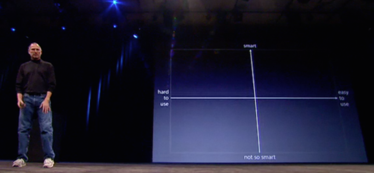
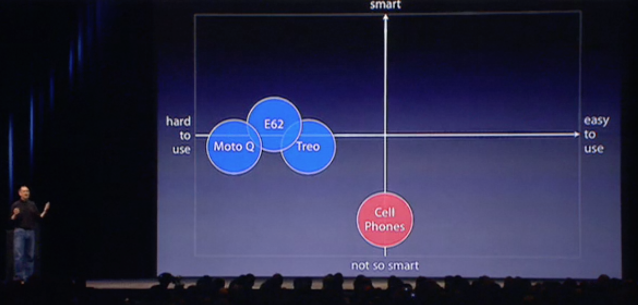
Let me illustrate with one of the greatest expositions of graphs as story telling in recent public memory. It starts with Steve Jobs introducing the original iPhone at Macworld in January, 2007. One where he embarks on a persuasive story of why the iPhone was created, and why it has a chance of succeeding despite various pundits and competitors saying its market was “mature” (unchangeable) and the iPhone was too expensive.
We start here with a screenshot, below, from Jobs’ iPhone keynote. If you have the entire 2007 keynote (available on iTunes or YouTube), it starts about 30 mins in. Jobs has just been discussing the properties of the current (2007) crop of “so-called” Smartphones, and wants us to know the iPhone has a place in the universe. He claims it’s because the current crop are neither that smart nor, in particular, easy to use. In other words, the current mature telco industry is saying, “You can have smart, you can have easy, but you can’t have both. We don’t know (or care) how to do that”.
For Apple, that is an industry worth challenging because the status quo has been accepted as unchangeable (A little like the science presentation scene, no?).
Jobs starts us on his journey of challenge – his narrative of why the iPhone is the right risk for Apple to take – with this simplest of graphs:
Jobs “cubes” this graph in, and then says,
“If you make a Business School 101 graph of a smart axis (Y) and an easy to use (X) axis….”
That gets an audience laugh perhaps because of Jobs’ use of a really simple graph together with his “I’m-almost-embarrassed-to-say-it” expression of, “Business School 101”. What Jobs is about to do is school the telco industry using the most basic analysis of why they are wrong. Next:
Jobs now slow builds in a circle showing the placement of the current majority of phones in use – dumb or feature phones – near the extreme of the “not so smart” Y Axis. They are zero on the X “ease of use” axis because that’s not why people buy them – it’s a given, and not a branding element. No one is claiming our phones are easier to use than our competitors, because all they do is make calls and send texts. (In fact, I always thought Nokia’s range of dumb phones possessed the most superior User Interface, compared to Ericsson or Motorola).
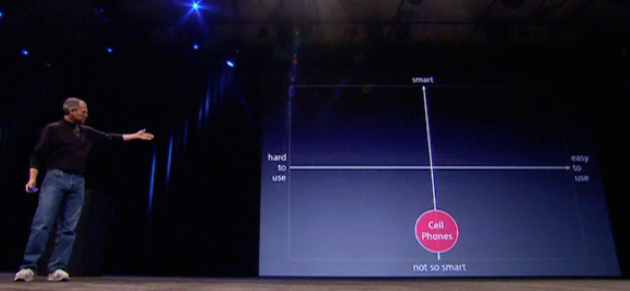
Jobs now wishes to make the case for where the current crop of alleged smartphones lies in his graph:
And he actually refers to them, something some of those in advertising would say is to break the Golden Rule of naming your competitors. But so confident is Jobs that Apple’s iPhone is a “leapfrog” above these (he actually uses that term, below) that he is not concerned to both name them, and later show them.
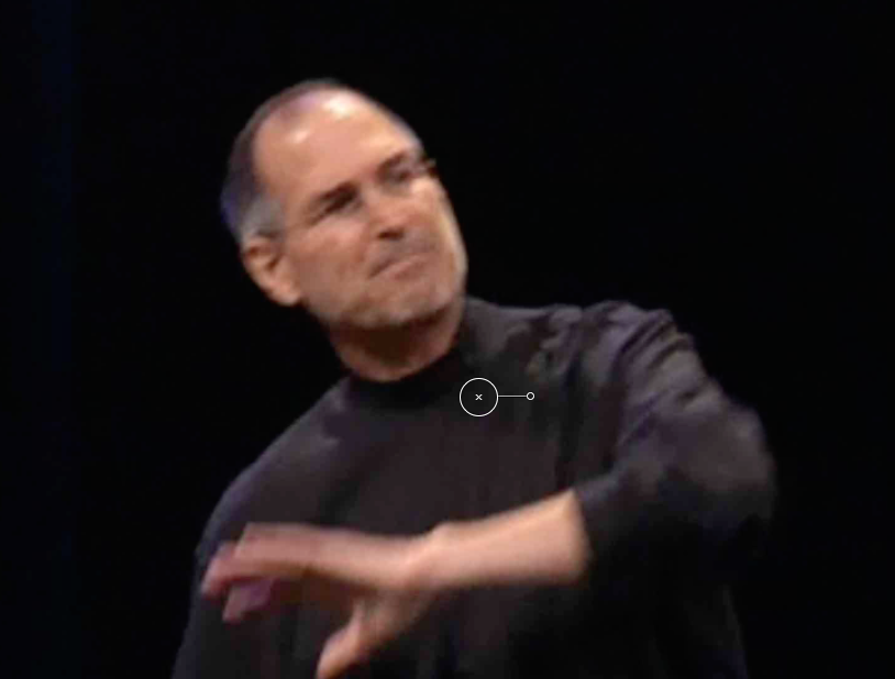
Steve Jobs: “We want to make a leapfrog product”
Having heaped scorn on the existing batch of dumb, feature and so-called smartphones, Jobs shows us why the iPhone has a reason for being:
Jobs says Apple wants to make a product that is “way smarter… and easier to use” than the usual suspects, and – before we’ve even seen what it looks like – places the green iPhone icon in the top right quadrant, well away from the others, visually in a category all on its own. If the tech industry had really studied this diagram during the keynote, rather than chuckling at Jobs’ seeming dumbing down of his Business School 101 graph – a true Jobsian misdirection – they may have detected the tsunami of innovation and change that was about to be unleashed upon them. Through hubris, inertia and groupthink, Nokia, Sony Ericsson, Motorola, Google, and especially Microsoft were caught flat-footed, and it started with such a simple, yet revealing graph.
Of course, Jobs was a master story creator and teller, and not all scientists are so gifted or empowered.
But let’s see some of the easy catches scientists can make to at least give themselves a better chance of successfully engaging and persuading their audiences.
To do this, I need to remind you of my previous blog entry, where I asserted your presentation needs to stand alone, be its own entity, and not merely a cut and paste job from your paper publication.
Here’s why:
What you’re seeing here is a Powerpoint slide, not a screenshot of a journal PDF from Neurobiology. It was used in a medical presentation I located in a random search using Google.
Now there is a place for showing you have gone to the original source for your slide. I do this on a frequent basis, although I always start with the first page of the article, and sometimes even show the cover of the journal opening using Keynote’s Flop (right to left) transition to suggest a page turn of the cover.
I then use Magic Move to focus in on a selection of the page, as in the diagram above. In the Powerpoint from which this slide is taken, there is simply a change of slide.
There are some issues though with this slide, however. For one, the images are heavily pixelated. Not such a serious problem however, and those at the back of the room probably won’t notice it. But what is disconcerting no matter where you sit is the tiny print explaining the meaning of the figure. This is fine to include in a printed journal document, but in a slide in a live presentation it’s out and out junk. Clutter. Distraction. Attention splitting. Confusing, Frustrating. Message denuding. This is ironic considering the figures are comparing brain activation areas in dyslexics and normals on certain reading tasks.
How would I do this instead if it was me showing this figure? Clearly, the figure is intended for meaning extraction by profoundly knowledgeable audiences. The use of acronyms and letters is meaningful to only such audiences and would require significant explanation for a lay audience.
What the author is trying to do is show differences between two groups on specific tasks. But in showing us all the twelve images (6 pairs) simultaneously we would have to have significant prior knowledge to know the meaning of these image variations.
For a lay audience, the idea would better be handled by taking some time to show normal responses on the tasks, then contrasting them step by step (once more using Magic Move to move from pair to pair of images) showing the changes for dyslexics across tasks. In other words, tell a story about the tasks and what they are testing for, and how it is that the images portray significant differences between the test groups.
Here’s another example from a colleague with a purpose built slide, not one taken directly from a publication:
What we’re seeing are two different measures of the same subject group side by side. The presenter first talks about one measure, say the one on the left, then transfers his, and presumably our, attention to the one on the right.
But why have both appear simultaneously and split our attention when the presenter can only describe one at at time? Where would the harm be in just using one graph per slide?
Here’s another slide from the same presentation to drive the point home:
Now, just because your software allows you to show four graphs at at time doesn’t mean you have to do it this way. It’s not like you’re giving handouts and trying to conserve paper. Unless indeed that’s what you’ve done, and have now asked your audience to turn to page 16 of their handout where you will walk them through each graph step by step. In that case, I don’t have an issue with this slide. Indeed, when I speak with academics they explain to me their students demand the slides ahead of class. And workshop attendees demand handouts to take something away with them for their cost of attendance.
(Aside: I never give handouts, before, during or after my workshops. I suggest at the beginning of the class how attendees can best make use of the visuals and information I’ll be presenting, and I let them know I will follow up with an email of links to services and ideas I will make mention of, including unplanned references spontaneously arising through group discussion.)
But unless you are making direct comparisons between the graphs and you need them all on the one slide, it’s just overwhelming for a live audience. What the presenter could do is:
1. Start with all four and say, “We conducted a series of four experimental procedures the results of which are summarised on this slide. Let start with the graph top left and have a closer look at what the results mean.”
2. From there, you use the Magic Move transition to zoom to that graph and explain to your audience what’s happening.
3. You do the same shift of attention for each of the remaining three graphs.
4. You zoom out again to show all four graphs and then offer a summary of what can be gleaned having exposed subjects to four experimental conditions, and where the data either advances a hypothesis, rejects it, or constructs a new set of hypotheses not previously considered.
Here’s a quick and dirty screenshow using Keynote 6 (KN6 falls over currently when exporting to Quicktime movies unlike the mature Keynote 5):
Here’s another slide from a Powerpoint show which demonstrates one of my other pet peeves:
Once more, we have two graphs on the one slide. What I really dislike is the now ingrained habit of labelling the Y (vertical axis) with English (not Chinese, or Japanese) words starting from bottom to top. It’s hard to read. Now if the idea is to say, “Yes but it signifies increasing levels (e.g. 80 – 200)” why aren’t the numerals also rotated 90 degrees counter-clockwise, like the words?
The other “explanation” I hear is that in space-constricted slides where screen real estate is at a premium, it’s easier to write words in a vertical plane to conserve space. Really? Look how much white space there is on this slide.
Surely, the designer could have taken one graph at a time, significantly enlarged it, and then found space to write the Y axis description horizontally, making it much easier to read.
What I do like about the slide is the author’s header, which specifically tells his or her audience the graphs’ meaning. It cues us in to look for the important elements in the slide, which the presenter then explains to us.
I almost always either use graphs with such an explanation header, or I completely leave off any descriptions, preferring to gently build the graph item by item, Jobs-style, drawing out important differences or similarities in a cohesive narrative.
A few more guidelines:
If you are going to use visual elements like photographs, try and use one per slide rather than cover your slide with numerous smaller pictures overlapping each other. There needs to be a specific reason why a slide has multiple pictures, collage-style, which otherwise simply clutters the slides and divides audience attention.
Make sure when using visuals they do not pixellate when you enlarge them. I have rejected truly brilliant photos in favour of less suitable photos (or none at all), if when enlarged, they pixellate. It’s just too distracting.
Make sure you remove any watermarks on photos which are not your own. It’s just plain unprofessional.(UPDATE: Following a comment below, I want to be quite specific about this point.What I should have written is, don’t just drag and drop a watermarked image into your slide. Do the right thing and purchase the image, thus killing two birds with one stone.I believe Getty images have released a huge tranche of its materials for free use in personal blogs. Worth pursuing as is paid services like iStockphoto (which now sells movies and backgrounds), and similar. And there is also Flickr and Creative Commons images to pursue with correct attribution. Also see Matt Shipman’s recent Scilogs science communication blog article here for ideas and free resources.I use a paid app from Glencode called Viewfinder to help track down images this way. These third party helpers and more will be demoed at my Macworld workshop March 26 this year.)
Be wary of mixing styles of data visualisation in the one slide. Look below at the slide for an example:
The task with the slide above is to give consideration to how an audience will respond to this very rich slide. Where should their attention go? To the pictures or the graph? Would it not be better to show one, then the other and use your speaking to make the connection?
There is now on the web an enormous library of guides for how to portray data sets visually. With the current emphasis on “Big Data”, there are now specialists in this area who can assist to produce complex charting which are useful for paper, convention expo or website viewing, but which overwhelm a slide unless you can use Magic Move to move around the slide bringing singular attention to each component. Here’s a Big data style expo stand I located today at an IT convention in Melbourne:
Also, go to the Roambi website here which makes apps for iPad and iPhones to assist with data visualisation on a large scale. Use it for inspiration.
Concluding remarks:
The challenge for scientists is that in the main they are using “small data” from their experiments, or “medium data” from meta-analytic studies then constructing the graphs themselves. This can be either using the built-in tools Powerpoint and Keynote offer, or purpose-built apps which can construct complex charts (eg. Excel and Numbers) then import them into your slidestack.
But whatever you do, make sure you stand back from your slide metaphorically and empathise with your audience. Ask if the slide is achieving your aim of providing persuasive information which best illustrates your ideas and findings, or is it there because science presentation dogma demands it.
In my next entry in this science-oriented series, I’ll look at the biggest challenge for scientists as well as those in the humanities: the use of text on slides. Is there a way to use text that still keeps audiences engaged and with the presenter, rather than reading and racing ahead?